

Grades will be posted tomorrow. It may be a little after midday, but when my laptop breaks, internet messes up, and phone starts all having problems. It makes thing haaaaaaard. XD. I'll find a way like I got my internet back up for now, but I expect it'll die again over night.
No worries though guys. I'll have it up asap.
EDIT: Sorry it took a little longer than I'd hoped, but keep getting more issues after another here preventing me from being as active as I want. Technology is failing me D=
@Velocity
Spoiler:Design: Heliolisk in this picture looks to be in part of nature. The kind it loves the most and comes most natural. We can easily tell what it is, where it's at, and it's colors are bright enough. Shading matches and fits in places. No complaints here on the design portion. 25 points
Matched Theme: While soaking up the sun is a thing you see a lot during the summer. It even fits to what you drew as that type of animal/Pokemon like the sun or warmer/dry air. Your theme does match so points for you, 23 points
Additional: Sun, check. Shadows, check. Background, check. All great additions to this submission. There's enough to get a great depiction of the character and the setting it's taking place. While the pose is great and I really liked the submission. I feel like there could be even more to really showcase the summer setting. 23 points
Creativity: The creativity behind this was really amazing as mentioned before. How you showed off the Heliolisk basking out in the sun in a setting natural to it. Even so, it can be hard to tell if it truly matches with "summer" is the only thing I can say about it. Other than that I really liked this submission! 23 points
@Scytherwolf
Spoiler:Design: Your overall design is bright an colorful. It's got multiple characters in one place to show off what's what's going on and where. The image and idea is clear enough we can tell what it's meant to show. 25 points
Matched Theme: Your theme is matched. What's one thing to enjoy in the middle of summer on a hot day? Relaxing at the beach! Anyone can enjoy it. Water Pokemon or not. 25 points
Additional:Your design is great, colorful, and bright. We can tell where they are and anything going on in the setting. Even as much as to the waves and water splashing around behind the Vaporeon, Emolga, and Heracross. The sun is shining on a fair and sunny day. Nothing to really complain about here on this one. 24 points
Creativity: Your idea fits the theme, it's got not just one, but THREE characters included. Each relaxing in their own unique way. The place seems like a perfect place to fit exactly what one enjoy doing on a hot summer day. 24 points
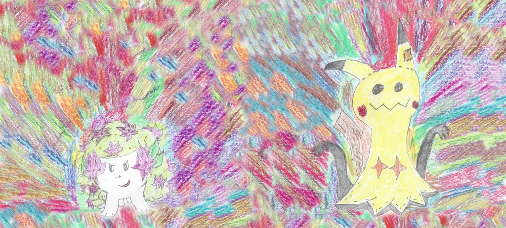
@Noblejanobii
Spoiler:Design: Similar as I am with limitations and little to offer, but it's no worries. Each character you drew was made out to the best of your ability. As long as we all know Pokemon (which I'm sure we do) we can tell what is which Pokemon. Some small piece missed in parts. Like the Pikachu for one I originally thought was Mimikyu at first. Especially missing the red cheeks (or cheek to show). I would have missed that if you didn't state it was yourself. The setting looks nice and warm. As a lot of friends are all having fun together and enjoying the beach. 19 points
Matched Theme: The theme appears to match easily. A group of friends all hanging out at the beach and enjoying a hot summer day. Either playing volleyball, relaxing enjoying a snack, staying cool under the umbrella, and relaxing in or on the water. I'd say it fits the theme perfectly. 25 points
Additional: With limitations it is hard to make changes or as descriptive as we want to be. Your setting fit and the characters are all set out. It's very nice set out piece and you even added small details that one would see on a beach. Volleyball, coolers under the umbrella, sunglasses one someone, a chair to lay back on, even an inner tube to lay on and relax on the water. So for all the additional things you added. Each adding to it. 25 points
Creativity: Your thought out you idea really well. Trying to add everyone you can think of to keep it part of your team. It's a fun simple thing that keeps everyone together. Another part of summer that everyone loves. The only part I could say is everything is so spread out and everywhere. The sheer size of some compared to others is really the only things I can say as part of this. It's nothing detrimental, but it's a small thing that threw me off. 22 points
@Coru
Spoiler:Design: It's a very simple creation. A Pokemon relaxing under a palm tree. It's easy to think of palm trees when you think about beaches. As you did mention, the Zorua is kinda unclear, but as long as you know what a Zorua is and look closely. You can make it out. The thought behind the design to it is an interesting one. Similar to that of a night sky being star-like. I really do like the design and thought to this. This was a water color design too. The color is very interesting at that 20 points
Matched Theme: The theme is simple to this using a palm tree. Even though palm trees are set out at a beach and it shows. Though even after summer, palm trees are still part of the beach. So even though it fits the summer theme of a beach it's hard to tell of a time or true theme. 17 points
Additional:The two images in the picture are the only things to look at. Though there's something a bit different about both. The physical color of these two objects have a different unique look to them. To fit an image and not look as they normally do. 21 points
Creativity: I love the whole look to a starry night time sky. Especially where you can see every little detail to stars, constellations, or the brightness or darkness in that sky design. It’s a sight to behold. That in itself is something. 22 points
@Morzone
Spoiler:Design: The design is interesting, yet classic. Two friends enjoying ice cream together as you mentioned. Smiling and just having a good time! Both characters very unique in the setting. 23 points
Matched Theme: The theme is simple as that. Two friends enjoying the ice cream they have together. It is a nice way to cool down and beat the summer heat 24 points
Additional: Other than the wall they are leaning against and the ice cream in their hands you can see some additional shading in places. The wall itself had its own design as you see in most wooden structures. I'd say it was pretty creative. Maybe create something a little extra in the background as well in future. It was great overall, so 23 points
Creativity: The idea for this was simple enough. 2 friends having some time to relax together, laugh, maybe share some jokes, and eat some ice cream. While it is very nice and creative. Sometimes it's the simplicity that perfects or effects something. 22 points
@Neo Emolga
Spoiler:Design: The design is bright and colorful. A simple Pikachu with some added extras. It's pretty simple and is a very nice throwback in the new age of how Pikachu looks. Sometimes it's those simple thoughts that can make or break it. 24 points
Matched Theme: Your theme I'd say hits the nail on the head. A summer sunset while surfing the waves with some tropical treats and a Hawaiian like attire around his neck. Keeping it cool with the shades. 25
Additional: A nice sunset background with waves to boot. The Pikachu holding onto some nice treats while it relaxes to it's classic surfboard. It's nice to see bright colorful images to a background. 24
Creativity: This is a very nice throwback to the early days of Pokemon. With an added style to it! A Pikachu on his surfboard. Holding a pina colada while surfing the waves at sundown. It's even wearing sunglasses and a Hawaiian like flower necklace. It's an interesting new design for the old school surfing Pikachu. 24 points
@Arrow-Jolteon
Spoiler:Design: This colorful piece was an interesting mix between the ideas of summer and a way to keep cool. An island with two Pokemon. One trying to keep cool by seeing the other as what it is. Ice cream. xD. I gotta admit it gave me a good laugh. Even from the shading in places. 25 points
Matched Theme: Yes! The theme fits and the general setting fits to show it. 24
Additional: The setting is pretty simple enough. What looks to be a tropical island at sunset and an additional character. Aice cream coneVanillite. Literal ice creame itself. I can see how the summer heat probably got to that Shinx and BAM. Picks it up and licks it thinking it's eating the coolest thing around. 25 points
Creativity: I loved the humor to this submission. How you used Pokemon in a humor sense for summer and the Vanillite as ice cream. It's not just us, but even Pokemon themselves believe that. This Shinx took advantage of that. 25 points
@sammy0295
Spoiler:Design: Is...is that Wigglytuff on fire? That must be really hot. It looks like it's just given up on it all. It's got a colorful sense to it. Very nice submission. The heat can be exhausting. 21 points
Matched Theme: While it looks like it has a heat effect. I think a little more to showcase what it is. Even if that's fire. It's not easy to be able to tell if it's caused or related to summer in this sense. 16
Additional: Other than the effect coming off of the Wigglytuff there's not too much else. Even something small to give that summer sense in the picture could be a bit better. 17
Creativity: I really like how the Wigglytuff has that look like it's completely given up. The summer heat really can do that. How it's sprawled out and the effect coming from it looks like it's just burnt out. Very interesting take 20
Week 3 will have an updated scoring board. As it is now it's very confusing and hard to make a good easy to go by scoring that'll just leave questions if you look at the scoreboard.
Please tell me if I'm grading too harshly, not harsh enough, or what you think will need improvement if you think it needs attention. I'm not one to really wanna be harsh on someone. So if I'm not being hard enough. Let me know please.
Results 21 to 30 of 48
Thread: PXFIRE Drawn Art Contest
-
07-12-2017, 03:41 AM #21P i k a c h u
 Administrator
- Join Date
- Jun 2014
- Location
- Clinging onto Hope
- Posts
- 10,852

Grades will be posted tomorrow. It may be a little after midday, but when my laptop breaks, internet messes up, and phone starts all having problems. It makes thing haaaaaaard. XD. I'll find a way like I got my internet back up for now, but I expect it'll die again over night.
No worries though guys. I'll have it up asap.
EDIT: Sorry it took a little longer than I'd hoped, but keep getting more issues after another here preventing me from being as active as I want. Technology is failing me D=
@Velocity
Spoiler:
@Scytherwolf
Spoiler:
@Noblejanobii
Spoiler:
@Coru
Spoiler:
@Morzone
Spoiler:
@Neo Emolga
Spoiler:
@Arrow-Jolteon
Spoiler:
@sammy0295
Spoiler:
Week 3 will have an updated scoring board. As it is now it's very confusing and hard to make a good easy to go by scoring that'll just leave questions if you look at the scoreboard.
Please tell me if I'm grading too harshly, not harsh enough, or what you think will need improvement if you think it needs attention. I'm not one to really wanna be harsh on someone. So if I'm not being hard enough. Let me know please.Last edited by Chakramaster; 07-13-2017 at 01:22 AM.

The time is upon us...

 . Pika Pair with the yellow bundle of fluff Chibi Altaria..
-
This post has been liked by:
-
07-13-2017, 10:17 PM #22Used Thunderbolt!
Moderator
- Join Date
- Aug 2013
- Location
- Running around
- Posts
- 4,492
Here's my entry for week 2:
Spoiler:
-
This post has been liked by:
-
07-14-2017, 04:14 PM #23The Known Stranger
- Join Date
- Jun 2015
- Location
- Where ever my Fantasy takes me.
- Posts
- 1,638
Boom! Morzone here. With an entry for week 2.
This is called a zentangle, which utilizes a collage of patterns to isolate and emphasize a white silhouette. Normally this is done in just black and white so as to bring more importance to pattern, shape, and shading, and so that the color doesn't overwhelm the outline in the center. I tried color this time though, since it better fit the theme, and for the centerpiece pokemon I chose, in honor of my awesome team, our mascot Skarmory! Hope you like it :)
Spoiler:
-
This post has been liked by:
-
07-14-2017, 08:13 PM #24taking flight!
URPG Staff
- Join Date
- May 2013
- Location
- My heart is in several places and all of them are fictional. u^u
- Posts
- 2,647
You know him, you love him, it's Taako Tacco! I challenge you to find a more dazzling wizard in all the land.
Spoiler:
-
This post has been liked by:
-
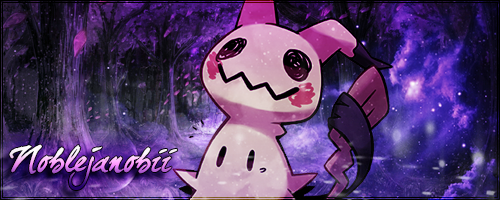
07-15-2017, 02:59 AM #25
The Queen of Shaymin
 Site EditorAdministrator
- Join Date
- Dec 2014
- Location
- US
- Posts
- 17,593
Spoiler:
What is more dazzling than a Shaymin and Mimikyu duo using dazzling gleam! Truth be told the power actually went out when I was working on this and I may have gone a bit overboard with the colors but I was bored. Plus it looks semiaccurate to the dazzling gleam move used in the anime.
-
This post has been liked by:
-
07-15-2017, 07:42 PM #26"I was stupid... So stupid"

- Join Date
- Apr 2014
- Location
- The Digital World
- Posts
- 1,607
So, it didn't really turn out as dazzling as I hoped, more like lightly glowing, but anyway here's my entry:
Spoiler:
-
This post has been liked by:
-
07-16-2017, 10:12 AM #27Faebulous
- Join Date
- Feb 2014
- Posts
- 1,148
No, not on fire, lol. Just a lazy abstract background.
Spoiler:
Does it get more dazzling than the literal rainbow pokemon?
-
This post has been liked by:
-
07-16-2017, 08:08 PM #28Cheers and good times!
Senior Administrator
- Join Date
- Mar 2013
- Location
- New Jersey
- Posts
- 17,436
Okay, I'll admit, as soon as I saw the theme, I got reminded of these three gals from Pokemon Mystery Dungeon Explorers of Time/Darkness/Sky.
Spoiler:
If you've played PMD2, you know who these gals are! And if you haven't.... >:O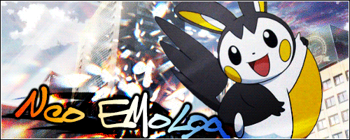
-
This post has been liked by:
-
07-17-2017, 01:43 AM #29P i k a c h u
Administrator
- Join Date
- Jun 2014
- Location
- Clinging onto Hope
- Posts
- 10,852
Alright guys gonna jump on grading as soon as I can! Thanks again for all of your entries!
Week 3 theme is........Ready for Adventure!
Draw your character, a character, or otherwise. These next two weeks will be strictly Pokémon related. Create a Pokémon showing how it or your character would prepare for an adventure. Did it finish its journey and find something truly majestic? You can even showcase that! Do they have any attire such as a bag to carry anything, a scarf, or even part of a rescue team or otherwise? Be creative and create your own if you want to. Show something truly adventurous.
IMPORTANT NOTICE
Along with this week points are being scaled down to 10 per category as to atone and make grading easier. Week 2 will still be graded as the point system started, but week 3&4 will have each category scaled down to 10 per each individual category.
The time is upon us...
. Pika Pair with the yellow bundle of fluff Chibi Altaria..
-
07-20-2017, 02:27 AM #30P i k a c h u
Administrator
- Join Date
- Jun 2014
- Location
- Clinging onto Hope
- Posts
- 10,852
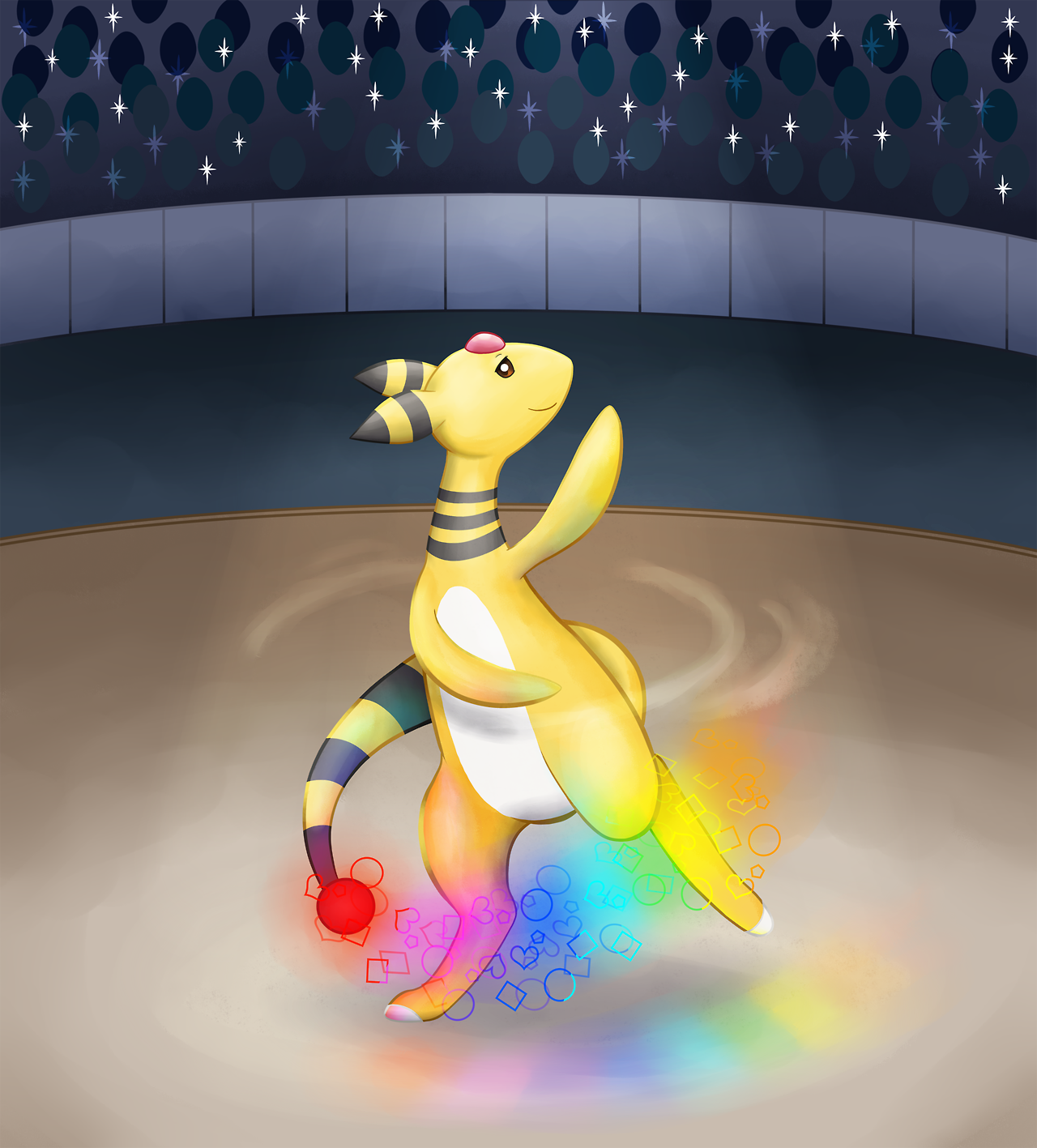
@Arrow-Jolteon
Design: At first glance the Amphros looks to be in a showfloor. Like some competition. Using the Signal Beam to make it even more showy! 24 Points
Matched Theme: It's every bit as dazzling as they say. It's showing off and very colorful while showing it off to all. 25 Points
Additional: the background is filled with a crowd watching as the Amphros dances. Showing off one of its moves to make a dazzling scene. 24 Points
Creativity: it's a really well thought out idea. Not only is it dazzling, but it's showing it off for all to see. The absolutely center of attention. While it can be hard to show off a particular "move" in a picture. I think it's really well represented especially after you mentioned what it was in your submission. 25 Points
@Morzone
Design: It's not everyday you see designs like this. It's a bit of a different style used to create this piece. It is very colorful and draws your attention. Almost everywhere you can see a little something outside of just the character used.23 Points
Matched Theme:. Theme matches. There's something to show off in each corner, but I think that's the one flaw. 24 Points
Additional: Though I love the look and design to how the entirety of he piece looks. There's so much to see in every corner. It almost takes away from what the Skarmory is showing. The background itself is colorful and very creative. I feel that's just one thing that takes away from the scene though. Don't get me wrong, I love the piece, but it's almost hard to find the actual focus in the image everything surrounding it draws in our attention. [i]21Points[i]
Creativity:the creativity is really great! It took a new style (one I haven't heard or at least seen of in a long time) especially for this challenge. It made it bright, colorful, and attracting our attention to more than one particular area. Whether a puzzle piece or a pokeball. Everything fits into a unique place25 Points
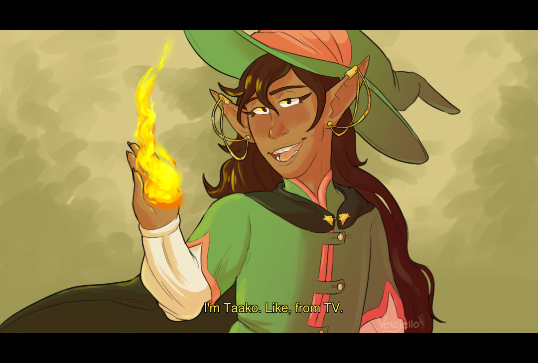
@Velocity
Design: This focuses on one character. Someone called Taako Tacco. While I don't know much about the character. It's based on what's here, not knowing who or what. Taako is holding a flame showing off the style they prefer. The design shows off the character and a pose. 24 Points
Matched Theme:Yes, it's a dazzling like photo-op taken at an opportune moment. 25 Points
Additional:the background is simple, but flows well with the character. The flame being like a wizard's calling card in most senses. He's ready to show off his dazzle, but other than the pose and flame that's about all the dazzling features to the piece.23 Points
Creativity: The submission is showing off a single character and what he does best. Keeping his pose and showing off a hint of his powers as a wizard. A simple flame in the hand to add to the effects. 23Points
@Noblejanobii
Design:The design is focused on 2 characters and a move that fills the area. Making it just a flow of colors everywhere.24 Points
Matched Theme: Theme matches and shows off a flow of colorful effects. 25 Points
Additional:theres one 2 Pokémon, but the background is filled with a dual clash of the effects from the moves they are using. Keeping the area filled bright and colorfully. 24 Points
Creativity:It's a creative piece using a simple idea and boosting it with the power of 2 instead of one. The colors as you say may seem overboard, but that's what Dazzling Gleam is. Two times the power makes it even brighter and dazzling. 25 Points
@Shruikan
Design: The Pokémon showcased in this is giving off a glowing like effect. It looks like it's in a darker part of the water.23 Points
Matched Theme:So-so. It's not super dazzling, but it has an interesting effect to it. So it still gets points 18 Points
Additional:other than the glowing effect and darkness lighting up behind it. There's not too much the piece offers.its a great piece and very lovely. 19 points
Creativity:the piece has got a slightly colorful effect that helps to light up the dark. While the idea is great I can see why you think it doesn't fit what you may have wanted. I think it did really come out nice though. So while it may not have come out like you wanted. I still think the idea behind it came out really well 20 points
@sammy0295
Design: the design is simple and shows off an effect unique to the Pokémon in the image 22 points
Matched Theme: it matches. The rainbow effect shows off Bo-oh in a pose where it's wings are spread and extending out the length of the rainbow in an upward way just as the rainbow effect is.23 points
Additional: the Ho-Oh is a Pokémon known to have a rainbow nearby it's presence. Other than the rainbow and Pokémon itself it's a natural background. 22 points
Creativity: it's a realativeky simple idea brought into the piece. The execution is shown well too 22 points
@Neo Emolga
Design: The design is really great. The dazzling Team Charm posing as they do. Showcasing these girls off in the way they love doing. 25 points
Matched Theme:it matches for sure. These girls aren't just your average Exploration team, but have the dazzling moves showcased in your submission. 25 points
Additional: along with the poses they love doing. Throwing in a heart with the team's name on it is almost all even more fitting. 24 Points
Creativity: two things came to mind with this theme myself. Corey and his Delphox along with this. Team Charm. You seemed to capture their true nature and what they love to do in a unique way. 25 points
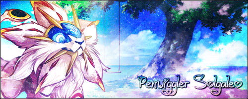
@Scyhterwolf
@Scytherwolf
Design: it's a colorful piece with many shimmering and shiny gems. It really catches the attention of your eyes. 24 points
Theme Matches: I'd say it does. The crystals/gems are bright a dazzling alone. The Heracross is looking at one amazing sight. 25 points
Additional: it's not just the Pokémon, but the illuminating crystals are shining around it too. A dazzling sight even more so 24 points
Creativity this piece is very creative. The surrounding crystals around the Pokémon illuminating the area and Heracross itself. Truly a sight to beholdLast edited by Chakramaster; 07-20-2017 at 03:43 AM.
The time is upon us...
. Pika Pair with the yellow bundle of fluff Chibi Altaria..


Bookmarks