

Great work everyone! Here are the scores for week 3, and that concludes our graphic art section for PXFIRE! Thanks to all that joined in!
Use of colour (/10):
Do the colours match nicely? Does everything show up well against each other?
Technique (/10):
Your use of graphic art techniques and skills such as using brushes and gradients, drawing vectors, editing images etc. to make a cohesive entry!
Matching the theme (/10):
How well does this piece match the theme? Are all required elements included?
Overall composition (/20):
How does the piece look overall? How do all of the elements work together? Is the eye drawn to the right parts of the artwork and is there a clear flow/direction? How much do I love it? :D
Neo Emolga 48
Use of colour (/10): 10
Nice primary colours. It almost seems like the panels reflect off each other a bit, with the red tint to Vaporeon. The grey frames everything nicely.
Technique (/10): 10
I'm loving the backgrounds of the panels corresponding to each type. Some nice brushwork going on as well. I like the borders and shadows on each panel. Great job!
Matching the theme (/10): 9
3 panels accounted for. They're not really the same size and I admit I was expecting more traditional, rectangular entries but I like what you did. :)
Overall composition (/20): 19
Everything looks great! If I had to nitpick I'd say the Vaporeon image has some outline issues on the left ear and back. But that's not really noticeable. I like the coloured glows and the blurring used to make everything look in motion. It's a great piece overall!
Morzone 46
Use of colour (/10): 10
Ooh a rainbow! It works well here against the grey background.
Technique (/10): 9
You did a really good job of cutting out the faces! The brick background has been manipulated in an interesting way as well. I like the simplicity. The way you joined the shoulders on the middle box especially is great. It could be a bit smoother on the left box by making their clothes the same colour, maybe. Other than that, good work.
Matching the theme (/10): 10
Three boxes of equal size, nice!
Overall composition (/20): 17
The grey kinda shadows on the boxes look a bit out of place as they're really hard to see along the bottom but stand out along the right hand side. A darker colour might have worked better. While you did a pretty good job of hiding it, the young boy's face is a lot blurrier than the others, which makes him kind of fade into the background. The faces being different sizes also disrupts the flow a bit for me. Like the two women on the left are quite large compared to the others, which makes them stand out a lot more. I appreciate the simplicity of the design but I can't help but want to see some interesting brushwork or effect that makes me go "wow, how did they do that?" xD This is a great idea though and well excecuted! Well done!
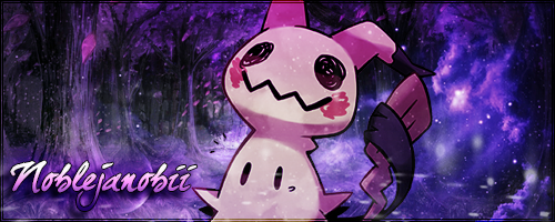
Noblejanobii 41
Use of colour (/10): 8
Wow! This really stands out! There are a lot of colours at play here which can make it look a little cluttered. Each panel individually works well but it seems a bit much when it's all put together. Mostly just that flame border, I think. It's so bright.
Technique (/10): 9
Very impressive image manipulation! I like your use of the different backgrounds in each panel, though it took me a while to recognise the Japan one. The glow on the swords is good and makes them stand out a bit and I also really like the blue glow on the butterfly panel.
Matching the theme (/10): 9
3 panels, not of equal sizes but that's okay xD
Overall composition (/20): 15
As you know, I didn't even realise you edited the images at the start because they looked so perfect. xD It's awesome that you can take images like that and really make them your own! It's cool how you managed to incorporate all the different elements of your story. I admit I find the flame border a bit distracting though, it stands out the most when I feel like the characters should be attracting more attention. I guess I feel like there might be a bit TOO much going on here as the eye is drawn to so many different things and it's hard to take it all in. But it's an awesome idea and a nice shape. I really like the butterfly panel a lot. Well done!
Steel Scavengers 69
Morzone 46 = 34
Neo Emolga 48 = 35
Gracidea Order 31
Noblejanobii 41 = 31
Results 21 to 24 of 24
Thread: PXFIRE Graphic Art
-
07-26-2017, 05:17 AM #21growing strong
 Site EditorSenior Administrator
- Join Date
- Feb 2013
- Location
- Route 1
- Posts
- 10,711
-
07-26-2017, 05:27 PM #22The Known Stranger
- Join Date
- Jun 2015
- Location
- Where ever my Fantasy takes me.
- Posts
- 1,638

At least the rainbow-against-a-gray-wall thing worked as planned. The edges of the squares were a nightmare, I really should have scraped it and started over. The squares always seemed to be a pixel or two off in some way and it would always screw with the edges so they never popped out properly or looked different from box to box. It didn't help the background was pretty much the same color as the edges. All in all better score tan I expected. When I saw Noble's and Neo's entry I kind of despaired at mine and felt I hadn't put anywhere near enough effort in.
-
07-26-2017, 05:52 PM #23
The Queen of Shaymin
 Site EditorAdministrator
- Join Date
- Dec 2014
- Location
- US
- Posts
- 17,593
Darn! Should have gone with the blue flames. Eh don't despair too much Morzone, yours is really good! You even scored better than me. Though don't be afraid to ask the advice of others. I was running my graphic by multiple people prior to submitting it to get their opinions which is what made it turn out so well.
-
07-26-2017, 09:22 PM #24Cheers and good times!
Senior Administrator
- Join Date
- Mar 2013
- Location
- New Jersey
- Posts
- 17,436
Oh frick, I thought all three divisions just had to have about the same kind of geometric area to them, not all be the exact same shape and size.
Glad you liked it anyway, even though it kind of bent the rules. :P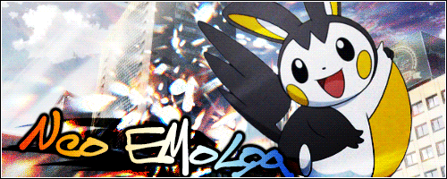


Bookmarks