

That awkward moment when you're recommended to use gradients next time but you usually did use a high amount of gradients this time.
Results 11 to 20 of 24
Thread: PXFIRE Graphic Art
-
07-18-2017, 11:39 PM #11
 The Queen of Shaymin
 Site EditorAdministrator
- Join Date
- Dec 2014
- Location
- US
- Posts
- 17,593
-
07-18-2017, 11:43 PM #12growing strong
Site EditorSenior Administrator
- Join Date
- Feb 2013
- Location
- Route 1
- Posts
- 10,711
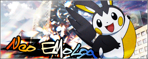
Like behind the Shaymin? I can kinda see something to the right side of the logo but I guess more visible gradients then. XD Originally Posted by Noblejanobii

-
07-18-2017, 11:44 PM #13Cheers and good times!
Senior Administrator
- Join Date
- Mar 2013
- Location
- New Jersey
- Posts
- 17,436
Lol, I have "that awkward moment when you go out of your way to remove the color to make it fit the grunge and post-apocalyptic look only to get told it needs more color." XD Originally Posted by Noblejanobii
-
This post has been liked by:
-
07-18-2017, 11:51 PM #14The Known Stranger
- Join Date
- Jun 2015
- Location
- Where ever my Fantasy takes me.
- Posts
- 1,638

This is the part where I start bashing my own work because I see all the little details as the creator
Yeah... I probably should have asked Neo for a sharper title but.. oh well. I was in kind of rush to get it done. The slogan under it I actually had a little trouble with. When I didn't filter and Blur it slightly, it kept giving me one of those 'Plastered on top" feelings that we were supposed to avoid.
The city was... well for someone who sees the small details a nightmare. The selecting process was horrible. If you look closely at parts, you see right through the buildings to the background behind. (Which isn't too bad, it kind of gives it a burning city feeling) but it also meant you could see the Skarmory's wings through parts of buildings that were supposed to be solid.
-
07-19-2017, 12:09 AM #15growing strong
Site EditorSenior Administrator
- Join Date
- Feb 2013
- Location
- Route 1
- Posts
- 10,711
Haha in the end, judging is personal opinion so I hope you guys don't take what I said to heart too much. xD I just tried to provide some tips for everyone if they were interested. And if it was really good then it was even harder to find something to pick on. ;_; You all did a great job and I was really glad to see so many great entries! :D
-
07-19-2017, 01:52 AM #16
The Queen of ShayminSite EditorAdministrator
- Join Date
- Dec 2014
- Location
- US
- Posts
- 17,593
Behind all the shaymin. The things you called shadows? Those are the gradients. XD Originally Posted by Pokemon Trainer Sarah
-
07-19-2017, 02:03 AM #17The Art Saboteur
- Join Date
- Dec 2013
- Location
- Lost in his trail of thoughts
- Posts
- 648
It's definitely a compression issue with the site. Shame it did that. I used Adobe Indesign so it should have been crisp but I did save it as an A4 so it was quite big. Definitely agree with you on your feedback. Everyone did great! The week 3 theme sounds really good and I have the perfect idea for what to do. Originally Posted by Pokemon Trainer Sarah
-
07-20-2017, 01:58 AM #18Cheers and good times!
Senior Administrator
- Join Date
- Mar 2013
- Location
- New Jersey
- Posts
- 17,436
Triptych Link: Click for great justice!
Title of Entry: Original Eeveelution Triptych!
Image Credits:
Main layout was inspired by the Cyberdyne Systems Logo from Terminator 2, but I did remake this variant myself. :3
Flareon
Jolteon
Vaporeon
-
This post has been liked by:
-
07-20-2017, 05:57 AM #19The Known Stranger
- Join Date
- Jun 2015
- Location
- Where ever my Fantasy takes me.
- Posts
- 1,638
Link to entry: Triptych
Title of entry: Faces spectrum
Image credits:
-background
-Girl 1
-Girl 2
-girl 3
-boy 1
-guy 2
-guy 3
Notes: Got this out of the way so I had time for drawing tomorrow! Hope you like it! It was kind of annoying to have to re-search up the various people, but they're all there!
-
This post has been liked by:
-
07-23-2017, 03:46 PM #20
The Queen of ShayminSite EditorAdministrator
- Join Date
- Dec 2014
- Location
- US
- Posts
- 17,593
Link to entry: http://sta.sh/010hfgwdz8bj
Title of entry: Burning WingsSpoiler:
Image Credits:
http://www.arkive.org/monarch-butter...aus-plexippus/
https://www.google.com/search?safe=s...iCAmvp9ceH4JM:
http://www.freetattoodesigns.org/ima...gel-tattoo.jpg
http://pre12.deviantart.net/fff0/th/...es-d8555c6.png
http://az616578.vo.msecnd.net/files/...gle-Photos.jpg
http://us.jnto.go.jp/images/japan101.jpg
http://www.castles.org/images/sd2_small.jpg
https://s-media-cache-ak0.pinimg.com...let-photos.jpg
https://s-media-cache-ak0.pinimg.com...llet-poses.jpg
http://download.gamezone.com/uploads...08140/fire.jpg
Notes:This is a reference to my creative writing entry from week 1-2, the Butterfly Epoch. The image on the left wing represents the main character, Muzapo, with his home planet of Alsondysi in the background. On the right is another main character, Antioch, with his castle home in the background. Finally, with the butterfly, we have the wings of a monarch (the symbol of the angel regime and main antagonists of the story) fused with the wings of a Haskótte, a moth native to Muzapo's home and the symbol of the rebellion. With that is a blue triangle butterfly whose significance is spoiler-ish and Japan is in the background because they go to Japan. And the sword that is there is the Kusanagi which is what Muzapo, Antioch, and five others are sent to Japan to fetch.Last edited by Noblejanobii; 07-23-2017 at 05:05 PM.
-
This post has been liked by:


Bookmarks