Page 14 of 16 FirstFirst ... 41213141516 LastLast
Results 131 to 140 of 154
  1. #131
    The Queen of Shaymin
    Noblejanobii's Avatar
    Site Editor

    Administrator

    Join Date
    Dec 2014
    Location
    US
    Posts
    17,593


    Sprite for a fakemon design a friend of mine and I worked on to make for our fakemon region. This is the fire starter, Hasal the Frolic Pokemon. You can see the designs here.
    / / / / / / / /
    Avatar by Soggymint
    Double Agents with Suicune's Fire

  2. #132
    Nicely done, Sloane! :D Looks great! I do think that the lineart needs to be darker, though. Lineart should always be darker where there is shading. I can see you have done that, but the change is so minimal you can hardly tell. Also, for the shiny colours, the lineart of the body is lighter than the lineart of the pink on the differently coloured features. This results in a banding-type look and stands out in a negative way. An easy fix is to just adjust the darkness of the lines.

    I think they would also benefit from harder shading tones, as the difference is barely visible. It makes for difficult readability. Anti-aliasing also really helps to make larger pixel art pieces not seem so jagged. Additionally, this is your colour pallet:


    There's an enormous number of colours there considering both fakemon have only pinks in their pallet. Try to reuse colours as much as you can!

  3. #133
    Gym Leader AWA1997's Avatar
    Join Date
    Aug 2015
    Location
    Larvitini Cave, Tohjo Falls
    Posts
    1,737
    Just scrolled through this whole thread and have a couple things to say.

    1) I don’t remember seeing the one of me in a tux (probably because my memory is Swiss cheese) and it’s awesome.
    2) Holy cow you’ve gotten so much better at all of this. Keep it up, it’s amazing!

  4. This post has been liked by:


  5. #134
    The Queen of Shaymin
    Noblejanobii's Avatar
    Site Editor

    Administrator

    Join Date
    Dec 2014
    Location
    US
    Posts
    17,593
    Quote Originally Posted by Suicune's Fire View Post
    Nicely done, Sloane! :D Looks great! I do think that the lineart needs to be darker, though. Lineart should always be darker where there is shading. I can see you have done that, but the change is so minimal you can hardly tell. Also, for the shiny colours, the lineart of the body is lighter than the lineart of the pink on the differently coloured features. This results in a banding-type look and stands out in a negative way. An easy fix is to just adjust the darkness of the lines.

    I think they would also benefit from harder shading tones, as the difference is barely visible. It makes for difficult readability. Anti-aliasing also really helps to make larger pixel art pieces not seem so jagged. Additionally, this is your colour pallet:


    There's an enormous number of colours there considering both fakemon have only pinks in their pallet. Try to reuse colours as much as you can!
    Most of what you said makes sense and I'll consider it for next time, but I do have a question about anti-aliasing and the colors. See in my experience whenever I use anti-aliasing it makes the sprites blurry and harder to see. It hurts the quality of the sprite. As for the colors, both the regular sprite and the shiny sprite use four colors. These are the base white, the base pink, the inner ear/iris pink, and the yellow for the eyebrows in the regular sprite, and the colors in the same corresponding areas for the shiny sprite. The rest of the colors is just shading so I'm a bit confused what you mean to use less colors since most pokemon palettes stick to 3-4 main colors.

    Quote Originally Posted by AWA1997 View Post
    Just scrolled through this whole thread and have a couple things to say.

    1) I don’t remember seeing the one of me in a tux (probably because my memory is Swiss cheese) and it’s awesome.
    2) Holy cow you’ve gotten so much better at all of this. Keep it up, it’s amazing!
    I don't remember how old that is either so there's no telling what it was for. XD But thank you! I've been working at it for years so we'll see how much better I can get.
    / / / / / / / /
    Avatar by Soggymint
    Double Agents with Suicune's Fire

  6. #135
    Quote Originally Posted by Noblejanobii View Post
    Most of what you said makes sense and I'll consider it for next time, but I do have a question about anti-aliasing and the colors. See in my experience whenever I use anti-aliasing it makes the sprites blurry and harder to see. It hurts the quality of the sprite. As for the colors, both the regular sprite and the shiny sprite use four colors. These are the base white, the base pink, the inner ear/iris pink, and the yellow for the eyebrows in the regular sprite, and the colors in the same corresponding areas for the shiny sprite. The rest of the colors is just shading so I'm a bit confused what you mean to use less colors since most pokemon palettes stick to 3-4 main colors.
    Ah, good that you're aiming for minimal colours. But see that colour table I put? Aalllll those colours are present in those two images. This happens when you miss recolouring some pixels sometimes. As a result, there are 47 different colours in those images, as shown by the table.

    Anti-aliasing can definitely make it look blurry, but right now it's really sharp and a bit of anti-aliasing makes it look better. I don't know if you've ever seen Speed's guide right here, but she goes over anti-aliasing and the dos and don'ts. In post 4, she talks about it for a bit. Too much looks bad, but just enough makes the sprite far easier on the eye and is just kind of good practice.

    Take Speed-X's pignite HD resize, for example.
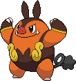


    Mostly the anti-aliasing is to cross over two colours that don't have a solid border, such as the brown or yellow stripes. Otherwise, it's around the face, specifically the eyes and mouth, which is very common. It helps to soften the image.


    So anti-aliasing is definitely necessary to have a good looking sprite when it's a really large one (in which case it's more like pixel art, since I see sprites as smaller), because otherwise it lacks depth. You can see that Speed used AA minimally, but it makes a huge difference. If you were to remove that from the sprite, it would look too sharp and unnatural. Basically, whenever I want to learn how to do something better, I use Speed's stuff as a reference (even if I'm nowhere near her skill level haha).

    But yeah aside from anti-aliasing, the other thing I'd suggest is higher contrast. It's hard to see the shading as it is now, and also makes for a flat image when the contrast is low.

  7. #136
    The Queen of Shaymin
    Noblejanobii's Avatar
    Site Editor

    Administrator

    Join Date
    Dec 2014
    Location
    US
    Posts
    17,593
    Quote Originally Posted by Suicune's Fire View Post
    Ah, good that you're aiming for minimal colours. But see that colour table I put? Aalllll those colours are present in those two images. This happens when you miss recolouring some pixels sometimes. As a result, there are 47 different colours in those images, as shown by the table.

    Anti-aliasing can definitely make it look blurry, but right now it's really sharp and a bit of anti-aliasing makes it look better. I don't know if you've ever seen Speed's guide right here, but she goes over anti-aliasing and the dos and don'ts. In post 4, she talks about it for a bit. Too much looks bad, but just enough makes the sprite far easier on the eye and is just kind of good practice.

    Take Speed-X's pignite HD resize, for example.


    Mostly the anti-aliasing is to cross over two colours that don't have a solid border, such as the brown or yellow stripes. Otherwise, it's around the face, specifically the eyes and mouth, which is very common. It helps to soften the image.


    So anti-aliasing is definitely necessary to have a good looking sprite when it's a really large one (in which case it's more like pixel art, since I see sprites as smaller), because otherwise it lacks depth. You can see that Speed used AA minimally, but it makes a huge difference. If you were to remove that from the sprite, it would look too sharp and unnatural. Basically, whenever I want to learn how to do something better, I use Speed's stuff as a reference (even if I'm nowhere near her skill level haha).

    But yeah aside from anti-aliasing, the other thing I'd suggest is higher contrast. It's hard to see the shading as it is now, and also makes for a flat image when the contrast is low.
    Ohhhh that's anti-aliasing! I thought that was dithering. But either way oh my god you're right. I knew these sprites were way too easy. If you actually go back and look at the previous batch of scratch sprites I did I actually did anti-alias with those and I just forgot to this time around. I'll definitely go back and update them later as well as check for the colors. It's a bit harder to distinguish them on my Dell (since the monitor on this laptop isn't specifically for graphics like my Mac), so I'll try to go back more carefully look it over.
    / / / / / / / /
    Avatar by Soggymint
    Double Agents with Suicune's Fire

  8. #137
    Quote Originally Posted by Noblejanobii View Post
    Ohhhh that's anti-aliasing! I thought that was dithering. But either way oh my god you're right. I knew these sprites were way too easy. If you actually go back and look at the previous batch of scratch sprites I did I actually did anti-alias with those and I just forgot to this time around. I'll definitely go back and update them later as well as check for the colors. It's a bit harder to distinguish them on my Dell (since the monitor on this laptop isn't specifically for graphics like my Mac), so I'll try to go back more carefully look it over.
    XD There is a lot of terminology so easy mistake, haha. And hey, that's great! :D Yes, a good work of pixel art requires a lot of time. :)

    Ooh as for the colour pallet, definitely don't try to do that on your own. I would never have known there were 47 colours had it not been for Photoshop's colour pallet count, but you can do it with other programs as well. Irfanview can count colours from what I remember (I used to use it a billion years ago) and GraphicsGale, which is my preferred spriting program. I don't know if GG has an editable pallet though, where Irfanview does. If you have too much trouble with it, I can condense the colours for you. :) It happens to me all the time; it's normally a result of slightly changing a shade and missing a pixel or two when recolouring.

  9. #138
    The Queen of Shaymin
    Noblejanobii's Avatar
    Site Editor

    Administrator

    Join Date
    Dec 2014
    Location
    US
    Posts
    17,593
    Quote Originally Posted by Suicune's Fire View Post
    XD There is a lot of terminology so easy mistake, haha. And hey, that's great! :D Yes, a good work of pixel art requires a lot of time. :)

    Ooh as for the colour pallet, definitely don't try to do that on your own. I would never have known there were 47 colours had it not been for Photoshop's colour pallet count, but you can do it with other programs as well. Irfanview can count colours from what I remember (I used to use it a billion years ago) and GraphicsGale, which is my preferred spriting program. I don't know if GG has an editable pallet though, where Irfanview does. If you have too much trouble with it, I can condense the colours for you. :) It happens to me all the time; it's normally a result of slightly changing a shade and missing a pixel or two when recolouring.
    How do you access it in photoshop? That's the program I normally use for spriting.
    / / / / / / / /
    Avatar by Soggymint
    Double Agents with Suicune's Fire

  10. #139
    Quote Originally Posted by Noblejanobii View Post
    How do you access it in photoshop? That's the program I normally use for spriting.
    Image > Mode > Indexed Color (it'll ask you if you want to to force black, white, and transparent. Don't force black and white because it's pointless haha). Then once it's indexed, go to Image > Mode > Color Table and it shows up. If you hit the eyedropper tool (the one in the colour table) then select each colour square, it'll show you where that colour is used in the picture/sprite.

  11. This post has been liked by:


  12. #140
    HIS TUFFNESS AD's Avatar
    Senior Moderator

    Join Date
    Nov 2015
    Location
    Mt Silver
    Posts
    3,339
    Quote Originally Posted by Noblejanobii View Post
    This gives me life. The first one, gives me life. Holy cheese curds batman that is so wonderloving adorable.


    ·»Your focus determines your reality«·

Bookmarks

Posting Permissions

  • You may not post new threads
  • You may not post replies
  • You may not post attachments
  • You may not edit your posts
  •