

Traditional Art:
Ocean:
Spoiler:
Biggest painting I've ever done, 30X40
Old crappy stuff:
Spoiler:
I've got this that I entered for WAR Drawn Arts.
Spoiler:
Tanks:
Spoiler:
Non pokemon related, just something i drew
Digital Art:
Old crappy stuff:
Spoiler:
Onix:
Spoiler:
Took me 2 months to get more motivation, but I made something else! I made an onix, once again in Krita. Thing is that the background sucks so bad that I think it actually takes away from the picture.
backround:
Spoiler:
no backround:
Spoiler:
Espeon:
Spoiler:
SOMETHING COMPLETELY NEW!!! By completely new, I mean one hundred and ten percent new and different. Thanks to someone from PXR on skype, I found the most amazing free art program ever. Its called Krita. Has TONS of tools and brushes and features, AND its free. Easy to figure out too, hardest part was figuring out what brush to start with (Because there really are that many).
Anyway, before I say any more, here is the picture:
It is a shiny Espeon, made for the shiny contest. I think that with time and practice, I can get better at this program than I ever could have been at paint.net
SF's Flareon:
Spoiler:
MADE SOMETHING NEW! HAPPY BIRTHDAY SF!!! I made this for her for her birthday. Already gave it to her but I wanted to post it in here. Spent 4 hours (A new record) on the flareon alone. Put minimal effort into the background because I had to get it done in like, two days, and my patience was 100% gone.
Suicune's Fire and only Suicune's fire has the right to use this image (Kinda Obviously)
DM Bannar:
Spoiler:
I just made something else. A banner for my signature. Not sure if my signature is too big now but i will try to check that.

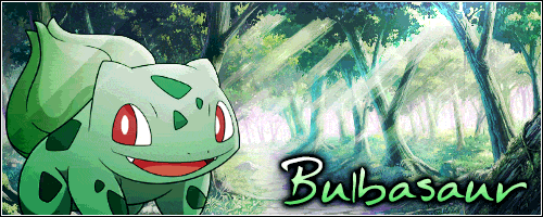
Bulbasaur I Avatar:
Spoiler:
Well, i haven't been making anything in a while. I just made this however due to a friends (Bulbasaur) request. I suppose if anyone wanted to make a request, even though there are other artists better than me, I would likely take the request.
Bulbasaur and Only Bulbasaur has permission to use this image.
Deddenne:
Spoiler:
Alright, made another picture. My primary purpose for this picture was to make something for the GCEA X/Y event but i also made it to test out Paint Tool Sai =D i may not be very good with it yet (This is my first time ever using it) but im loving it so far.
Eevee:
Spoiler:Got yet another picture. I made this Eevee for my upcoming story (my writing skills are far from fantastic but i figured id give it a try)
the background is basicly the same as my Bulbasaur but much much better.
Mesprit:
Spoiler:I made another picture. I couldn't decide which i liked so i uploaded both of them. The backround looked dull so the second image was my attempt to make it slightly more interesting.*
Spoiler:
and now version two:
Spoiler:
Bulbasaur:
Spoiler:
Due to a friends (bulbasaur) suggestion/request i have drawn Mays Bulbasaur. To me the shading looks a bit off on the face but i think the pod on its back is the best ive done with shading yet. also probobly took the longest out of all the pokemon i drew, believe it or not i spent 3+ hours (not consecutive) working on it.
i give Bulbasaur rights to use this image however he wants
Ho-Oh:
Spoiler:
This Ho-Oh is still not amazing compaired to many other pictures i have seen recently on this forum but its still my best picture yet IMO
Squirtle:
Spoiler:this Squirtle is not very good but IMO its an improvement over my first attempt (the garchomp that i will not link to or post here because im very unhappy with how it came out)

Results 1 to 10 of 70
Thread: Dragonmaster's Art
-
09-10-2013, 11:04 PM #1Certified Eeveelution Enthusiast
 GCEA Staff
- Join Date
- Aug 2013
- Location
- New Jersey
- Posts
- 3,257
Dragonmaster's Art
Traditional Art:
Ocean:
Spoiler:
Old crappy stuff:
Spoiler:
Digital Art:
Old crappy stuff:
Spoiler:Last edited by Dragon Master Mike; 01-17-2017 at 01:48 PM.
-
09-10-2013, 11:47 PM #2garlic bread champion
- Join Date
- May 2013
- Location
- New Joysey
- Posts
- 10,635
Looks like Squirtle to me. :X Originally Posted by dragonmaster715

-
09-11-2013, 12:16 AM #3your turn to roll
- Join Date
- Feb 2013
- Posts
- 13,469
HOORAAAAAAAAAAY! It looks so much better! :D Well done. I don't think the garchomp was more detailed than this; the garchomp had sprite parts, which made it not detailed, but messy and something that had nothing to do with detail. XD This is great, though. :] To make it easier when you go over the sprite lines, do you reduce the opacity level of the sprite's layer so that it's dim, and you can see the lines that you're drawing over it with better? It makes it easier to see. x)
It needs a nose, and a bit more shape when it comes to the mouth. The arms and legs are also bear, and the tail should be curly, like a squirrel's tail. xD What I suggest is, after you go over a sprite like this, you then go google the pokemon you're spriting and use a reference to fill in the details that you couldn't make out because it was a sprite. Or maybe the detail couldn't be included well enough in the sprite because they're small. XD Regardless, go to google images and look up squirtle, then use that to edit the lineart that you got from tracing over the sprite. Make sense? :]
You're progressing fast, as this is pretty good, so well done!
~SF.
-
09-11-2013, 01:34 AM #4Certified Eeveelution Enthusiast
GCEA Staff
- Join Date
- Aug 2013
- Location
- New Jersey
- Posts
- 3,257
true Originally Posted by Bulbasaur
yes i did. and thanks for the complement, it really isnt that good. next time i will look up pictures of the pokemon so i can see other details Originally Posted by Suicune's Fire
-
09-17-2013, 09:09 PM #5Certified Eeveelution Enthusiast
GCEA Staff
- Join Date
- Aug 2013
- Location
- New Jersey
- Posts
- 3,257
New picture =D very happy with how it came out, not amazing but its my best picture yet
-
09-19-2013, 12:19 AM #6your turn to roll
- Join Date
- Feb 2013
- Posts
- 13,469
Hooray! 8D You know, when you have a new picture, you can post it in the post you're telling us there's a new picture in. ^-^
As for THIS...
There's a difference between putting yourself down and wanting to improve... You're putting yourself down, so stop that. xD Originally Posted by dragonmaster715
So! The new ho-oh picture! I do like it. :] The pose is good, but there's a lot about it I want to critique. x) Firstly, the outlines. You have a bunch of coloured lines inside the drawing, but then some of outlines turn black, like on the head. It looks a little out of place, especially when you use black for the whole head, since there are many colours there. There's nothing wrong with using black for outline colours, but it's usually appropriate when all outlines are black and thinner, or when there's a heavily shaded part of the drawing and you need dark outlines so that they don't clash. Another thing is that the colouring is a little messy; I can see that the white belly has pixels around the yellow outline above (between the white and the orange chest) and that would come from using the paint bucket tool on photoshop when you're not dealing with pixel outlines.
Never use the paint bucket tool when you're colouring a drawing that you've done with the brush. :] Otherwise it does that--leaves stray pixels unfilled. Unless you're then going to go over the edges with a brush, then don't use the paint bucket tool. You can do that on the colour layer, and then the outline layer over the top will cover up where the white starts and where the orange chest begins, but you have to do that with layers. Or, if you want to be difficult and use the same layer for colour and outlines, redo the outlines after you've done the colour.
Apart from that, the creature looks very flat. This partly comes from the black outlines being used in unnecessary places, and the outlines are also a little thick. They don't need to be. Another thing is, the toes on its left foot (on our right) look a little twisted, and behind the foot, the white, round leg part is cut off. That should continue in its circle, but instead it gets cut off near the topmost toe. That is also the toe I'm referring to which is in the wrong spot; it should be over to the right a little and larger, and proper shaped more like a claw.
Other things include not much shading at all, and the face is very expressionless. Expression comes with time, and it isn't helped by the black outlines either. It looks similar to what an ancient inscription of a ho-oh would look like or something. x)
But regardless, I do still like it. :D I hope my advice/critique helps! You've definitely got the right idea; just need to work on some things. :] Also, do you do sketches before you draw? It's important to always do that too. x) On a bottom layer of course, haha.
~SF.
-
09-20-2013, 02:04 AM #7Certified Eeveelution Enthusiast
GCEA Staff
- Join Date
- Aug 2013
- Location
- New Jersey
- Posts
- 3,257
Thanks. Yes i did use the paint bucket tool and i have been going over the areas it leaves uncovered but i guess i missed a spot. i also knew the feet were off but no matter how much i toyed with it i couldn't make it look normal. I will keep these things in mind next time, particularly the part about the black outlines. Not sure what i was thinking when i did that. Maybie i should try to draw something with colored pencils and paper, im better at drawing than digital art ( or whatever you want to call it) (these are my first REAL attempts at digital art, ive been drawing IRL far longer than i have been drawing digitally) Originally Posted by Suicune's Fire
-
09-20-2013, 06:34 AM #8your turn to roll
- Join Date
- Feb 2013
- Posts
- 13,469
No worries. x) Yeah, therein lies your problem. Ahh okay, I see! Well remember to look at reference photos, or even literally bring up your own hand and curl your fingers over, then copy the shape of them. Okay, sounds good! 8D XD Doesn't matter. You live and you learn, right? xD Yeah, you could try that! 8D Digital art takes a while to get a handle on. (Traditional art and digital art is what I generally call them. xD) Cool! Well you're getting better so don't get discouraged!
Also, do you have a drawing tablet? That's what I use and it's MUCH easier than a mouse.
~SF.
-
09-20-2013, 09:32 PM #9Certified Eeveelution Enthusiast
GCEA Staff
- Join Date
- Aug 2013
- Location
- New Jersey
- Posts
- 3,257
I have used drawing tablets but i dont actually own one. Also is it bad that the program im using i don't think is really even meant for this kind of thing lol (paint.net)? i just use it because i don't know any other decent free programs and i don't feel like spending money (yet) Originally Posted by Suicune's Fire
-
09-21-2013, 04:04 AM #10your turn to roll
- Join Date
- Feb 2013
- Posts
- 13,469
I see! Drawing with mice...too hard for me. xD Maybe drawing traditionally would be best for you for the time being. :] Ahaha, nah, Paint dot net is pretty good as far as I know. I had it once and it was okay, but I just preferred photoshop so I use that instead. x) I think GIMP can be useful as well, and Paint Tool SAI is great, although that costs money, I'm pretty sure. =/ You can get a free trial, but those things are annoying. xD
~SF.


 Reply With Quote


Bookmarks