

I think C is probably the best technique-wise, but I like the colors on A more (especially if you're going to be creating a palm tree).
Results 51 to 60 of 79
Thread: Prankster Platoon
-
07-04-2017, 04:20 AM #51taking flight!
 URPG Staff
- Join Date
- May 2013
- Location
- My heart is in several places and all of them are fictional. u^u
- Posts
- 2,647
-
07-04-2017, 07:43 AM #52Chikorita ♪
- Join Date
- Jan 2017
- Posts
- 1,011
@Coru A is my favorite one, but they are all awesome. Great job! o/

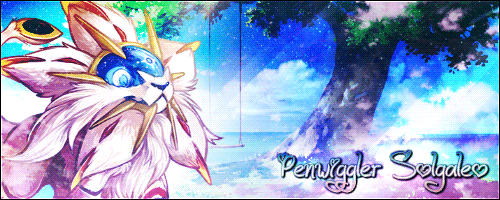
Special thanks to Fate for this cute avatar and this cute banner! :D
Special thanks to AD for this awesome Chikorita GIF! :D
-
07-06-2017, 10:16 AM #53Chikorita ♪
- Join Date
- Jan 2017
- Posts
- 1,011
Hello everybody! What do you think of this battle?
http://replay.pokemonshowdown.com/ge...ttle-600176273 @LKWayvern @Sacred Fire @Chakramaster
Special thanks to Fate for this cute avatar and this cute banner! :D
Special thanks to AD for this awesome Chikorita GIF! :D
-
07-06-2017, 03:48 PM #54The Art Saboteur
- Join Date
- Dec 2013
- Location
- Lost in his trail of thoughts
- Posts
- 648
I've submitted my sprite art entry for this week, Lets hope I've managed to top Sarah's great entry. Now I'm going to work on the drawn art. I've got some really good competition in the drawn art so far so need to up my game. haha.
How's this guys. Took ages to get it how I want it. Not sure how I think about it at the moment though. It is purposefully meant to be messy, I think it exaggerates the fact it is watercolour. It was a real challenge to still get it in the shape I wanted it. Hopefully that looks like a zorua as well.

Last edited by Coru; 07-06-2017 at 04:57 PM.
-
07-10-2017, 11:09 AM #55The Art Saboteur
- Join Date
- Dec 2013
- Location
- Lost in his trail of thoughts
- Posts
- 648
Hi guys. So, this week's theme for graphic art is a recruitment poster for our team. I did poster design at uni this year so I should be quite good at this. I'm thinking of going for a graffiti theme to capture the prankster theme of our team and also keep the dark purple/blue/green colour scheme we have. you guys have any suggestions?
-
07-10-2017, 11:43 AM #56Eldritch_Angel
- Join Date
- May 2015
- Location
- Scenic 'the Void'
- Posts
- 1,208

I like the graffiti idea! Perhaps it could also be in a rather unconventional place, like directly over an ad for another team? XD
Avatar made by Neo Emolga.
-
This post has been liked by:
-
07-11-2017, 06:13 AM #57The Art Saboteur
- Join Date
- Dec 2013
- Location
- Lost in his trail of thoughts
- Posts
- 648
Judging is starting to come in now. We managed to grab 60 points so far! The Gracedea Order is 26 points ahead but lets hope we can close the gap.
I have to come up with a logo for our team for the graphic art brief. How's this guys? I also need a slogan and was thinking about "Creating out of this world chaos"
Spoiler:
Also, I've designed the base of the poster. it will have some changes and corrections but this is the basic idea.
Spoiler:Last edited by Coru; 07-11-2017 at 09:02 AM.
-
07-11-2017, 10:51 AM #58Eldritch_Angel
- Join Date
- May 2015
- Location
- Scenic 'the Void'
- Posts
- 1,208
I kinda like that slogan~ And I love the artwork. A couple stars in the background too, perhaps?
Avatar made by Neo Emolga.
-
This post has been liked by:
-
07-11-2017, 01:42 PM #59taking flight!
URPG Staff
- Join Date
- May 2013
- Location
- My heart is in several places and all of them are fictional. u^u
- Posts
- 2,647
The poster is off to a good start, but I would definitely create more highlights at the top of the "world" so that there's more value contrast between it and the background. I would also maybe create a border around the dark red text or change its color, so that there's more value contrast there, too. It looks pretty strong already and I love the colors, but value contrast is everyone's best friend and adding a little more can make it really pop.
-
This post has been liked by:
-
07-11-2017, 11:13 PM #60The Art Saboteur
- Join Date
- Dec 2013
- Location
- Lost in his trail of thoughts
- Posts
- 648
Ok, I have kind of COMPLETELY ditched the original design. My lecturer's words were bouncing round my head with the graphic design sins I had done, so I simplified it, played around more with typography and come up with this. I have changed the text colours for the highlights because I agree there wasn't enough and it was hard to read sometimes. I may change the background a bit too. I just can't help feeling something is missing. I've tried to put in Zorua but can't find a good place where it doesn't mess up the design.
Spoiler:


Bookmarks