


.:*~Pixel Art "Do"s and "Don't"s~*:.
Given all of the information above, you likely now have a much better grasp of what pixel art is. However, with great knowledge comes great responsibility. It's good to know how to do something, but you also need to know how to do it right.
.:*~Anti-Aliasing~*:.
Anti-aliasing, as briefly described above, is the method of manually adding "buffer" pixels / colors to smoothen jagged edges out. Advanced programs such as Photoshop, or the newer versions of Microsoft Paint, will have tools (i.e. brush tool) that will automatically anti-alias around the brush stroke. In pixel art, anti-aliasing needs to be applied by hand.
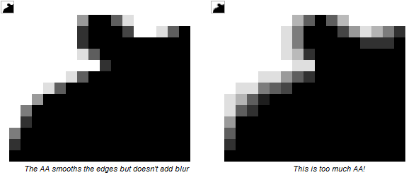
Anti-Aliasing is a wonderful tool to use; however, you need to be able to know just how to use it...and how much. Below is an excerpt from a thread on Pixel Joint (linked to in the thread's credits section) related to how much anti-aliasing to use and not use.
That should be a good transition into the next section...Too much AA (over-anti-aliasing)- You only want to use as much AA as is necessary to smooth the edge. If you use too much, the edges can look blurry, and you lose the crispness of the line.
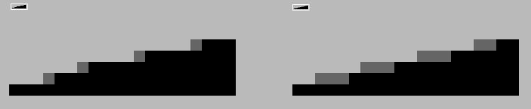
Too little AA- Here the artist has used single pixels to ease the transition, but he has only succeeded in blunting the jagged edge a bit. He could have made a much smoother transition by using longer lines of pixels to show a more gradual transition:
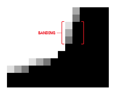
AA banding- When segments of AA line up with the lines they're buffering, AA banding occurs. For a better understanding of AA banding, be sure to read the section on banding.
--cure
.:*~Banding~*:.[
Banding is when pixels line up together, or "hug" each other. Banding is frequentlly used with deliberately shaded sprites. it tends to happen often during the shading process. Below are a couple of common examples of banding:
Banding should be avoided at all costs, simply because of it looking completely unattractive. Banding can be very sneaky and creep up on us when we least expect it, but don't worry yourselves with this at the time.
.:*~Jagged Line Art ("Jaggies")~*:.
Jagged lines are both a good and bad thing. First, let's look at it in a positive light in a way it can actually be helpful--something that a lot of beginning pixel artists tend to avoid or just overlook.
See this? This happens most often when you are trying to make a curve, particularly a large curve. Adding the jagged line right at the end, when zoomed out, helps make it look more natural and curvy, and less polygonic. However, when making these you should also balance it out with a little bit of anti-aliasing, because despite all your efforts, without anti-aliasing / selective outlining, you will either have a curve with an obvious jagg or a curve that looks too polygonic.
Now, let's analyze how it can be a detrimental element to our pixel art. These reasons should be pretty apparent just by looking at these images, so I will take less time explaining them.
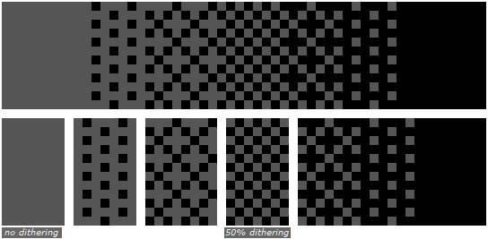
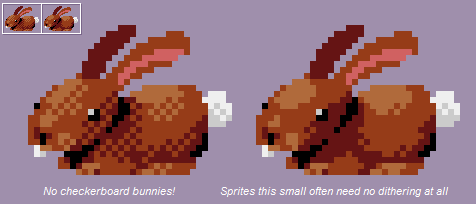
.:*~Dithering~*:.
Dithering can be beneficial for sure: it is used to ease the transition between colors in an innovative manner--without having to use an extra color or colors as a buffer. Despite the fact that dithering can be difficult to use effectively; by intermediate pixel artists, dithering in general tends to be viewed as a taboo. This isn't an entirely accurate viewpoint. Dithering, additionally, can be used to create a type of texturing; and is also commonly used when you are forced to preserve colors (having a limited palette). Here's yet another slight excerpt from the same Pixel Joint thread, because cure explains dithering fantastically here.
Too much dithering should be avoided, especially if it's just standard dithering. Doing such can add an unnecessarily rough appearance to what it's being applied to. If you really need to use so much dithering, you'd be best off adding a buffer color instead.Dithering consists of different patterns of pixels. It's typically used to ease the transition between two colors, without adding any new colors to the palette. It's also used for creating texture. In the days of CRT monitors, dithering was especially useful as the screen would actually blur the dithered area and obscure the pattern. Now that crisp LCD monitors are the norm, the patterns are no longer as easy to hide, meaning dithering is not as versatile as it once was. Even so, dithering still has its uses.
The most common form of dithering you'll see is a 50/50 dither, also known as a 50% dither or a checkerboard pattern.
As shown in the example above, you can create various other patterns to further buffer between a full color and a 50% dithering pattern.
These patterns are often easier to spot than a 50% dither though, so be careful!
Stylized dithering is another technique, and is characterized by the addition of small shapes in the pattern.
Interlaced dithering allows for two dither regions to hug each other. It is called interlaced dithering because the two dithers weave together at the borders. This type of dithering allows you to blend dithers together to form gradients.
Random dithering is a less-common form of dithering, and isn't generally advised, as it adds a lot of single-pixel noise to the image. While it has some usage in very small doses, random dithering is something you'll often want to avoid.
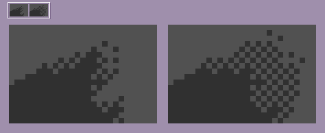
As useful as dithering is, it's often misused by inexperienced artists.
--cure
The below image shows an effective amount of dithering (right) versus excessive dithering (left).
The amount of dithering to use should depend on the contrast of your colors and/or the size of the palette you're working with. It's best determined on a case-by-case basis.
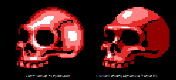
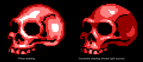
.:*~Pillow-Shading~*:.
Ah, pillow-shading...one of the most taboo, if not THE worst taboo technique to use in the pixel art world. Pillow-shading is a type of shading that you will want to do your best to avoid AT ALL COSTS.
Pillow shading is more often than not an amateur mistake. Sometimes, though--like banding--pillow-shading can be sneaky and pop up even when you don't intend for it to. Pillow-shading is commonly paired with banding."Shading by surrounding a central area with increasingly darker bands. Pillow-shading is bad because it pays no attention to the light source, and conforms to the shape of the area rather than the form it represents of how light affects it."
--cure, Pixel Joint
.:*~Selective Outlining~*:.
Selective outlining, sometimes referred to as "Sel-out"ing is mainly used for sprites that have a definite outline / line art. It is the process of shading the lineart manually in order to conform with how the light hits that area of said line art.
Using only colors for outlines versus using colors AND black for the outline is something that is mostly based on personal preference and is a highly debatable subject.
Results 1 to 10 of 19
Thread: The PxR Spriting Encyclopedia
Hybrid View
-
02-27-2014, 04:17 AM #1formerly Speed-X

- Join Date
- Apr 2013
- Location
- USA
- Posts
- 4,686


Greninja: Axibians | Gengar: Speed's ORAS Emporium! | Malamar: Picarto | Roserade: Speed's Pixel Cluster | Gliscor: ASB Stats | Tentacruel: Pokemon Prism Stats | Drapion: VPP Stats | Mega Sableye: Recolored Shiny XYORAS Icon Sprites | Flygon: URPG Stats | Snivy: Viridian Reference | Treecko: Link Vault | Shiny Whismur: All shiny Pokemon
Pfp by my friend Muerte Verde
------------
-
This post has been liked by:
-
02-27-2014, 04:21 AM #2formerly Speed-X
- Join Date
- Apr 2013
- Location
- USA
- Posts
- 4,686
.:*~Conclusion and Final Notes~*:.
.:*~Conclusion~*:.
This guide was purely intended to go over the basic, yet utterly important elements of spriting. Overall, pixel art takes lots of patience, attention to detail, precision, and mistakes. Yes, you heard that last one right: art is about making mistakes and learning from them. This is why critique is the most important factor to help an artist improve. Do not be ashamed to post something because you think it is inferior: we do not bite and will not judge you. Art is about being humble and accepting of others' input and feedback.
If you approach art with a patient and persistent heart, your efforts will surely be rewarded.
.:*~Side-Notes~*:.
I felt the need to make this guide because of the fact that we are trying to expand this sub-board and get more people to post their art. While there are several other guides out there that explain things one-hundred times better than I have, this is meant to be a comprehensive and relatively easy-to-understand guide. This thread is very subject to change and be added on to when it is necessary. As a result, your feedback and questions are greatly appreciated. I also felt as if merely linking you guys to the two threads I have heavily referenced from wouldn't give the same effect. Even if I had to paraphrase about half of the content here, there's something about creating something yourself that gives it a certain charm.
I have tried to make this post seem as professional as possible, including an introduction, conclusion, footnotes, and complete references and credits. Any bit of content that is directly quoted is stated as such; minus the fact that the content in post three is put in a large quote. This is to separate it from the rest of the post and an attempt to give it a more organized appearance. Anything that is a direct quote ends with "--<username>."
Note that the fact that I used these two wonderful references hopefully shouldn't make you feel as if I am just parroting back whatever these people say. I've been wanting to create one of these mega-threads since this morning for everyone here's reference and hopeful understanding. Anyways, please do not let this doubt my credibility in what I am telling you. While I'm really not trying to sound egotistical or over-confident, I have been into pixel art for almost a decade. Simply put, it's what I'm passionate about.
Even if I do have the tendency to go on long hiatuses.
Thank you for reading. I hope you all enjoy reading this as much as I enjoyed creating it.
.:*~Credits~*:.
Dictionary.com for a couple of definitions. The reason of using this is due to the fact that it defined said term(s) much better than I could have.
This thread has been heavily referenced from the following threads:
"The Pixel Art Tutorial" by cure, at Pixel Joint Forum.
"SPRITING DICTIONARY (and resources)" by Gors, at The VG Resource (formerly known as The Spriters Resource).
The images that I have used all originate from the aforementioned two threads, unless otherwise stated. I also recommend reading the following thread, that elaborates more on the things mentioned here in a step-by-step tutorial fashion.
"Noobtorials" by Hapiel, at Pixel Joint Forum.
.:*~Edit Log~*:.
February 27, 2014
-Updated the side notes / disclaimer.
-Added more terminology and Pokemon spriting community-esqued jargon.
------------------------------------------------
I'll compile a list of PXR-made pixel art-based tutorials here! ^^
ZrowNoodles' basic animation tutorialLast edited by SassySnivy; 01-30-2015 at 01:23 AM.
Greninja: Axibians | Gengar: Speed's ORAS Emporium! | Malamar: Picarto | Roserade: Speed's Pixel Cluster | Gliscor: ASB Stats | Tentacruel: Pokemon Prism Stats | Drapion: VPP Stats | Mega Sableye: Recolored Shiny XYORAS Icon Sprites | Flygon: URPG Stats | Snivy: Viridian Reference | Treecko: Link Vault | Shiny Whismur: All shiny Pokemon
Pfp by my friend Muerte Verde
------------
-
This post has been liked by:


 Reply With Quote
Bookmarks