

Please Read: This thread is a trial to see if there is interest in this sort of thing! The idea is very similar to the Daily Pokemon Opinions thread, but it's geared towards commenting and critiquing the design of Pokemon. I will post a Pokemon daily for the next week (Monday April 7th to Sunday April 13th) and see what sort of response and interest this gets. So if you like the idea then post away, or leave some feedback. Alternatively if you do not like the idea then feel free to leave feedback as to why by either posting in this thread or sending me a private message/VM.
Daily Pokemon Design Critique
Leave your feedback regarding the overall design of this Pokemon. What would you change? Does it need improvement? How do you feel about the colour choices? Or is it just perfect?
Rate the Pokemon's design out of 10, and leave a comment or two explaining it. :) Have fun! Have suggestions for a Pokemon to discuss? Feel free to message me.
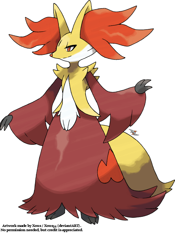
Delphox
Render: http://xous54.deviantart.com/art/Delphox-405959183
My critique: I think the colours for Delphox are fantastic, and although my initial impression of the bipedal direction was poorly recieved I ended up appreciating it and really enjoying this Pokemon/evolution line. My biggest issues are the direction of the hair coming out of the ears and the length/puffiness of the dress. If I could tweak this design I would shorten the dress a bit and make it more elegant, and I would direct the ear hair downwards instead of straight out. Overall I do think it's a fairly pretty Pokemon design but small adjustments, imo, could have made it better. I know a lot of people dislike Delphox though!
8/10
Results 1 to 10 of 21
-
04-07-2014, 01:35 PM #1The Fire Fox Gijinka

- Join Date
- Jan 2014
- Location
- Canada
- Posts
- 812
[Discussion Trial] Daily Pokemon Design Critique
-
04-08-2014, 08:45 AM #2Pokemon Trainer
- Join Date
- Dec 2013
- Location
- Canadaustralia
- Posts
- 230
Eh, there's nothing really bad about Delphox, other than the feet, but design wise, I felt more could be done. While it's true, less can be more, and it is often the case with a lot of Pokemon, nothing really stands out besides the ear hair. That and the coloring of it's head, specifically where it shifts from yellow to white. It looks so off to me. I just... I'm not a big fan of that coloring. Shame, since I thing the face is one of the better things about this Pokemon. I love the warm, fiery color scheme that somehow remains calm, but the heavy usage of that burgundy like color... it just seems lazy to me, especially when it makes the orange fire symbols on her side seem tacked on and unnecessary.
This being said, it still gets across Delphox quite nicely. The color scheme is calm yet heated, it looks graceful and serene, and it has the giant ear fluff that is demanded as well as sending a warning that Delphox is not to be trifled with. Sadly, this means Delphox is just a satisfactory design. I see nothing special in it, but nothing too terrible either.
6/10~~~Deviant Art ~~~
~~~ Pokemon Crossroads~~~
 Facebook~~~
-
This post has been liked by:
-
04-08-2014, 05:37 PM #3The Fire Fox Gijinka
- Join Date
- Jan 2014
- Location
- Canada
- Posts
- 812
Feebas!

What are your thoughts on Feebas' design?
I personally think this design is fairly well done. It works especially well when you consider Milotic and the Beauty option for evolution of course! But besides that I adore colours used for this fish. It's not overdone but it's not plain either, the detailing on the body is a great added touch as well. IMO the best part of Feebas is his tail fin though, I think they did well keeping him "ugly" (that's a horrible word haha) by putting cuts in the tail fin as opposed to leaving it full. It may not make as much sense from a mobility standpoint but it's a fantastic design choice.
7/10
-
04-08-2014, 06:13 PM #4"Dude, what?"
- Join Date
- Feb 2013
- Location
- California
- Posts
- 2,298


Personally, I like Feebas' design. As Braixen said, the colors go well together, and they're also good, bland colors for a fish. It's sunken eyes and frowning mouth make it look "uglier." One thing I never liked, though were those triangular marks above its mouth. They always looked kinda like nostrils and that weirded me out cos he's a fish.
Overall, 7/10 since it's not the coolest looking thing, but it's good or what it's supposed to be.
-
04-09-2014, 12:16 AM #5taking flight!
URPG Staff
- Join Date
- May 2013
- Location
- My heart is in several places and all of them are fictional. u^u
- Posts
- 2,647
I love this idea, jussaying.
Feebas is exactly what it's supposed to be - it's ugly. It has big, pouty lips, a dopey eye with a small pupil, and bland colors. It manages to do all of this without being completely revolting to the eye, which is nice. However, the blue and the brown look weird to me; maybe it's just taste, but the blue looks a little too similar in value to the brown. And I'll never figure out why its gills are near its behind - what kind of fish has gills on its butt? Overall, it's a strong design, but nothing extraordinary and nothing I really care about.
6/10
-
04-09-2014, 04:30 AM #6Pokemon Trainer
- Join Date
- Dec 2013
- Location
- Canadaustralia
- Posts
- 230
I love Feebas' design. It is meant to look ugly but not hateable. It's brown and dirty, but not a contender for a rock type appearance. I love the the cheek bones especially. When people think beauty, one of the many idea are pronouncedcheek bones. Feebas has them, but in this case... not too pretty. And that is a perfect yet subtle hint as to what is to come. There is nothing I don't love about Feebas. Not a single thing. Except maybe it's fin. The on his head. That thing looks like it belongs on an electric type. There are so many other ways they could've gone with it, but they went with that. It's juts the piece of pyrite in the gold stack. That being said, that's all that's bad.
9/10~~~Deviant Art~~~Pokemon Crossroads~~~Facebook~~~
-
04-09-2014, 10:39 PM #7The Fire Fox Gijinka
- Join Date
- Jan 2014
- Location
- Canada
- Posts
- 812
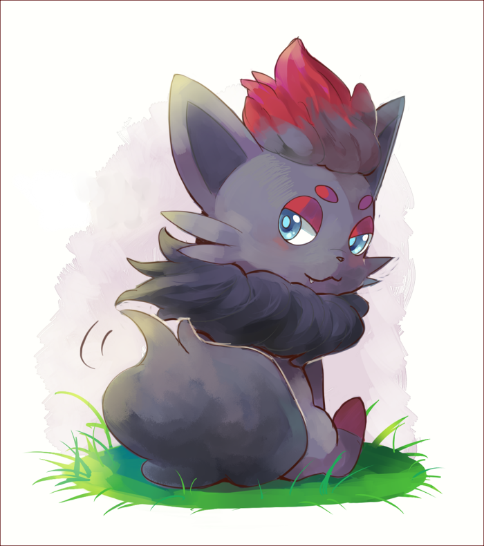
What are your thoughts on Zorua? :)
I think he's an absolutely fantastic design. The colour scheme is gorgeous and in all honesty he has the air of simplicity that a lot of people believe the later generations are lacking in. The only thing I occasionally am up and down about as far as his design is his eyebrows haha, I enjoy his sassy look but I think they could have been done a bit differently, or left out completely. Sometimes they just look like spots and it's confusing, occasionally they're too circular when I think they should be more oblong etc. Overall in my books he's a fantastic design!
9.5/10
-
04-09-2014, 11:17 PM #8A fairy a day keeps the Hydra away
- Join Date
- Nov 2013
- Location
- Teh interwebz, Connecticut
- Posts
- 3,678
My rating: 6.5/10
Zoura has an okey-dokey design. Cute, but there's many unevolved Pokemon that outclass it in that department for me. I never thought of the spots above his eyes as eyebrows but now I do and I can't unsee it. Which makes it slightly less cute. I do like the colors though, so that gives him a little boost. I'm not a huge fan of the picture Braixen chose though, but my personal favorite Zoura is strangely the sprite from Black and White. It just looks perfect there too me. And that sprite boosts it from 6 to 6.5 for me.
Sprite:
Spoiler: Spoiler:
-
04-10-2014, 10:27 PM #9The Fire Fox Gijinka
- Join Date
- Jan 2014
- Location
- Canada
- Posts
- 812
Serperior

My thoughts: It's a fairly good design, I honestly don't have much I would change about it. I always liked his detailing and such and think his tail is absolutely adorable. Green is the obvious choice.. yellow looks nice, the only thing I find odd about the design is his neck area. He looks a bit royal with the addition around his neck but I feel as though it could have been toned down a bit! :P
7/10
What are your thoughts? :)
-
04-10-2014, 10:38 PM #10"Dude, what?"
- Join Date
- Feb 2013
- Location
- California
- Posts
- 2,298
I love Serperior, for its functionality and design. The gold (a very majestic and rich color) matches his characteristically green coloring along with his personality. The projections around his head/neck remind me of a crown and cape, which also makes him appear to be more royal and dignified. One thing I don't like, though, are the curls in front of his eyes. I feel like it makes his face look too busy and that the curls near where his ears would be are enough. Aside from that thing, though, Serperior has a stunning design, so I give him a 9/10. :3

 Reply With Quote





Bookmarks