

I honestly should have set aside a lot more time for this, but something is better than nothing, right?
Form
Name: monkeybard
Team: Jupiter Mining Corp
Myth/Legend: How Koi Become Dragons
Summary/Link: [link]
The essence of it is, many fish in the wild will travel upstream in breeding seasons; salmon are a common example of this, as are koi. There's a Chinese myth associated with this where when a koi successfully scales a waterfall with all its strength, it is rewarded for its efforts by transforming into a magnificent dragon. I wanted to draw some koi-dragon hybrid in mid transformation and ascending to the heavens where it now deserves to be. Incidentally, this idea is also where the concept of Magikarp (Koiking in Japanese) evolving into Gyarados originates from, if I'm not mistaken.
Piece of work:

Results 81 to 90 of 93
Thread: [WAR: Season II] Drawn Art
-
06-28-2015, 03:06 AM #81a simian minstrel

- Join Date
- Jun 2015
- Posts
- 130
-
This post has been liked by:
-
06-28-2015, 04:06 PM #82The Art Saboteur
- Join Date
- Dec 2013
- Location
- Lost in his trail of thoughts
- Posts
- 648
WEEK 2 REJUDGE @Morzone
@FellySpoiler:
Spoiler:
@Pokemon Trainer Sarah
@VelocitySpoiler:
@a3personSpoiler:
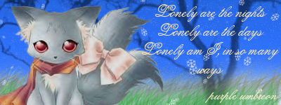
@purple umbreonSpoiler:
@PTGigiSpoiler:
@The Frost DragonSpoiler:
@Sou CleifeSpoiler:
@ElysiaSpoiler:
Spoiler:
Winners
3rd Place
Spoiler:
2nd Place
Spoiler:
1st Place
Spoiler:
Here is the WEEK 2 rejudge that Neo Emolga asked for. I have rejudged based on what he said and what I agreed I should need to change.
I am working on Week 3's results and they will be up later along with the last Theme of the WARLast edited by Coru; 06-28-2015 at 10:58 PM.
-
This post has been liked by:
-
06-28-2015, 10:47 PM #83The Art Saboteur
- Join Date
- Dec 2013
- Location
- Lost in his trail of thoughts
- Posts
- 648
Week 3 results @Noblejanobii
Spoiler:
@Morzone
@VelocitySpoiler:
@Sou CleifeSpoiler:
@Arrow-JolteonSpoiler:
@ShruikanSpoiler:
@purple umbreonSpoiler:
@ElysiaSpoiler:
@monkeybardSpoiler:
Spoiler:
Winners
3rd Place
Spoiler:
2nd Place
Spoiler:
1st Place
Spoiler:
Well done everyone! What a great week.
Now, for the Grand Finale of the WAR Drawn Art contest.
WEEK 4: Pokemon Fusion Gijinka
So for the Grand Finale, I want to finish with a challenging bang. And it is this. Pokemon Fusion Gijinka.
There shall be two steps to this, and because it is challenging, I will say that starting as soon as possible will be best.
STEP 1:
Visit this website and randomly select some pokemon, two being the minimum and 3 being the maximum (Any higher would be too time consuming and would mean that you wouldn't have enough time to complete it.)
If the pokemon really aren't your best, you can cycle through a few random cycles. Doing this 3 times at the most. You are then to draw a fusion pokemon from these two pokemon. This IS NOT the piece you will be judged on, so it does not need to be good, it can be a sketch. However, the better the drawing, the better it will be for you to use later on in the task. I want you to submit this fusion draft along with the final subission. It will not be marked, but it will help me judge your actual entry as it will give me an idea of what I am looking at. (So if it helps me understand and relate to the piece more, then you will get more marks, so it will indirectly help. Bare this in mind)
STEP 2:
Now using that draft you made, create a Gijinka from it. A Gijinka is a person who looks like the pokemon, much like a person cosplaying a pokemon. The main way that will show the relation to your pokemon fusion will be the clothes, so make sure these resemble the pokemon you created. You can do anything with this. They can be of any age and gender, any body type or ethnicity, as long as it suits your pokemon. Any way to relate it to your pokemon is allowed. Go crazy.
Another thing.
THEY MUST ALL BE DRAW ON PAPER. NO DIGITAL SOFTWARE AT ALL IS TO BE USED.
Here are some examples of Gijinkas to help you for ideas:
http://www.deviantart.com/browse/all/?q=Pokemon+Gijinka
Have fun, you have 1 week. Entries will close on Saturday 4th July at midnight
Form:
Name:
Team:
Pokemon in fusion:
Fusion draft:
Gijinka:
Extra Details:
Last edited by Coru; 06-28-2015 at 11:39 PM.
-
This post has been liked by:
-
06-28-2015, 11:42 PM #84a simian minstrel
- Join Date
- Jun 2015
- Posts
- 130
Really good work to everybody! The entries were all really creative and we all did pretty well c:
I really don't want to be that guy though, but it looks like you've added up Velocity's score total wrong (10, 9, 8, 8).
In any case, this last task is incredibly hype, I love designing fusions and I love designing gijinkas; I wonder why I never though to combine the two. Are we expected to have a background or would drawing the design out like clean standalone art/concept art type deal yield the same results?
-
06-28-2015, 11:49 PM #85The Art Saboteur
- Join Date
- Dec 2013
- Location
- Lost in his trail of thoughts
- Posts
- 648
I was thinking it would be standalone. A background here would not be appropriate with the brief, but if you wish to add one, feel free. Just know that it won't count for much, if anything it will only give you maybe one creativity point at the most but the big proportion of points will be on the Gijinka itself.
I've also fixed the miscalculation, thanks. :)
-
06-28-2015, 11:52 PM #86a simian minstrel
- Join Date
- Jun 2015
- Posts
- 130
Standalone is just fine! I'll get to work on it as soon as possible c:
-
06-29-2015, 12:46 AM #87your turn to roll
- Join Date
- Feb 2013
- Posts
- 13,468
AWESOME WORK, GUYS! So proud of our team. ;~;
Also dammit. D: I suck at drawing humans. >.< But that's awesome that it has to be traditional! O:
-
06-30-2015, 08:05 PM #88The lord of cookies :D
- Join Date
- May 2015
- Location
- The land of chocolate
- Posts
- 85

I have my pokemon randomized and now I need to start drawing. I am looking forward to this

-
07-02-2015, 04:34 AM #89a simian minstrel
- Join Date
- Jun 2015
- Posts
- 130
Name: monkeybard
Team: Jupiter Mining Corp
Pokemon in fusion: Scatterbug and Relicanth
Fusion draft: Scattercanth [Design 1]
Gijinka:

Extra Details:
I don't have a lot of good colour pencils, and it might've looked a bit better if I shaded it with lead but I'm pretty happy with how it turned out. I thought that Scattercanth's face would work well as a mask, but I didn't want to have the gijinka wear the mask because that would obscure a lot of details and just make it look like I put a Scattercanth head on a human body. When I made her wear the mask to the side of the head and gave her slanted eyes like a Scattercanth, the rest of the summer festival/yukata look just fell into place, and I made her gloves, sandals and obi pointed like the 6 little feet of the Scattercanth.
-
This post has been liked by:
-
07-04-2015, 07:54 PM #90Used Thunderbolt!
Moderator
- Join Date
- Aug 2013
- Location
- Running around
- Posts
- 4,492
Name: Arrow-Jolteon
Team: Jupiter Mining Corp
Pokemon in fusion: Raikou and Cherrim
Fusion & Gijinka: "Cherraikou"

Extra details:I really hate how the hands look in this one. They give me hell.Okay, ranting aside, at first I thought I'd go for a more elegant design, but then I realized it was going to be tricky to make the Cherrim component show through the design if I went for elegant, so instead I went for something small and cute. It came out looking like a chibified Raikou with petals glued to its body XD. The little flower at the tip of Cherraikou's tail is based on Cherrim's Overcast Form, and in the humanized version I turned it into a toy. Speaking of the human version, it wasn't originally going to be a child, but I decided to draw the two interacting and I thought it'd look funny if it was a kid playing with their pet.
-
This post has been liked by:

 Reply With Quote


Bookmarks