


Unfortunately, I'm going to have to override XaiakuX as judge, as we're almost into Tuesday and the next theme badly needs to go up (not to mention this is holding up the Week #1 overall scorekeeping).
GRAPHIC ART WEEK #1 RESULTS!
I don't really have the time to grade art entries based on XaiakuX's rubric, so I'll try to leave a short but sweet review for each piece. I know you guys worked hard on your stuff and I wish I could go into more detail like I did with Creative Writing (and this is why I do my judging on a weekend!), but I'll do my best just keeping it simple with a rating of 1-100.
Hope you guys understand. :)
lorri - The Prism League, Restorers of Light
This is definitely a neat, very eye-catching banner and the animation is simple, but neat, smooth, and fits the banner just right. I also like the cityscape-like background and the white, neon-like text is a great fit as well. It's simple and to the point, but in a great way and doesn't go too over-the-top with unnecessary flair or gimmicks. The text and title stand out and it definitely does a great job. I think one extra layer of effects, such as maybe a sun behind the central pyramid, clouds in the background, or stars (something along those lines) would have really given it an extra bit of spark, but it's great on its own.
92/100
---------------------------------------------------------------------------
Sou Cleife - Team Trainer - For courage, honor, and Glory!
Definitely a neat, animated banner by a true Pokémon fan. :D
I like the unique shape of the banner, and the way you incorporated the GIF animation into the Poké Ball off to the side. I think it bit more variance in the color would have been need to see (maybe more of a transition from pink to purple would help it stand out some more, but overall, it's definitely neat and well-designed. I also think the animation would have been better off in the center, since it's definitely the most eye-catching feature on the banner itself. But overall, it's a nice piece of art!
85/100
---------------------------------------------------------------------------
Pokémon Trainer Sarah - Team Trainer - Honour, courage, glory
You bring out the best in Mega Charizard X. And I'm sure it takes a REALLY good trainer to handle a beasty like him, so you picked a good one! XD
I like this banner for the fact that it takes a big step away from the rectangular shape and instead, the Mega Charizard really stands out, but the background effects like the arrows, spikes, and the squares in their varying shades of red, black, and blue actually bring out the Mega Charizard X even more. Plus, I really like the way you incorporated the background Poké Ball and the way you used the text.
The only teeny change I'd suggest is maybe doing something a bit more with the "Team Trainer" text to make it stand out. I think just a little more bang and sparkle with it would have really made it even more epic, but overall, you did a great job with that banner. :D
95/100
---------------------------------------------------------------------------
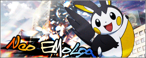
Felly - Team Yoga Bears - Gettin' All the Honeys
You sure love your bears. XD
The claw print is a cool idea and I like the slogan, but I think a little bit more could have been done with the images and the text to make them stand out. I'd even suggest maybe going with a nice white font that stands out a bit more (like on your current signature) as opposed to a dark yellow on a green background, which doesn't make it as easy to read.
To make the banner even better, I'd suggest going beyond the diagonal black line overlay and incorporate more effects and dynamics to make the banner more of your own creation rather than relying too much on the images. Try some experimentation and don't be afraid to try new things to see what works and helps it stand out more. :)
72/100
---------------------------------------------------------------------------
sammy0295 - Team Trainer - Honor, Courage, Glory
I love how Team Trainer likes to go old school when it comes to Pokémon artwork. XD
I like how you made the banner take on a unique shape and how you linked the manga artwork with the colored rod-like shapes. It keeps it simple and to the point. I think maybe a little adjustment could have been done to make it brighter and stand out a bit more.
Also, some of the text is a bit hard to read, especially the word "Glory." The name "Team Trainer" is also not too easy to read either. Maybe going with white for "Honor," "Courage," and "Glory" would help those words stand out a bit more, and some kind of gradient or patterned effect for "Team Trainer" would have helped it stand out a bit more and be more eye-catching.
76/100
WINNERS:
3 Points - Pokémon Trainer Sarah (Team Trainer)
2 Points - lorii (The Prism League)
1 Point - Sou Cleife (Team Trainer)
GRAPHIC ART WEEK #2
For this week, we're going with... Legendary Pokémon!
Pick a legendary (just one) and make the best banner you can for them that really captures their essence and character. On the banner itself, it should have:
- An image of the Legendary Pokémon.
- The Legendary's name, in text.
- And some kind of phrase, statement, or slogan that you feel best captures them.
Other than that, go all out and good luck!
Results 1 to 10 of 40
Thread: [WAR II] Graphic Arts!
Hybrid View
-
06-16-2015, 03:56 AM #1Cheers and good times!
 Senior Administrator
- Join Date
- Mar 2013
- Location
- New Jersey
- Posts
- 17,504
-
This post has been liked by:

 Reply With Quote
Bookmarks