

All feedback is constructive criticism so if you feel put down about your work, we apologize and we have made sure to include ways to improve. If you feel we have been a bit harsh, feel free to PM us and we will give you more reasons in detail and try to help you
Digital Art Contest
We have been through the entrants and the three of us, @Corrupt_Voidlich, @Absol and @XaiakuX, have all critiqued the entries and decided on a place for every entrant. You will get a score and comments on how to improve, you will find yourself below. Thank You for taking part in an official PXR event and we look forward to seeing you again
Charmander009
Spoiler:Judges Comments:
Corrupt_VoidLich
Spoiler:Score:Creativity:7/10
Thoughtfulness:6/10
Sticking to Brief:8/10
General Look:8/10
Total: 29/40
Critique: This is a great banner. The render is enorporated well, the smoke/flame background fits with emboars blue flames and you have even added its dex number which is impressive and creative. It looks professional and there are hardly any things that aren't done well, however, I feel that the banner is too dark and there is little contast and I feel that it lets it down slightly. I feel that if that is tweaked and if a few more things are added to make the banner more interesting, it will be a very good banner.
XaiakuXSpoiler:Scores:Creativity: 6/10
Thoughtfulness: 7/10
Sticking to Brief: 7/10
General Look: 6/10
Total: 26/40
Critique: That Emboar is offical art? Definitely not Sugimori art. Probably PGL artwork. Anyways, I like the text and the smoke. I just feel like having a Pokémon that's literally on fire would have a bit more of a firey concept to it, and that the banner would be brighter and more.. orange? I dunno, that's just how I feel about it.
AbsolSpoiler:Scores:
Creativity: 9/10
Thoughtfulness: 8/10
Sticking to Brief: 8/10
General Look: 8/10
Total: 33/40
Critique: This banner is very well done, it creates an image that flows perfectly and includes enough detail to be interesting yet does not crowd the subject. My only issue is that the render could have been altered a bit more to fit as the colours make it stand out a bit too much for me. Yes, the flow is still good, but I'd love to see it tweeked a tiny bit!
Total: 88/120
Dragon Master
Spoiler:Judges Comments:
Corrupt_VoidLich
Spoiler:Score:Creativity:8/10
Thoughtfulness:6/10
Sticking to Brief:5/10
General Look:5/10
Total: 24/40
Critique: I am surprised that this was the only digital art entry in the competition, I was hoping for more. I know creating a piece of digital artworkis a lot harder than doing a banner so I commend you a lot, however, there are some parts that need improving. I feel that the background could have done with some improvement, eventhough the sky is very well done, the grass seems a bit too bland. If you add more to that like blades of grass, it will be great. Also, the pokemon, eventhough drawn well, lacks shading in some areas, making those parts look flat, shading should be added here. One more thing is that the outlines look jagged, by smoothening these out, it will look much better. Other than that, with a little more time, this could be a great piece of work.
XaiakuXSpoiler:Scores:Creativity: 4/10
Thoughtfulness: 2/10
Sticking to Brief: 3/10
General Look: 4/10
Total: 13/40
Critique: Hi, I'm XaiakuX, and I'm an art critic. I just did this for a Traditional art fellow, as well. The brief said "it can't be just the Pokémon." Granted, you did more than the other guy, but still. The anatomy is strange, the concept is bland, and it feels like there wasn't any thought put into it. It feels like you just wanted to throw something in this contest for the lolz. That isn't a way to win, or get decent scores.
AbsolTotal: 62/120Spoiler:Scores:
Creativity: 6/10
Thoughtfulness: 6/10
Sticking to Brief: 8/10
General Look: 4/10
Total: 25/40
Critique:
Although I have awarded a low score for this image I do appreciate the artist's work. The painting technique is not perfect but an obvious effort has been put into this image! The artist is definitely on their way to becoming a great digital artist and it's nice to see them in the middle of that process. I will state that they failed to continue to create depth with the image on the face of the Espeon, in comparison to the lower half of the body. I would have suggested some lighter colours to contour the face, head and ears. Overall it's an endearing image but could have been enhanced with a bit more background. Great job.
☯Intel☯
Spoiler:Judges Comments:
Corrupt_VoidLich
Spoiler:Score:Creativity:7/10
Thoughtfulness:9/10
Sticking to Brief:7/10
General Look:5/10
Total: 28/40
Critique: This is another great banner, however, the colour is a little harsh and the text at the top is hard to read. Maybe making the green slightly less vibrant would help and changing the colour of th text also. I really like the two outside renders of Mewtwo, I think the colour scheme and the style fits with the banner and effect you want to create, however, the one in the middle looks slightly out of place as it is so different, manybe giving it back a few colours would make it look a bit less odd. I like the fact that you have took the renders outside the cinfinements of the banner outlines and I like all of the thought put into it. With a few tweaks, it can be a great example of a successful thought out banner.
XaiakuXSpoiler:Scores:Creativity: 6/10
Thoughtfulness: 6/10
Sticking to Brief: 6/10
General Look: 4/10
Total: 22/40
Critique: OH GOD, MY EYES. There is too much lime green. It hurts. The text is barely legible, I'm going to hold my comments on the Mewtwo on the left, although I do admire breaking out of the borders. I enjoy the concept, you had a good idea, but it's just way too hard to look at. If you'd like some tutorials or help with all of that saturation or the text, you can send me a PM, and I'll help.
AbsolTotal Score: 77/120Spoiler:Scores:
Creativity: 6/10
Thoughtfulness: 6/10
Sticking to Brief: 8/10
General Look: 6/10
Total: 27/40
Critique:
This banner has a clear and concise subject and I enjoyed 2/3 of the renders used in this image. Despite this I believe the renders could have been blended a bit more and flowed a bit better. Using renders of different styles is a common occurrence in banner making but it's difficult to pull off unless image editing has been done to make the styles a bit more uniform or the contrast a bit less harsh. Despite this the creator used a very clear colour and subject theme and rolled with it the entire way! I would also suggest the use of a different colour for the text though, and possible some way to highlight it (such as a dropdown shadow, a border, etc). Overall a great attempt with clear initiative.
Final Places
Spoiler:
1st: Charmander009
2nd: Intel
3rd: Dragon Master
Message from XaiaikuX: All in all, you guys need work. I'm seasoned at digital art and graphic design, so if you need advice, tutorials, or help, I'll gladly lend a hand. I will say this, I'm not the best, even on the forum, but I know what people like to see, even if I can't always deliver on that.
Traditional Art Contest
We have been through the entrants and the three of us, @Corrupt_Voidlich, @Absol and @XaiakuX, have all critiqued the entries and decided on a place for every entrant. You will get a score and comments on how to improve, you will find yourself below. Thank You for taking part in an official PXR event and we look forward to seeing you again
Winter
Spoiler:Judges Comments:
Corrupt_VoidLich
Spoiler:Score:Creativity:9/10
Thoughtfulness:8/10
Sticking to Brief:7/10
General Look:8/10
Total: 32/40
Critique: I really like this. I like how you have coloured the hair, however, some parts look slightly flat due to the lack of shading, this is mainly the dress and gloves, however I like how you have thought differently and not done a typical pokemon, that's why I feel it is very creative. I would have liked to see the digital version of this but too bad it wasn't submitted in time. It looks like not much has been done to the skin, even if it would be white, there would be shading, so I feel that could be improved. Also, a background could have been added to make it stand out even more. All together, I think this is a good quality drawing.
XaiakuXSpoiler:Scores:Creativity: 6/10
Thoughtfulness: 5/10
Sticking to Brief: 8/10
General Look: 9/10
Total: 28/40
Critique: Okay, so... Yours is like the opposite of the last 2. It looks good with no decent idea to back it. Too bad I didn't get to see the digital version before the contest ended, probably would have gotten you a 10 there. Anyways, the anatomy is fine, the drawing is all fine, although you could have shaded it, more. I just wasn't a fan of the idea. The Gijinka concept is a little worn out for me.
AbsolSpoiler:Scores:
Creativity: 9/10
Thoughtfulness: 7/10
Sticking to Brief: 8/10
General Look: 7.5/10
Total: 31.5/40
Critique:
This is a great traditional piece of art. My only critique is that it's too simple in terms of colouring, and background. I would have liked to see a method of contrasting the piece with the background and also a bit more contouring. The outline is absolutely lovely though, and the image is full of life. It's elegant, graceful, and beautiful. It's everything you would expect from the Pokemon! Winter also gave the piece a perfect title, and I commend her effort overall with this art.
Total: 91.5/120
Judge Joseph Dredd
Spoiler:Judges Comments:
Corrupt_VoidLich
Spoiler:Score:Creativity:9/10
Thoughtfulness:8/10
Sticking to Brief:9/10
General Look:9/10
Total: 37/40
Critique:I am very impressed by this, you have put a lot of work and effort into this and have managed to include more than one pokemon. It shows a scene with pokemon and not just a pokemon. It is very creative and I have little to fault it, however, Some parts appear blotchy, but as it was done with pen, there may not be anything to stop it. Also, I feel a bit more could be done with the background by maybe adding flowers or clouds. Not much needs to be done to this, but as I said, I feel a little bit more could be added to perfect it.
XaiakuXSpoiler:Scores:Creativity: 7/10
Thoughtfulness: 8/10
Sticking to Brief: 8/10
General Look: 6/10
Total: 29/40
Critique: You draw like I did 7 years ago. Dunno if you remember those days, but I like it. Still draw hands better than I do. You drew cute Pokémon to draw us in and love the image as a whole. But you also did so to distract from the blotchy coloring and shading (markers are terrible for it.). The anatomy of the Pokémon and Trainer are a little rough, but that Wurmple looks demonic and I love it.
AbsolSpoiler:Scores:
Creativity: 9.5/10
Thoughtfulness: 9.5/10
Sticking to Brief: 9/10
General Look: 9/10
Total: 37/40
Critique:
I have scored this piece very highly as, although there are areas that could be improved, it's a great image and meets the criteria of the contest extremely well! It depicts multiple shiny Pokemon that are clearly interaction, the image is about more than just a shiny Pokemon, it's a story. I really appreciate this entry and think it follows the briefing the closest out of these entries. Excellent job! The Poochyena is especially adorable.
Total: 103/120
Brettles
Spoiler:Judges Comments:
Corrupt_VoidLich
Spoiler:Score:Creativity:7/10
Thoughtfulness:8/10
Sticking to Brief:7/10
General Look:6/10
Total: 28/40
Critique:This is very different and quite interesting. It is a strange piece of work to understand but I like it that way. To me, the eye seems slightly too big though, and I feel a bit more shading would be needed to refine the flames and to make the skin of the horse look slightly better. Obviously some time and effort has been put into this due to the clean outlines and the proportions of the head being correct.
XaiakuXSpoiler:Scores:Creativity: 6/10
Thoughtfulness: 7/10
Sticking to Brief: 10/10
General Look: 3/10
Total: 26/40
Critique: I like the idea, the concept, the illusion, and what you were trying to portray here. It's the actual portrayal, actually putting it to paper that stops me from loving it. I'm actually probably the worst to judge simply because I have such high standards for art. My advice is to practice. Your lines, your shading techniques, your anatomy, just all of it. Never stop. I was told to summarize, but if you want details, you can always PM me.
AbsolSpoiler:Scores:
Creativity: 9/10
Thoughtfulness: 6/10
Sticking to Brief: 7/10
General Look: 6/10
Total: 28/40
Critique: This image isn't lacking in creative concept but I would have liked to see more detail in the Ponyta. The colouring work is great and blends nicely but there could have been a bit more detailing in the line work to bring the Shinyta to life! I commend the artist for the effort, however, and I did enjoy this piece due to it's underlying concept.
Total: 82/120
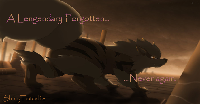
Shiny Totodile
Spoiler:Judges Comments:
Corrupt_VoidLich
Spoiler:Score:Creativity:4/10
Thoughtfulness:4/10
Sticking To brief:4/10
General Look:7/10
Total:19/40
Critique:First of all, this is just a pokemon, this is said to be avoided in the brief, this will make you lose points. However, it is still a good drawing, some proportions are off, however, the colouring is correct, except for the eye colour and overall it looks very well done. Next time, just add more to it to make it more original and also try to make it your own by changing the pose of the pokemon and not just copying a pose. With a little more time and thought, it could be a great piece of work.
XaiakuXSpoiler:Scores:Creativity: 3/10
Thoughtfulness: 2/10
Sticking to Brief: 2/10
General Look: 3/10
Total: 10/40
Critique: Hi, I'm XaiakuX, and I'm an art critic. The brief said "it can't be just the Pokémon." That's all you drew. On top of that, one leg is way longer than the other, one arm is longer than the other (even with depth perception), and Shiny Greninja's eyes aren't green. They're red. You drew another version of someone else's fan art. I'm done here.
AbsolSpoiler:Scores:
Creativity: 5/10
Thoughtfulness: 5/10
Sticking to Brief: 7/10
General Look: 7/10
Total:24/40
Critique: This image is well done in terms of accuracy and portrayal of Shiny Greninja, although it lacks creativity as the artist did not create a original render position and instead used the already made Pokemon art. The colours are fairly well done, and again it was executed well, it falls short in terms of being creative and thoughtful though. The artist has great potential, as their line art is dead on, they just need to take a few creative steps out of their comfort zone to impress. This can be started by creating backgrounds for their images. A good attempt overall.
Total:53/120
Final Places
Spoiler:
1st: Judge Joseph Dredd
2nd: Winter
3rd: Brettles
4th: Shiny Totodile
Message from XaiakuX: All in all, I appreciate your efforts, all of you. But I've got ridiculous art standards, which comes from dating 2 of the best traditional artists I've ever known, and being friends with several more. I surround myself with talented people to learn, practice, and get better.
Fusion Spriting Contest
The judges of the spriting contest have judges the entrants and we have decided a place for everyone. The judges, @Corrupt_Voidlich and @Suicune's Fire, have given you a score and comments on how to improve. You will find yourself below. Thank you for taking part in a PXR official event and we look forward to seeing you next time.
Blaquaza
Spoiler:Judges Comments:
Corrupt_VoidLich
Spoiler:Scores:Creativity: 6/10
Skill: 5/10
Sticking to Brief: 7/10
General Look: 7/10
Total: 25/40
Comments: Challenge 1: I like this. It shows splicing skill and it is consistant without any gaps in the outlines and the shading is intact, however, I feel that the colours do not go well together as one is a cold colour and the other is a neutral colour. Also, the right arm seems to be too bright so that may have needed to be changed slightly so the highlighting is either bend out from the arm or the middle shade would bend into the arm, then it would look more natural, other than that, it is a good splice, well done.
Challenge 2: I like the thought put into this, it has different pokemon in it that usually wouldn't be put together, so I feel it doesn't really go together. You have clearly tried to make parts fit, however, I feel it looks slightly wierd or too angular, however, they can only be realised when zoomed in. The main thing that I would point out is the yellow cape. It has no black outline, this makes it look strange as the others have black somewhere in the outline. It could do with a little tweaking to make the lines smoother, however, good try.
Suicune's FireSpoiler:
Scores:
Creativity: 4.5/10
Skill: 2.5/10
Sticking to Brief: 10/10
General Look: 3.75/10
Total: 20.75/40
Comments:Challenge 1: This fusion amuses me, although it doesn’t make too much sense. xD It’s pretty copy-pasty, but gave me a smile. The light blue on the tag above the yellowy bit looks weird and clashes strangely too.
Challenge 2: This one, because it has slightly better shading and outlines, was better than the first. Its compact form gives you more of an excuse not to have added more detail, although it is pretty lacking. The removal of the tail makes a big difference though, and I enjoy that little smile.
Total: 45.75/80
Brettles
Spoiler:Judges Comments:
Corrupt_VoidLich
Spoiler:Scores:Creativity: 5/10
Skill: 4/10
Sticking to Brief: 6/10
General Look: 4/10
Total: 19/40
Comments:Challenge 1: First of all, the recolouring is slightly off. There are some places that still have the old colouring of the sprite. This is not good, it makes them look messy, also, some places seem to have become pixelised as if some areas are in .jpg form. An example of this would be the ear. If they are like this, it makes it look blurry when zoomed out. Also, the tail isn't completely neatly put on, so it will look odd. It is a good start,however it must be improved a lot by looking over it and making sure that all of the shades are replaced with the intended ones when recolouring and when splicing, things must match to make it look natural, do this by experimenting how you connect the different body parts and maybe change it if needed
Challenge 2: This one is a lot better splicing wise, I like the idea behind it as it is interesting and fun. Also, the shading is quite accurate with the colours. With this, the only issue I have is, again, the recolouring. Some parts are recoloured some aren;t, leaving a patchy sprite, so make sure all of the sorite is recoloured with the new shades. The outlines have to be changed as well as they are just a darker shade of the colour inside. There is not much more to say as it is simple but an effective sprite.
Suicune's FireSpoiler:
Name: Brettles
Scores:
Creativity: 4/10
Skill: 2/10
Sticking to Brief: 10/10
General Look: 2.75/10
Total: 18.75/40
Comments:Challenge 1: Ooh. Working with mightyena sprites...that’s hard. The harsh blackness of the outlines does not go well with the colour you’ve used here, giving it a very unfitting look that screams “unnatural.” The tail was very messily done, as was the fire. You can’t treat fire like regular shading because it won’t work the same way.
Challenge 2: The green is really quite eye-piercing and doesn’t fit the sprite very well. The outlines took a blow to the face, as half of them haven’t even been recoloured green, and same with how some of its arm wasn’t recoloured. It’s a generally sloppy fusion, with a simple abra head slapped on. Attention to detail – any detail at all – Brettles! xD
Total: 38.75/80
Sudoku
Spoiler:Judges Comments:
Corrupt_VoidLich
Spoiler:Scores:Creativity: 7/10
Skill: 5/10
Sticking to Brief: 6/10
General Look: 1/10
Total: 19/40
Comments:Challenge 1: Oh No! You have fallen into the .jpg trap. Do not save any sprites as .jpg as it will reduce the quality, leaving them as a pixelised blurry mess. This really ruins a great sprite, shown here. I was really confident you would have gained a really high score until I found it out. The splicing is good and from what I can make out, the shading is good, so you get points for that, but the general look is ruined by the .jpg issue. It's a mistake everyone makes though. I wouldn't say anything else spritewise would need to be improved, apart from the fact that most of the upper body is very similar in colour, which could become confusing.
Challenge 2: Sadly this has been saved as a .jpg too so the quality has disappeared as well. It is great you have dedicated it to SF too, i'm sure they feel flattered. The sprite itself has nothing wrong with it except for the back front leg. The outline is all one colour and it isn't black, which will make it look weird as it will look comparitively lighter than the outline of the body, which may look confusing. My favourite parts are the flames and you seem to have perfected them. It definitely shows skill. Next time, just do not save as .jpg so you can make the most out of the sprites you create.
Suicune's FireSpoiler:Name: Sudoku
Scores:
Creativity: 2.5/10
Skill: 2/10
Sticking to Brief: 10/10
General Look: 2.5/10
Total: 17/40
Comments:Challenge 1: The first one doesn’t look that bad, but it’s the lack of creativity or proper fusion etiquette that lets down this sprite. Most of it has just been copied and pasted on, even though the colour combination works quite well. That’s probably the best thing about the sprite.
Challenge 2: There looks to be a lot of recolour struggles here. The patches that are normally white on a suicune are a tan colour that clashes extremely disagreeably with the rest of its body, and the fire on the mane looks messy. The ribbons are also missing outlines, as well as said outlines being oddly orange.
Total: 36/80
Dragon Master
Spoiler:Judges Comments:
Corrupt_VoidLich
Spoiler:Scores:Creativity: 6/10
Skill: 5/10
Sticking to Brief: 8/10
General Look: 5/10
Total: 24/40
Comments:Challenge 1: This is a good try, the splicing is smooth and it looks natural, however, the head is a strange colour. It doesn't really match the rest of the sprite and it looks out of place. I know you got the colours from the belt, but it doesn't suit it. Also, there is a sction on the head which doesn't really fit, It is still the original colour and does not go with the colour you chose. I would suggest changing the colour of the head and then it would look much better.
Challenge 2: Although simple, this one is great, I like it for many reasons but mainly for the goofy looking head. Although you probably didn't intend for it to look goofy, i think it adds something unique to it. However, to me, the mouth looks awkward, it looks too wide and unnatural to me Also, the head is too dark in comparison to the body, therefore looks odd. A bit of adjustment in the shading should fix this though and make the smile a bit shorter. To add a better effect, maybe you could add some of Bulbasaur's speckles onto Flareon's body.
Suicune's FireSpoiler:Scores:
Creativity: 3.5/10
Skill: 3.25/10
Sticking to Brief: 10/10
General Look: 4.25/10
Total: 21/40
Comments:Challenge 1: ...The pose of this thing makes me laugh. The head especially. xD The colour confuses me, as it’s quite an ugly colour that doesn’t match anything else on its body. xD There’s also little else to it than copying and pasting, and there’s an uncoloured patch near its nose.
Challenge 2: The only difference I can see is a bulbasaur head, which is little more than a copy and paste. Although neither of your entries had messy recolouring or confused outlines, they were both rather plain.
Total: 45/80
andmcadams
Spoiler:Judges Comments:
Corrupt_VoidLich
Spoiler:Scores:Creativity: 4/10
Skill: 5/10
Sticking to Brief: 5/10
General Look: 4/10
Total: 18/40
Comments:Challenge 1: This is a very simple fusion. You have recoloured successfully, however, the shell seems to be highlighted in white, which makes it look strange and gives it a feel of a previus gen, which looks slightly messy as it looks like more than one style has been put together. Also, you only mixed two together, not three, not sticking to the brief. However, as it was a good quality splice and recolour, eventhough on the simple side, it still gets decent marks. Next time make sure you pay attention to the instructions and never recolour the highlighted areas of pokemon with white.
Challenge 2: It is an interesting approach to use a substitiute, very creative. It is a successful recolour and the bulbasaur bulb has been spliced on and it looks natural, however, I would have liked to see more done with this. You could have added things like Bulbasaur's vines or you could have thought outside the box and added something comletely unique to represent something else in PXR. Next time, just add a little bit more to help show off what you have to offer.
Suicune's FireSpoiler:Scores:
Creativity: 3.75/10
Skill: 2/10
Sticking to Brief: 7.5/10
General Look: 4.5/10
Total: 17.75/40
Comments:Challenge 1: You missed one pokémon in the brief so I can only give you half marks in that area. The sprite is very basic, with little alteration. The shell’s lightest shade is too bright and doesn’t work very well.
Challenge 2: I liked the idea of the substitute sprite and the story behind why you chose to use it. It only has one alteration made to it though, and that’s a bulbasaur bulb. And three spots—all three places aren’t where bulbasaur typically have spots. xD
Total: 35.75/80
Volt Blitz
Spoiler:Judges Comments:
Corrupt_VoidLich
Spoiler:Scores:Creativity: 7/10
Skill: 6/10
Sticking to Brief: 9/10
General Look: 8/10
Total: 30/40
Comments:Challenge 1:To me, there is a little bit too much going on here. There is no doubt that you have skill and this iy definitely a good sprite, however, having too much on a sprite can also be as bad as having too little. I feel that you have made it slightly too complicated so maybe a simler approach nect time would be a little bit better. All of the selections fit with the colour scheme and they all seem to be spliced well, but the arms seem a bit too big for Infernape to look anatomically possible, using different arms or body parts would have made it look a lot better. One other thing is that the flame coming from his back is a different colour from his head, which look strange and doesn't flow well, so changing the colour of one flame would make it look much better.
Challenge 2: The simplistic idea of this is quite good. You haven't done anything very special here but it is effective and looks good. The spliced pikachu parts fit well and the pose looks natural, the only issue I have with this is thatthe ears are completely mirrored. They would not look like this and they look strange and make you look slightly lazy. using a different shaped ear or tweaking the existing one a little could do a lot for the sprite.
Suicune's FireSpoiler:
Scores:
Creativity: 1.5/10
Skill: 1/10
Sticking to Brief: 10/10
General Look: 1.75/10
Total: 14.25/40
Comments:Challenge 1: The level of copy and paste for this sprite is a little heartbreaking. You literally severed that poor creature’s arm and it’s suspended in midair, not connected to anything. Spriting requires editing. A lot of editing. Remember that.
Challenge 2:You made a few small additions to this sprite and frankly it’s lacking everything a good sprite needs—detail. It barely looks different to a regular abra, aside from ears and the tail.
Total: 44.25/80
☯Intel☯
Spoiler:Judges Comments:
Corrupt_VoidLichSpoiler:Scores:
Creativity: 6/10
Skill: 6/10
Sticking to Brief: 9/10
General Look: 5/10
Total: 26/40
Comments:Challenge 1: This sprite is creative and it is well done, serperior and milotic's bodies are very similar so you pulled it off. Also, the wings look like they are placed correctly. However, I have an issue with the colours. To me, there are too many. When you have too many colours, it makes it look a little messy as it looks like it is all just thrown together without bringing it all together, even though you have successfully recoloured, reducing the amount of colours the sprite has would make it look significantly better to me. Challenge 2: I like this sprite, you have tried to do something different and you have used parts of pokemon to create inanimate objects, which I think is clever, however, it is quite simple and there are some parts that don't look right. The main issue for me is the hat. It looks a bit pasted onto the sprite as the hair has light shades where there would normally be shadows from the hat. If you add shadows there, this would solve that issue. Also, I am not a big fan of the brownish colour you used in replace of the white of the 'dress'. I feel If you make that colour a bit more attractive it will look a bit better.
Suicune's FireSpoiler:
Scores:
Creativity: 5.5/10
Skill: 5/10
Sticking to Brief: 10/10
General Look: 5.75/10
Total: 26.25/40
Comments:Challenge 1: Probably my favourite sprite in the contest, and the way it’s put together looks reasonable good. The light source seemed to have gotten confused in a few places, such as the fins on the end of the tail, and the outlines are too light in most places, such as around the chest/front and the hair. The wings don’t sit right and look like they’re glued to the side of the sprite. The colour of them also doesn’t fit the rest of the body. The sprite’s a little pretty though. :]
Challenge 2:The fusion seems more like a regular gardevoir with odd arms holding a paint brush and wearing a beret. There is bits of outline missing on the armpit and the lines are too light around the chest area. It is a good mix, but lacks fusion detail that could have made it better.
Total: 52.25/80
Final Score
Spoiler:1st: Intel
2nd: Blaquaza
3rd: Dragon Master
4th: Volt Blitz
5th: Brettles
6th: Sudoku
7th: andmcadams
RewardsSpoiler:Charmander009, Judge Joseph Dredd, Intel - 3 Points
Intel, Winter, Blaquaza - 2 Points
Dragon Master (2), Brettles, - 1 point
Shiny Totodile, Volt Blitz, Brettles, Sudoku, andmcadams - 1/2 point
If you appear on multiple ones as you have entered more than one of these contests, you get all of your winnings and add them together to get a complete total.
Congratulations or commiserations to every entrant on the results and I look forward to seeing you in the next PXR official event. To use your Reward Points, go to this thread.
Results 1 to 10 of 12
-
03-04-2014, 11:38 PM #1The Art Saboteur

- Join Date
- Dec 2013
- Location
- Lost in his trail of thoughts
- Posts
- 648
Pokemon Crossroad's Official Shiny Event: Arty Results

All feedback is constructive criticism so if you feel put down about your work, we apologize and we have made sure to include ways to improve. If you feel we have been a bit harsh, feel free to PM us and we will give you more reasons in detail and try to help you
Digital Art Contest
We have been through the entrants and the three of us, @Corrupt_Voidlich, @Absol and @XaiakuX, have all critiqued the entries and decided on a place for every entrant. You will get a score and comments on how to improve, you will find yourself below. Thank You for taking part in an official PXR event and we look forward to seeing you again
Charmander009
Spoiler:
Dragon Master
Spoiler:
☯Intel☯
Spoiler:
Final Places
Spoiler:
Message from XaiaikuX: All in all, you guys need work. I'm seasoned at digital art and graphic design, so if you need advice, tutorials, or help, I'll gladly lend a hand. I will say this, I'm not the best, even on the forum, but I know what people like to see, even if I can't always deliver on that.
Traditional Art Contest
We have been through the entrants and the three of us, @Corrupt_Voidlich, @Absol and @XaiakuX, have all critiqued the entries and decided on a place for every entrant. You will get a score and comments on how to improve, you will find yourself below. Thank You for taking part in an official PXR event and we look forward to seeing you again
Winter
Spoiler:
Judge Joseph Dredd
Spoiler:
Brettles
Spoiler:
Shiny Totodile
Spoiler:
Final Places
Spoiler:
Message from XaiakuX: All in all, I appreciate your efforts, all of you. But I've got ridiculous art standards, which comes from dating 2 of the best traditional artists I've ever known, and being friends with several more. I surround myself with talented people to learn, practice, and get better.
Fusion Spriting Contest
The judges of the spriting contest have judges the entrants and we have decided a place for everyone. The judges, @Corrupt_Voidlich and @Suicune's Fire, have given you a score and comments on how to improve. You will find yourself below. Thank you for taking part in a PXR official event and we look forward to seeing you next time.
Blaquaza
Spoiler:
Brettles
Spoiler:
Sudoku
Spoiler:
Dragon Master
Spoiler:
andmcadams
Spoiler:
Volt Blitz
Spoiler:
☯Intel☯
Spoiler:
Final Score
Spoiler:
RewardsSpoiler:
Congratulations or commiserations to every entrant on the results and I look forward to seeing you in the next PXR official event. To use your Reward Points, go to this thread.
-
This post has been liked by:
-
03-05-2014, 01:53 AM #2Certified Eeveelution Enthusiast
GCEA Staff
- Join Date
- Aug 2013
- Location
- New Jersey
- Posts
- 3,257
"The anatomy is strange, the concept is bland, and it feels like there wasn't any thought put into it. It feels like you just wanted to throw something in this contest for the lolz. That isn't a way to win, or get decent scores."
LOL XaiakuX, The funny part is it wasn't thrown in "for the lolz", that was actually the best I was capable of XDDDD. Never claimed I was a good artist XD. Well, a good digital artist at least. Congrats to all the winners though! This has been really fun!
So, does that say I have 2 points? or is it 1 point and I am misunderstanding it?
-
03-05-2014, 03:40 PM #3The Art Saboteur
- Join Date
- Dec 2013
- Location
- Lost in his trail of thoughts
- Posts
- 648
Sorry about the terrible misunderstanding with the rewards, I tried explaining it a bit better but I couldn't as it made it more confusing. You indeed have two points as you came third in two contests. :)
-
03-05-2014, 10:31 PM #4♣Spriting Guy♣
- Join Date
- Jan 2014
- Location
- Narnia ;)
- Posts
- 1,019
I felt like I just did this last minute and I could've done it better. I'll know to try harder and move out of my comfort zone next time! Good job to everyone else though!
 I made this myself!!! Come check out my deviantart page at http://mrcoolbro3.deviantart.com/. And here's my shop! http://www.pokemoncrossroads.com/for...hop-of-Sprites
-
03-06-2014, 06:59 PM #5The Fire Fox Gijinka
- Join Date
- Jan 2014
- Location
- Canada
- Posts
- 812
I look forward to seeing that in the future. :) Originally Posted by Shiny Totodile

-
03-06-2014, 07:17 PM #6Hooligans, Represent!
- Join Date
- Jun 2013
- Posts
- 18,510
Great job everyone ! We are going to try and have big events a couple times a year! :) I hope to see everyone return more ready than ever!
Congrats to the winners ! Make sure you claim prizes !
Proud partner with @Pokemon Trainer Sarah
Spoiler:
-
This post has been liked by:
-
03-12-2014, 03:13 AM #7Ace Trainer
- Join Date
- May 2013
- Location
- Banora, Munchin' on Dumbapples
- Posts
- 596

*Totally late to the party because I've been internet deprived the past few days. XD* Firstly, glad to finally see the results! Secondly, I have a few responses to the commentary on my piece...
I wasn't aware that the digital version would have been accepted since it was, well, digital. It was posted to my DeviantArt later the same day I posted the original, but I felt that the digital color would have made it digital rather than traditional, and therefore didn't submit it.I would have liked to see the digital version of this but too bad it wasn't submitted in time.
As for the remarks about the lack of shading and background, I'll be honest--after getting really into doing digital color work, I found going back to colored pencil a bit...odd. The uneven texture drove me crazy, and I'm not one to bear down hard on the paper, so I kinda got tossed over on that one, and it discouraged me from really trying to shade the piece, which I'm not all the great at anyway. The scanner butchered colors, so though her skin DOES have color in person, none of that showed up when it scanned. *grumbles on about lighting and color* As for background...yeah. I almost never do them. Namely because I have a horrible time with them, and I have yet to have a class that's taught me how to improve in making them. XD
For those who haven't seen the digital image yet, it can be found here.
-
03-12-2014, 03:18 AM #8Hooligans, Represent!
- Join Date
- Jun 2013
- Posts
- 18,510
Originally Posted by Winter
I thought the same thing. To my understanding traditional art was drawn by hand. The color also needed to come from hand drawings. Or I too would have cleaned up some of my work.
Proud partner with @Pokemon Trainer Sarah
Spoiler:
-
03-14-2014, 05:14 PM #9The Art Saboteur
- Join Date
- Dec 2013
- Location
- Lost in his trail of thoughts
- Posts
- 648
When you mentioned before about a digital piece, I assumed you meant that you were going to submit it in the digital art contest, my bad. I can relate to you in some parts with the shading though. I have recently done prep for my art exam, which included pencil drawings with shading, and I hated it as I got so used to doing acrylic paintings, that it was a bother for me as I found it boring and I couldn't get it to look smooth because of the nature of graphite. Originally Posted by Winter
-
03-14-2014, 05:59 PM #10Ace Trainer
- Join Date
- May 2013
- Location
- Banora, Munchin' on Dumbapples
- Posts
- 596


Bookmarks