

So, hi there! So, just passing by to share some of my art. Welp, I'll add more later, since I'm using another computer, and that kind of stuff. Okay... Let's start?
Some pokemon sprites.
A clown Bouffalant... Nothing important to say.
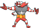
Cyber Lucario. The left one is supposed to be CL in combat mode.
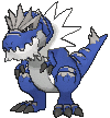
Lava Tyranitar. It's my personal style. I'm going to do other Lava pokes soon...
Mini Wailord! I tried to do a mini pokemon like Speed... Welp, it's not what I expected, but I still like how it came out.
Here are my Ow sprites...
These two aren't Malva and Drasna... They just look like them. I made for a friend on another forum.
Sorry for only posting a few sprites... Anyways, what do you think?
Results 1 to 5 of 5
Thread: Mr. Nyan Sprite/Pixel art Dump
-
04-05-2014, 11:37 PM #1Member of the blue crew

- Join Date
- Dec 2013
- Location
- Maybe mars
- Posts
- 188
Mr. Nyan Sprite/Pixel art Dump

Titles:
Member of the blue crew(although my fave color is green)
King of the Dots
<insert another title here>

-
04-06-2014, 11:54 PM #2your turn to roll
- Join Date
- Feb 2013
- Posts
- 13,469
Imma critique some of your sprites. :] They're pretty good to look at, but when I look closer, I see lots to improve on. :D
The cloud bouffalant is actually pretty cool. xD It's a neat idea, and it looks good for the most part. However, with the rainbow gradient, you've added quite a few greens and blues for a transition when it probably doesn't need that many; rather, it would need some dithering. As well as that, it looks odd transitioning on that angle, considering bouffalant hair is fluffy. If you did it so you could see more shape in the fluff, then it would look more like it has dimension, but right now you have it all flowing in one direction which makes it look flat. Some of your outlines are much too light and are too much of a contrast with the black outlines that it meets up with. Mostly on the wig, and also on the left front leg, especially because it's coloured darker, which naturally means that you should have darker outlines for that part.
The cyber lucario has a cool palette and is a good idea, but the shading makes it look totally flat. It seems like you haven't paid attention to any sort of light source, and the shading also looks too gradual, which makes it look like you've grabbed a patterned texture and then whacked outlines over the top of it. Mainly around the crotch area. The head especially looks flat. I look at how the original lucario head is shaded beside it and try to mimic that.
I like the lava tyranitar but I think it should have kept its black outlines. The fact that you've shortened the face and made it look like it's looking at us makes it look a little misshapen and creepy, especially because that mouth just does not work anymore. xD The shading also seems a little off; I would recommend sticking with the default shading to begin with and then editing it after you've recoloured and lava-fied it, then seeing if you need to change it. Also remember that putting light or dark shading on the edge of the shape to hug the outline always will make it look flat.
The mini wailord is good, but you need to do more editing on the fins and on the outlines. It also has a stretched eye. Grab a larger version of the sprite and put it beside it to compare, then try to replicate everything but in miniature form.
I like the overworld sprites, but the first one needs to have darker outlines on the hair because right now they pretty much blend with the darkest shade. The second one has non-symmetrical shading on her bow; for overworld sprites, the shading is always symmetrical, unless the two sides of the sprite are different of course. But in this case, the only difference is one pixel on the middle bow thing.I would recommend against keeping that other pixel so that it is symmetrical.
Hope this helps!
~SF.
-
04-07-2014, 04:50 PM #3Member of the blue crew
- Join Date
- Dec 2013
- Location
- Maybe mars
- Posts
- 188
Thanks for the critique. About the lava Tyranitar, I used the Pokesho sprite, and that's why the lack of black outlines... And the cyber pokemon has a special shading. It's not my own style, though. Thank you!
Titles:
Member of the blue crew(although my fave color is green)
King of the Dots
<insert another title here>
-
04-07-2014, 04:53 PM #4Hooligans, Represent!
- Join Date
- Jun 2013
- Posts
- 18,510
I like Lava Ttar..I cant give you much feedback on what is wrong because I'm not great with spriting. I can however say while I love the fire effect on the tail of ttar the fire seems a little out of place because it seems so real compared to the basic color with ttar's tail.
Proud partner with @Pokemon Trainer Sarah
Spoiler:
-
04-07-2014, 11:45 PM #5your turn to roll
- Join Date
- Feb 2013
- Posts
- 13,469
Ah yeah, the thing with Pokesho sprites is that they're not official. They're sprites that somebody has done, and they usually aren't completely accurate depictions. I would recommend against using them unless your goal is to fix them up. x) But yeah, good to experiment I suppose. No worries! :] Originally Posted by Mr. Nyan

~SF.


 Reply With Quote


Bookmarks