Page 1 of 10 123 ... LastLast
Results 1 to 10 of 93
  1. #1
    The Art Saboteur Coru's Avatar
    Join Date
    Dec 2013
    Location
    Lost in his trail of thoughts
    Posts
    648

    [WAR: Season II] Drawn Art

    Banner on it's way!
    DRAWN ART CONTEST

    Hello, and welcome the the
    second season of the PXR WAR, and welcome the the Drawn Art contest!
    Here, you will compete to get points to help your team thrive and gain victory at the end of these four weeks.
    Let's get on with the show.

    Rules:
    1: All PXR forum rules apply
    2: You may not enter after I post and say that entries are closed. Although entries should close on Friday, I will accept any on Saturday that are submitted before I post that entries are closed, but if any are after that, they will not be accepted
    3: If the form isn't used or completed properly, your entry will not be counted, so please make sure it is completed correctly [If this happens, I will notify you]
    4: You may ask questions in this thread but please don't have general discussion. It clutters up the thread and it will take me more time to find the entries.
    5: NO HATE on anyone's work. It is unfair on the person and hinders their improvement.
    6: All of this MUST be drawn. This means NO digital programs to enhance your work and the only digital work that may be done is if the work is done without any after effects and is worked on as if it was on a piece of paper. This is to make it fair for all the entrants.
    7: Have Fun!

    Judging Scheme:
    Each week, I will compare the entries to a Judging Scheme. In total, the scheme will have 4 categories and 40 points in total and the highest scoring in this scheme will win that week.
    Theme: /10
    Creativity: /10
    Artistic: [Experimentation: /5 | Accuracy: /5] /10
    Effort: /10

    Points system:
    Each week, there will be three winners. The winners will gain points for their respective teams.
    GOLD POSITION:
    1st- 3 points

    SILVER POSITION:
    2nd- 2 points

    BRONZE POSITION:
    3rd- 1 point

    THERE WILL BE NO THIRD PLACE IN WEEK 2 DUE TO POINT DISTRIBUTION BALANCING

    If there is ever a tie for these positions, I will have to comprimise, meaning that one week, the points system may change to compensate so the points are balanced out. You will be notified beforehand if this needs to happen.

    Now, we have got out of the way how the competition works, time to get on with the theme. It will change each week and you will need to match the theme and create a piece that showcases your skills that fits within the theme.

    Theme:
    WEEK 4: Pokemon Fusion Gijinka
    So for the Grand Finale, I want to finish with a challenging bang. And it is this. Pokemon Fusion Gijinka.
    There shall be two steps to this, and because it is challenging, I will say that starting as soon as possible will be best.

    STEP 1:
    Visit this website and randomly select some pokemon, two being the minimum and 3 being the maximum (Any higher would be too time consuming and would mean that you wouldn't have enough time to complete it.)
    If the pokemon really aren't your best, you can cycle through a few random cycles. Doing this 3 times at the most. You are then to draw a fusion pokemon from these two pokemon. This IS NOT the piece you will be judged on, so it does not need to be good, it can be a sketch. However, the better the drawing, the better it will be for you to use later on in the task. I want you to submit this fusion draft along with the final subission. It will not be marked, but it will help me judge your actual entry as it will give me an idea of what I am looking at. (So if it helps me understand and relate to the piece more, then you will get more marks, so it will indirectly help. Bare this in mind)

    STEP 2:
    Now using that draft you made, create a Gijinka from it. A Gijinka is a person who looks like the pokemon, much like a person cosplaying a pokemon. The main way that will show the relation to your pokemon fusion will be the clothes, so make sure these resemble the pokemon you created. You can do anything with this. They can be of any age and gender, any body type or ethnicity, as long as it suits your pokemon. Any way to relate it to your pokemon is allowed. Go crazy.

    Another thing.
    THEY MUST ALL BE DRAW ON PAPER. NO DIGITAL SOFTWARE AT ALL IS TO BE USED.


    Here are some examples of Gijinkas to help you for ideas:
    http://www.deviantart.com/browse/all/?q=Pokemon+Gijinka

    Have fun, you have 1 week. Entries will close on Saturday 4th July at midnight

    Form:
    Name:
    Team:
    Pokemon in fusion:
    Fusion draft:
    Gijinka:
    Extra Details:
    Last edited by Coru; 06-28-2015 at 11:14 PM.

    Feel free to check out my Instagram for design and art stuffs

  2. #2
    The Art Saboteur Coru's Avatar
    Join Date
    Dec 2013
    Location
    Lost in his trail of thoughts
    Posts
    648
    Fakemon:


    This week, to kick things off, I think we should start with Fakemon, but with a twist.
    You must create a Pokemon type. A type the does not currently exist in the pokemon universe. If it already exists in the fanbase, you can still use it and if you come up with it yourself, that is also usable. I wish for you to then take this type and create a fakemon that would be this type or either a dual type with this type as it's first typing. It can be any fakemon and may be an evolution/pre-evolution of an existing pokemon, however, not a form of an existing pokemon. So no Mega-evolutions or alternate forms, sorry.
    Furthermore, I would like for you to briefly explain the pokemon to me, either through an explanation or a pokedex entry. You will not be marked on this entry, however, it will significantly help you to convince me how it relates to your chosen type and therefore how it relates to the brief.

    Here are a few nice examples by MC-Studios on Deviant-Art
    Be sure to follow them if you like their work.

    Ok, so here are the results!
    All of the entries were great and showed that you all worked hard on them. Well Done everyone!
    Also, I apologise, Speed, that this theme wasn't one you were comfortable with. I like to try and balance the themes in the WAR so more people can join in, but that does mean that some people may opt out one week as it isn't their cup of tea. I wanted to start Week 1 with a really creative piece which looked interesting and fun to try and draw attention to the contest so people wouldnt think it was too simple or not interesting. I think that based on what you said though, this week's theme would be better for you. :)
    @Mad Max
    Spoiler:

    Theme: 9/10
    Creativity: 8/10
    Artistic: [Experimentation: 3/5 | Accuracy: 4/5] 7/10
    Effort: 7/10

    Total: 31/40
    Comments: I like this one plainly due to the way it works. It is simple yet very effective. If pokemon were to create a pokemon like this, many would rage due to the no inanimate objects thing but if I saw this, I wouldn't mind. It works and I can imagine this to be a pokemon. You completely understood the brief and stuck to it very well. Also, I have never seen a 'plastic' type before so that gives you creativity points. It is really interesting. The resistances are also logical. I know they weren't needed for this brief, but I appreciate the logical type matching. I feel that you could have done more with the background. This brief wasnt in need of a background, however, it would award a small amount of marks if done well. Although it fits your style well and does go with the piece, I feel to get those one or two extra marks, you could have done a little bit more with it, however, the main subject, the pokemon, gave you the majority of the marks. One thing I would say, and this is me being very picky, so it isn't a flaw at all, just a suggestion, I would try to stylize your outlines a bit more as they seem to get lost in the piece as they are so uniform in thickness and black. I would suggest, if you are to keep that style, maybe change up the colours slightly so they match the colour of the area. e.g. The red label could have a dark red outline. This would then make the outlines less harsh and would make them seem more part of the piece itself. That, however, was only me being picky. As a piece of art itself it stands well. Great Job!

    @JamestheTyphlosion
    Spoiler:

    Theme: 5/10
    Creativity: 8/10
    Artistic: [Experimentation: 3/5 | Accuracy: 3/5] 6/10
    Effort: 7/10

    Total: 26/40
    Comments: Now, this is good, but you lost quite a few marks when you didn't follow a certain part of the brief. You gave it a Fire/Dark typing, when the brief asked for a new pokemon typing. This could have done well if not for that one little mistake, but as a piece in itself regardless of the brief it is good. You can imagine it being part of the Zorua/Zoroark line and it works. The colour scheme is good and I like the style. The shading is good too. However, I feel that the right leg looks rather flat. It doesn't seem to have any shading on it at all. This makes it look a little flat. You could have done with adding a small shadow on the leftmost part of the leg and could have tried to add a shadow that the left arm may cast on the leg. However, everywhere else, the shading is good. None of the colours are too harsh and looks like a genuine pokemon. One final thing I have to comment on is the fire. I feel that although the way you did it was good, it didn't really fit the style of this piece. This piece seems to emphasise and include the outlines and as the flames are absent of these outlines, it looks out of place. So if you were to add and outline and then colour in the fire in a similar manner to what you originally did, I feel it would look better. Good Job. :)

    @Nekomata
    Spoiler:

    Theme: 9/10
    Creativity: 9/10
    Artistic: [Experimentation: 4/5 | Accuracy: 3/5] 7/10
    Effort: 8/10

    Total: 33/40
    Comments: I like this a lot due to the glowy effects of it. It really suits the fact that it is meant to be a light/dark type. That itself is something that I like too. Two contrasting types, those are my favourite pokemon typings. That is why I am so excited for Volcanion. Anyway. It suits the theme really well and it is really creative with the typing and the glowy effects will certainly award you more points for that. You also put a lot of effort into this. It must have been hell just to do all of those stars let alone the pokemon itself. The one issue I have with this is the pose. Due to the colour being very similar to the background, the pose doesn't really help distinguish the true shape of the fakemon. At first glance, it may look like it has one wing, but when inspecting it, you can see that the front wing covers almost half of the body due to the pose. I feel that if the wing was drawn at a slightly different angle to the body, it would have been a little more obvious of the shape and anatomy of the pokemon. However, this certainly doesn't take much away from the piece, it just takes a little longer to take everything from the piece. I like this a lot and I really appreciate the amount of effort that really went into this. Well Done!

    @lorii
    Spoiler:

    Theme: 9/10
    Creativity: 7/10
    Artistic: [Experimentation: 3/5 | Accuracy: 4/5] 7/10
    Effort: 9/10

    Total: 32/40
    Comments: This is an interesting piece. The fact that you gave 3 extra positions of the pokemon will give you extra effort marks. I also like the typing. It seems to be a new take on the 'space' typing but very different at the same time. I also like how it seems futuristic. The shading fits with the type it is and how it is robotic. The shading portrays the blockiness and sharpness of the angles and edges that this pokemon has. Which is good. I also like the way it has it's own light sources. Although it makes the shading a little awkward, it seems to work. The only issue I have with this is the arm-like extensions on the bottom that attack the the bottom orb. They look ok, but look quite flat and it isn't clear what exactly they do. It looks a little like they go behind the orb, but it also looks like it attaches to the sides of the orb. I feel a little bit more shading on this would make it a little more clear. Good Work! :)

    @Suicune's Fire
    Spoiler:

    Theme: 9/10
    Creativity: 7/10
    Artistic: [Experimentation: 4/5 | Accuracy: 3/5] 7/10
    Effort: 7/10
    Total: 30/40
    Comments: I like this for the simplicity it has. It is effective. It symbolizes they backstory very well and I can se this as a genuine pokemon. I also like how it doesn't resemble a different type at all so it is like a stand alone of it's own type. I also think the style is very pokemon-like and suits the piece a lot. The fact it doesnt have a background makes it refreshing as the design of the pokemon is not lost completely and stands out more. The one issue I have with this is the shading. Some areas do not need it and look good without it and I think the paterns it has adds depth the the piece, but some areas are hard to distinguish whether they are in the background or foreground. The main things that suffere from this are the arms. However, they are very thin so I know it could be an issue to try and portray it better. It isn't a major issue though because after a while, you can tell what it is intended to be like. The only other thing I think needs a tiny bit of improvement is the horn-like extension on the head. I don't exactly know if it is meant to be shaped like an L with it pointing forward or not, so if that is made a little clearer, it would improve it a bit. However, I like the piece. Well done!

    @MoogleSam
    Spoiler:

    Theme: 9/10
    Creativity: 6/10
    Artistic: [Experimentation: 3/5 | Accuracy: 3/5] 6/10
    Effort: 7/10
    Total: 28/40
    Comments:This is a good idea with some well thought through plans. I also like the different forms. I like those types of pokemon as it makes them a little more desirable due to there being different versions. Such as Spinda and the Flabébé line. Also, the way you drew it is quite good. The folds seem natural due to how you drew it and I like the colours. However, I have a few issues. The shading isn't the best. I feel like some areas are shading a bit incorrectly. The left and right legs seem to both be shaded as if there was a light source pointing from the outside area of it. Meaning that the shading implies that there are two light sources, which isn't true if you take into account your other shading. I know the paper folds differently, but the shadows would still be in one consistant direction, unless the folds themselves are creating shadows of their own. So I suggest have three tones if you wish to keep it simple. The original tone, the highlight and shadow. Then take into account where the light source is, and then shade it making sure that the highlights always fall upon the areas closest to and facing the light source. One last thing, you could have made the paint go in different directions when the paper folds to make it look more natural, but this is minor. Overall, good job.

    @Lady Darkrina
    Spoiler:

    Theme: 9/10
    Creativity: 7/10
    Artistic: [Experimentation: 4/5 | Accuracy: 2/5] 6/10
    Effort: 7/10
    Total: 29/40
    Comments: This is quite refreshing to have a hand drawn piece amongst all of the digitally drawn ones. It's nice. I also like the idea. I love Dragon types so I like it haha. I also like the idea of there being an 'Undead' type. I can see a few being this type (even though all not undead themselves of course) Such as Cubone and marowak, Banette etc. The drawing itself is also good as the anatomy looks mostly correct. Overall it is a good design. It has a few small flaws though. The one main flaw is the colouring. I feel like it is quite colourless and there is little shading in places. Although the colourlessness is completely intended as it is bone, I feel that a more creamish colour would have been better so you could give it white highlights. I also think because of it being a white paper, it makes it seem a little bit flat in areas and making it hard to distinguish some features. All of this would be sorted with a slight change in colour and maybe a few touch ups on the shading to add some shadows in a few areas and highlights in others. Other than that. Well Done. Good work!

    @Velocity
    Spoiler:

    Theme: 9/10
    Creativity: 9/10
    Artistic: [Experimentation: 4/5 | Accuracy: 4/5] 8/10
    Effort: 9/10
    Total: 35/40
    Comments: I wondered if you would enter this year after winning twice last year, haha. You didn't disappoint.
    Your style fits very well with the design. The background is also fully incorporated creating an overall great piece. I also like how you have an evolutionary line. Although it gives little merit as I asked for one, it would give you maybe an extra point. I also like how your type seems to be in the pokemon but also in the atmosphere of the piece itself. Shading is accurate, anatomy is good and there is little I can fault with this to be honest, which I don't like as I like to give constructive criticism for everyone haha. Good Work!

    @Morzone
    Spoiler:

    Theme: 9/10
    Creativity: 7/10
    Artistic: [Experimentation: 3/5 | Accuracy: 3/5] 6/10
    Effort: 7/10
    Total: 29/40
    Comments: Another hand drawn piece. I like it. Many seem to submit digital pieces as if they think that they are of higher quality or are more comfortable with it, so it is always nice to see hand drawn ones. This is an interesting piece. I like how it is a 'silk' type. It is something outside the box. I like it. I can also see it as a pokemon. It has that cuteness most pokemon do but looks cool as well. I also like the entry you did. It is quite interesting and a very unique idea. However, I feel the main thing that let this down is the shading, moreso the lack of. This lack of shading leaves the pokemon to look a little flat and it then lowers the quality of it. I feel if you had maybe added a bit of shading to the white ghost like areas, then it would have looked much better and would have scored higher. However, I do like how you have made the ribbon silvery-gold (That's what I get from the picture anyway) Apart from that one issue, it is good. Well done. :)

    @PTGigi
    Spoiler:

    Theme: 9/10
    Creativity: 9/10
    Artistic: [Experimentation: 4/5 | Accuracy: 4/5] 8/10
    Effort: 8/10
    Total: 34/40
    Comments: I like this one. The vibrant colours suit the fakemon and I like the background too. However, it doesn't really go with the style of the fakemon, which is a little bit of a negative. However, the two styles are good in themselves and both work nicely, maybe just a bit of refinement to brng the together would help. I think the fakemon is well designed and I like the style. I also like the idea of all fossil pokemon getting their own type. It would work really well and would stop them from being stuck with a part rock typing. I like the way you did the fakemon and how it looks quite eyecatching. It really makes me want to have that fakemon on my team right away. One thing I would say that could improve it could be the shading in some parts. You have used shading well in some areas, such as the back arm and leg, however, on the side of the fakemon that we see, there is hardly any shading so looks quite flat. If you were to add some shading in some areas, it could give the fakemon more character by adding a bit more texture to it. However, this is not a completely major thing as it looks good without it, just a suggestion to enhance the look of the fakemon. Good Job!

    @The Frost Dragon
    Spoiler:

    Theme: 9/10
    Creativity: 9/10
    Artistic: [Experimentation: 4/5 | Accuracy: 4/5] 8/10
    Effort: 7/10
    Total: 33/40
    Comments: This one cracks me up. haha. It is genius. Pure genius. I never expected a piece like this and it wasn't what I was originally looking for, but it is all interpretation. You stuck to the brief and you decided to go to a sort of comedical approach. I love that and it will definitely give you quite a lot of creativity points for that. I also like the style. Very simple but it works. The fakemon design itself is actually quite good regardless of what it was intended to be and the shading is correct and the background helps add some prospective to the piece. One thing I would say, and this is me being picky, is that I don't like the way the flames have been done. I mentioned a similar point for JamesTheTyphlosion's piece. The fire does not fit with the style of the piece. Although the fire is done well, it doesn't suit the rest of the piece and that is why it looks a little weird to me. I feel if you change the fire to match your style more, it would be a big improvement to the piece. By matching the style, I mean giving it an outline and shading it in a similar fashion to the fakemon where it is blocked shading rather than gradients. or smudges colours to create a fire type pattern. Overall, love your take on this. Good Job!


    So that means:
    RESULTS:

    Gold:
    Spoiler:
    Team The Phoenix Battalion
    Velocity
    35 POINTS
    Gains 3 points


    Silver:
    Spoiler:
    Team The Prism League
    PTGigi
    34 POINTS
    Gains 2 points


    Bronze:
    Spoiler:
    Team The Prism League
    Nekomata
    33 POINTS
    Gains 1 point

    Team Trainer
    THE FROST DRAGON
    33 POINTS
    Gains 1 point

    This, of course, means that next week, to balance out the points system, sadly, we will not have a 3rd place winning. This is to keep the points system balanced and fair.
    If there are any draws of any kind, there will be some form of compromise in the points system sadly.

    Last edited by Coru; 06-15-2015 at 11:04 PM.

    Feel free to check out my Instagram for design and art stuffs

  3. #3
    The Art Saboteur Coru's Avatar
    Join Date
    Dec 2013
    Location
    Lost in his trail of thoughts
    Posts
    648
    Theme:
    WEEK 2:
    Favourite Animal:
    So, this theme is very different from last weeks. I request for you to get inspiration and draw your favourite animal. It could be just of the animal itself (no background), of an animal in a home place (like a pet) or an animal in it's natural environment, however, this theme will give a nice amount for a background that suits the piece, but to make it fair, it won't be enough to put those without backgrounds to a considerable disadvantage. Go wild. Do what you want to make it different and original. Remember, although this is quite a broad topic, I still want for you to be creative and think outside the box in this, that way you can grab some valuable creativity points!
    Any animal is ok and go crazy with it and I will say this. It can be as realistic or unrealistic as you wish. Just as long as it looks like the original animal.
    Have fun!
    Also, if you want, you could also put in why it is your favourite animal and I will add that to the form. If you don't want to, you don't need to, just remove it from the form. It is just there if you want to interest me with some reading and discussion on here. haha

    Form:
    Name:
    Animal:
    Why is it your favourite?
    Entry:
    WAR Team:
    Extra Details:

    Here are two sets of examples. Browse through the art if you wish to get inspiration
    Traditional Art examples
    Digital Art examples

    You have until Saturday 20th June. You may start!
    @
    Morzone
    Spoiler:

    Theme: 10/10
    Creativity: 7/10
    Artistic: [Experimentation: 3/5 | Accuracy: 3/5] 6/10
    Effort: 9/10
    Total: 32/40
    Comments: I like this, I mostly like how you have done it where there is a waterfall at the corner of the page. Nice touch, I looks good and it works. You have clearly shown you favourite animal and I can see the effort you put into this. You also got the scenery quite accurate in terms of where the tortoise would live. However, there are a few things with this. Although a good piece, I feel that the lack of colour means that some of the piece is lost. Even if it is just a little bit of colour, I think this piece would benefit as it would bring a bit more life to the piece and add a bit more depth. Also, the horizon is completely flat. If this was land, it would not be like this, there would be some form of shrubbery or foliage making the horizon less straight. In terms of a drawn piece, well done. This is good.
    @
    Felly
    Spoiler:

    Theme: 10/10
    Creativity: 8/10
    Artistic: [Experimentation: 3/5 | Accuracy: 2/5] 5/10
    Effort: 8/10
    Total:31/40
    Comments: This piece is a nice starting point. It has nice colours, a good concept and is quite a charming piece. Although some bits are very flat, it seems to create a type of style that can be appreciated in itself. There are only two major issues I have with this, and those are the flatness of everything compared to the room, and the way the room is made 3D. I feel that the two prospectives clash here, if you made it all 3D, it would look better or if you made it all 2D. What I mean here, is that the room is intended to be 3D so it has the boxy room feel to it, but the table and drawers are really flat. These clash and make it seem a bit weird. The way you did the room also makes the room seem a little too long. It seems to extend quite a bit. Overall, if those were worked on it would be a nice piece. Well done and even if you feel you have no artistic ability, there is a starting point for everyone and it all is improve on from there.


    @
    Pokemon Trainer Sarah
    Spoiler:

    Theme: 10/10
    Creativity: 8/10
    Artistic: [Experimentation: 4/5] [Accuracy: 4/5] 8/10
    Effort: 8/10
    Total: 34/40
    Comments: I'm a reptile lover too! They are amazing! haha. But onto the piece, I like the way you made it a birds-eye-view of the hatching of the turtle. It is quite different from the others for that. I also like how it is at the start of the life cycle of the turtle as it seems to be interesting to you, and I agree it is brutal. I like how you have done the sand too. A few things to improve on would mainly be adding a few of the egg fragments, as the hole seems to have no fragments scattered around it and also maybe add a little bit of texure to the sand itself. However all of this is just to add to the overall look of the piece, so it is small but will benifit a lot. Great piece. Well done. :)
    @
    Velocity
    Spoiler:

    Theme: 10/10
    Creativity: 9/10
    Artistic: [Experimentation: 4/5 | Accuracy: 5/5] 9/10
    Effort: 8/10
    Total: 36/40
    Comments: Where do I start with this, haha. I really like how you seemed to research this so you have the anatomy correct in terms of what we have found out. That would give you a lot of accuracy points there. Also, I like how you have layed with the two different looks. It doesn't look inconsistent, as it, in my eyes, demonstrates differentiation within a species. The one issue I have with this is the light sources. It seems to me that there is two. The normal source which would be the sun that you can see on the tree's foliage in the background which is coming from the left, but there is a second, more bluish light source coming from the right reflecting off the tree trunk. This is the only thing that bugs me a little with this. Other than that. Good work there.
    @
    a3person
    Spoiler:

    Theme: 10/10
    Creativity: 8/10
    Artistic: [Experimentation: 4/5 | Accuracy: 3/5] 7/10
    Effort: 8/10
    Total: 33/40
    Comments: I like this as it has more of a painted approach due to the lack of lines. I also like how it seems to be flying away from some sort of fire or explosion. The anatomy looks ok as some things don't look out of proportion but that tongue looks rather large, however, this may have been the intention. I like how you did the wings too, theywork well. A few little problems I have with this is the fact that some things look a little off. For example, the horns looks less rounded and more flat but this could just be the shading on it. Also, they seem to get fatter up the horn which usually isn't the case, they usually get thinner, again this could be due to the style, but it makes it look a little strange. Also, some parts of the background could be touched up a little, the main part being the stone. The way you did it makes it seem to melt into the redish rock. Overall, I like this piece. well done.
    @
    purple umbreon
    Spoiler:

    Theme: 10/10
    Creativity: 8/10
    Artistic: [Experimentation: 3/5 | Accuracy: 3/5] 6/10
    Effort: 8/10
    Total: 32/40
    Comments: I like the idea of this, although slightly grim and depressing, it symbolises the harshness of nature sometimes, which is a nice idea. Also, the anatomy looks good and the cubs look really cute, haha. Also, the rocks look good and don't look awkwardly placed. One main issue I have with this is the fact that there is a lot of white space, just like Morzone had. I feel like more could be done with this, even if it is just adding some grass or ground of some sort. Then it would just make it a bit more creative and less blank. However, without this, it is still a great piece. Well done.
    @
    PTGigi
    Spoiler:

    Theme: 10/10
    Creativity: 9/10
    Artistic: [Experimentation: 4/5 | Accuracy: 4/5] 8/10
    Effort: 8/10
    Mark demotions: Glows: -2 Points
    Total: 33/40
    Comments: I like this piece. I has a lot of atmosphere and I really like the colours you have going on here. It is a really atmospheric piece. The anatomy is good, the antlers look great and I like how you have used purple as a shadow for the white hair as it suits the piece a a whole. The main issue I have with this is that the water (I assume it is water) seems to actively blend in with the sky and you do not know which is which. This is a little confusing. Also, I have had to demote a few marks because of the use of glows. I usually would let this go because I know glows can be done authentically, but they look a bit too perfect. I apologise but it does say that effects and edits may not be used.
    @
    The Frost Dragon
    Spoiler:

    Theme: 10/10
    Creativity: 7/10
    Artistic: [Experimentation: 3/5 | Accuracy: 3/5] 6/10
    Effort: 8/10
    Total: 31/40
    Comments: This is a nice piece. The emotion in the otter makes it quite sad. There are no huge issues with the anatomy and I like how you have gone for an underwater city idea. The only issue I have is that this is not clearly shown. When I first saw it and if I did not read your little description, I would have thought they were at a window of a normal skyscraper. So I feel if you add a few bubbles or watery features to show it is an underwater city then that would make it much better. Also, I feel because it is underwater, to clearly show this, you could add a bit more to it rather than just have skyscrapers, so maybe just little shoals of fish swimming around. It doesn't have to be that but something like that if it makes sense. Well Done.
    @
    Sou Cleife
    Spoiler:

    Theme: 10/10
    Creativity: 8/10
    Artistic: [Experimentation: 3/5 | Accuracy: 4/5] 7/40
    Effort: 8/40
    Total: 33/40
    Comments: Why does this cat look so myschievous? haha. I like the whole environment of this, it suits the type of cat it is, making the cat look posh and sassy, which is quite funny and interesting here. I also like how you did the cat itself. The whole style is very well done and I think the best part is definitely the head. The one thing with this that needs to be sorted is the tiles on the floor. They look like perfect squares. This would only be the case if you are looking at it from a birds-eye-view. This means that it makes it look like he cat isn't actually standing on it, so you would need to angle the tiles a little bit to make it look a bit more accurate and look better. Also, with the light source, the shadow the cat would be casting would extend a bit more to the left and I feel bits of the shadow are lost so that is the only other thing that needs to be fixed by making it darker and extending it a bit to the left. Other than that, well done.
    @
    Elysia
    Spoiler:

    Theme: 10/10
    Creativity: 8/10
    Artistic: [Experimentation: 4/5][Accuracy:4/5] 8/10
    Effort: 9/10
    Point Demotions: Late Entry: -5 points
    Total: 30/40
    Comments: Theres one thing here that I will mention first off. You were late submitting this piece by a few hours. I will not discount it as you still entered and it wasn't rediculously late, however, I will take 5 points off your final score because of this. So, I personally like this one. I feel like the sky would take ages to complete because of the amount of stars you put onto it and how it looks so delicate. That will give you effort marks. Also, I feel the owl was drawn well. I like the colours and they all work well together. One thing I will mention is the legs that are seen. I know we can't see all of the legs, however, the parts we can see look slightly awkward. Other than that, well done.


    Winners

    3rd Place


    Spoiler:
    a3person, PTGigi, Sou Cliefe
    Team Juniper Minin Corp, Team Prism League, Team Trainer
    33 Points
    0.5 Points each

    2nd Place
    Spoiler:
    Pokemon Trainer Sarah
    Team Trainer
    34 Points
    2 Points


    1st Place


    Spoiler:
    Velocity
    Team
    36 Points
    Gains 2.5 Points
    Last edited by Coru; 06-28-2015 at 10:59 PM.

    Feel free to check out my Instagram for design and art stuffs

  4. #4
    The Art Saboteur Coru's Avatar
    Join Date
    Dec 2013
    Location
    Lost in his trail of thoughts
    Posts
    648
    Week 3:
    Legends and Myths
    For this theme, you can draw anything related to a legend or myth. It can be local, well known or something you have heard spread around. It could be based off a creature, an area, a person. It can be real or unreal.
    I feel that this is a good theme as it is HUGE. It can be based around supernatural ideas, animalistic, area based and more, leaving it accessible to many people as something will appear that is their strong point.
    It will also allow people to get their creativity flowing because it is a very creative exercise as it would need people to take in details fro a myth and create a piece based on their own interpretation
    However, I must ask for a small summary of the myth/legend to prove it relates to the theme and if not a summary, a link to something about it.

    Some ideas could be:
    -Cthulhu
    -Ghosts
    -Haunted House
    -Angels/Devil
    -Cupid
    -Mythical Forest
    -Atlantis


    Have fun. You have until Saturday 27th. Go all for it.

    Form
    Name:
    Team:
    Myth/Legend:
    Summary/Link:
    Piece of work:
    Extra:

    Week 3 results
    @
    Noblejanobii
    Spoiler:
    Theme: 10/10
    Creativity: 5/10
    Artistic: [Experimentation: 2/10] [Accuracy:3/5] 5/10
    Effort: 6/10
    Total: 26/40
    Comments: I like the backstory to this. It is quite interesting and sounds quite tragic at the same time. I also like the idea of a gravestone to her, especially since it is in your garden. I, however, feel like a little more could be done with this. I feel like it would have been nice if you drew maybe your garden around the area where her tombstone was and include the tombstone. That would be a little more creative and eyecatching than the epitaph that you did. I like it, but I feel much more could have been done with this idea.

    @
    Morzone
    Spoiler:
    Theme: 10/10
    Creativity: 7/10
    Artistic: [Experimentation: 3/10] [Accuracy:3/5] 6/10
    Effort: 7/10
    Total: 30/40
    Comments: I was wondering if this would pop up, haha. I feel the pyramid and All seeing eye sum up the Illuminati well. All that is missing is some conspiracy haha. But I like it. The people could do with improvement but are a really good start as the size anatomy seem reasonably ok, it is just the shapes and the way everything flows that needs a bit of an improvement. Other than the people, there is nothing wrong with this piece, but I would have liked to see some colour in this. I think colour would bring in a bit more to life and make it more eye catching, but overall, good piece, keep up the good work.
    @
    Velocity
    Spoiler:
    Theme: 10/10
    Creativity: 9/10
    Artistic: [Experimentation: 4/5][Accuracy: 4/5] 8/10
    Effort: 8/10
    Total: 36/40
    Comments: Is that a gradient I see in the background? To me, it looks authenticly done, however, be careful with those as they may be mistaken for editing. Anyway, this is a good piece. A nice take on the Sphinx. The Spinx character kind of reminds me of that wise character in stories with their white hair in parts and that type of face. I also like it's surrounding, they fit well and the whole colour scheme of the piece is consistant and nice. One thing I would say is the background seems a bit more rushed compared to the foreground, which looks a little weird, however, I know that people use that to focus on the main areas in the foreground, so it is not much of an issue. Well done, great work as usual.
    @
    Sou Cleife
    Spoiler:
    Theme: 10/10
    Creativity: 8/10
    Artistic: [Experimentation: 3/5][Accuracy:4/5]: 7/10
    Effort: 8/10
    Total: 33/40
    Comments: Pandora's box. I like that story too, I also like how it has taken on many forms throughout the time it was told. This is a nice piece. I especially like how the ghosts have the deadly sins written on them. Nice touch. I also like how you drew Pandora. The anatomy is ok and shading is well done. However, the left ear looks much bigger than the right and the prospective means they should roughly be the same size. I sometimes have this issue and find that drawing them one after another and using guidelines help with this issue. I also like how the background is done, however, the way they are shaded isn't consistant, unless the light source is intended to be from the centre of the room. One other thing is the words in the ghosts are really hard to make out, so it would be better if the ghosts were made a little bit more opaque so there is more contrast, or the word written in another way. Overall, good piece, well done.
    @
    Arrow-Jolteon
    Spoiler:
    Theme: 10/10
    Creativity: 9/10
    Artistic: [Experimentation: 4/10][Acuracy:4/5] 8/10
    Effort: 8/10
    Total: 35/40
    Comments: I don't think this piece is awful at all. I think it is done quite well. The colours look consistant, however, I'm not too sure about the lime green on the crest but it still works nevertheless. The shading is good and I like the anatomy because it is how I would also imagine the Loch Ness Monster to look. The eye is also a nice touch. I also like the water, using the spray brush works, it gives it some nice texture, however, it doesn't really work with the style of Nessy. If it is cleaned up a little then the water would look great along with Nessy. Good Piece. Well done.
    @
    Shruikan
    Spoiler:
    Theme: 9/10
    Creativity: 8/10
    Artistic: [Experimentation: 3/5][Accuracy] 3/5] 6/10
    Effort: 8/10
    Total: 31/40
    Comments: This is quite different. I didn't intend for the theme to really involve pokemon, but It seems to fit, so good work, haha. It is an interesting story and clearly is shown by the image as you can see the love potion at work. Also, it is quite a cute piece. I like it. However, there are a few little improvements that could be made. The main would be the dimensions of the work. Some of it seems too flat and with shading it still looks a little strange. The main example here being the table. If you added a rim going around, it would look less flat and would make it a bit better. Also, I feel that if the planks of wood were angled, it would make it look more like a flat surface. To me, the planks seem to make the floor look strange so if they were angled, I feel it would make it look better and make the pokemon look more like they are truly standing on it. Good work.
    @
    purple umbreon
    Spoiler:
    Theme: 10/10
    Creativity: 7/10
    Artistic: [Experimentation: 3/5][Accuracy: 2/5] 5/10
    Effort: 7/10
    Total: 29/40
    Comments: I like the story of this piece. Seems quite spooky and interesting. Your buck is also decently drawn. However, I feel like adding colour would benifit this piece massively. To me, it seems quite plain and bland without the colour. It also lacks some of that spooky atmosphere, so I feel if you added colour, the piece would be great. The buckdriver is also not too bad. Thr anatomy from what I can see seems ok, but the face, unless it is meant to be empty, seems too smooth. If this had colour, it would help this piece a lot. well done.
    @
    Elysia
    Spoiler:
    Theme: 9/10
    Creativity: 8/10
    Artistic: [Experimentation: 4/5][Accuracy: 4/5] 8/10
    Effort: 8/10
    Total: 33/40
    Comments: A name that I recognise. Princess Mononoke is a great film. Quite long though. Not the sort of interpretation I intended, however, it is as valid as the others as it did use the word 'Legend' which can refer to a person. I like your take on Princess Mononoke. She still has that wild feel to her that I felt she had in the film. I again see that starry background that you used to some extent in your previous piece. I like it. The one feature that really stands out on this is the mask which I really like. It looks great. Something I think that needs inprovement is the mane. It gets a bit lost and looks a little like cloud or mist rather than fur due to the smooth shading and almost smooth edges. I feel if you make the shading a little messier and scruffier, it would look more like hair. That is the one thing that needs improvement in this. Good work.
    @
    monkeybard
    Spoiler:
    Theme: 10/10
    Creativity: 9/10
    Artistic: [Experimentation: 4/5][Accuracy] 4/5] 8/10
    Effort: 9/10
    Total: 36/40
    Comments: I really really like this piece. I like how you have also gone for this myth and have tried to illustrate the transformation, the whole transformation must have been hard to imagine let alone draw. I like the way you drew the Koi dragon. The golden scales look great and I like the shading. I also like how you drew the waterfall and how mist shrouds the dragon as if it is mist-ifying (Sorry, I just had to do that) I will just say that compared to the koi, the waterfall looks a little simple and like less effort was put into it, however, like I said with Velocity's piece, I understand that Artists do this to emphasise the piece in the centre of attention, so I like it. Well done.


    Winners


    3rd Place


    Spoiler:
    Sou Cleife, Elysia
    Team 'Trainer' and Team 'Yoga Bears'

    33 points
    0.5 points each


    2nd Place


    Spoiler:

    Arrow-Jolteon
    Team 'Juniper Mining Corp'
    35 Points
    1 Point


    1st Place


    Spoiler:

    Velocity and monkeybard
    Team 'The Phoenix Battalion' and Team 'Juniper Mining Corp'
    36 Points
    2 Points each


    Well done everyone! What a great week.
    Last edited by Coru; 06-28-2015 at 11:07 PM.

    Feel free to check out my Instagram for design and art stuffs

  5. #5
    The Art Saboteur Coru's Avatar
    Join Date
    Dec 2013
    Location
    Lost in his trail of thoughts
    Posts
    648
    WEEK 4: Pokemon Fusion Gijinka
    So for the Grand Finale, I want to finish with a challenging bang. And it is this. Pokemon Fusion Gijinka.
    There shall be two steps to this, and because it is challenging, I will say that starting as soon as possible will be best.

    STEP 1:
    Visit this website and randomly select some pokemon, two being the minimum and 3 being the maximum (Any higher would be too time consuming and would mean that you wouldn't have enough time to complete it.)
    If the pokemon really aren't your best, you can cycle through a few random cycles. Doing this 3 times at the most. You are then to draw a fusion pokemon from these two pokemon. This IS NOT the piece you will be judged on, so it does not need to be good, it can be a sketch. However, the better the drawing, the better it will be for you to use later on in the task. I want you to submit this fusion draft along with the final subission. It will not be marked, but it will help me judge your actual entry as it will give me an idea of what I am looking at. (So if it helps me understand and relate to the piece more, then you will get more marks, so it will indirectly help. Bare this in mind)

    STEP 2:
    Now using that draft you made, create a Gijinka from it. A Gijinka is a person who looks like the pokemon, much like a person cosplaying a pokemon. The main way that will show the relation to your pokemon fusion will be the clothes, so make sure these resemble the pokemon you created. You can do anything with this. They can be of any age and gender, any body type or ethnicity, as long as it suits your pokemon. Any way to relate it to your pokemon is allowed. Go crazy.

    Another thing.
    THEY MUST ALL BE DRAW ON PAPER. NO DIGITAL SOFTWARE AT ALL IS TO BE USED.


    Here are some examples of Gijinkas to help you for ideas:
    http://www.deviantart.com/browse/all/?q=Pokemon+Gijinka

    Have fun, you have 1 week. Entries will close on Saturday 4th July at midnight

    Form:
    Name:
    Team:
    Pokemon in fusion:
    Fusion draft:
    Gijinka:
    Extra Details:
    Last edited by Coru; 06-28-2015 at 11:15 PM.

    Feel free to check out my Instagram for design and art stuffs

  6. #6
    Name: Mad Max
    Fakemon Type: Plastic/Water
    Description: Dottle is a Plastic/Water type. Dottle is 3'11 and Weighs 74 Pounds. Known as the Dolphin Pokemon. Dottle are very smart and very playful.
    Pokedex Entry
    "Dottle lives close to the shores moving in groups of five or six. The Dottle are extremely resourceful using their air bubble attack to trap groups of Warphish in confined area so they can hunt easier."
    Entry:
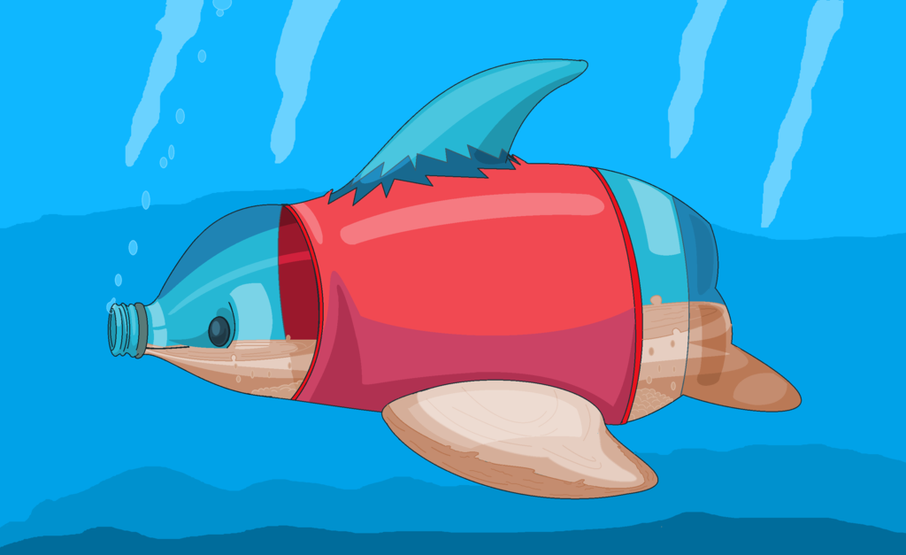
    WAR Team: Team Trainer
    Extra Details: Plastic Typing Chart

    Plastic Types are strong against
    Water and Flying Types

    and Weak against
    Fire and Ice Types.

    They are resistant to
    Poison
    Grass
    Ground
    Bug


    Additionally The following types are resistant to Plastic
    Electric and Steel


    Proud partner with @Pokemon Trainer Sarah

    Spoiler:

    Gible bite's Comic


    GCEA Trainer Links based on title characters

    ....GCEA Diamond/Platnium/ Blizard Blue/Platnium 2/ Pokemon Prism.......


  7. This post has been liked by:


  8. #7
    Name: Zerkonra

    Fakemon Type: Dark/Fire type

    Description: Height - 6'3.5 Weight - 201.6 lb
    Pack leader pokemon
    Known for taking command and never backing down. It is known to never have fear

    Pokedex entry: "Zerkonra is known to every zoroark and zorua as the pack leader within any territory and will fight to protect its pack at all costs, even if it means banishing a pack member. The symbols on its claws and eyes resemble his title and his connection with fire types. Zerkonra is a rare type to find since very few have evolved into this form."

    Entry:


    WAR Team: The Prism League
    Attached Images Attached Images
    JamestheTyphlosion
    Author of:


  9. This post has been liked by:


  10. #8
    Here's my entry: Lumebus. Light/Dark type.


    Lumebus is an elusive Pokemon that comes out on starry nights. It's bright wings help guide lost Pokemon through the dark and can be used to blind any Pokemon that try to attack it. It gets it's energy by sun-bathing in high places.

    Also, I chose the light type since it relates to prisms. TEAM SPIRIT. -shot-

    Weak to: Dark, Steel, Psychic
    Resists: Ghost, Faerie, Electric

    Strong Against: Dark, Ghost, Electric
    Resisted By: Grass, Fire, Ice, Ground, Steel

    Edit: Form version

    Name: Lemebus
    Fakemon Type: Light/Dark
    Description: Lumebus is an elusive Pokemon that comes out on starry nights. It's bright wings help guide lost Pokemon through the dark and can be used to blind any Pokemon that try to attack it. It gets it's energy by sun-bathing in high places.
    Entry: http://orig12.deviantart.net/57b2/f/...to-d8wplg2.png
    WAR Team: The Prism League
    Extra Details:
    Weak to: Dark, Steel, Psychic
    Resists: Ghost, Faerie, Electric

    Strong Against: Dark, Ghost, Electric
    Resisted By: Grass, Fire, Ice, Ground, Steel
    Last edited by Nekomata; 06-12-2015 at 01:28 AM.

  11. This post has been liked by:


  12. #9

    Name: Diovbot
    Type: Void / Steel
    Description: Height: 1'3", Weight: 33 lb
    Pokedex Entry: The dimension drone Pokemon. It wanders through galaxies, restoring the fabric of space. The orb it holds is rumored to contain the energy of extinguished stars.
    WAR Team: The Prism League
    Extra Info:
    Void Type Effectiveness:
    Strong against: Dark, Fighting
    Weak against: Psychic, Dragon
    Resists: Electric, Grass, Ground
    Immunity: Poison
    Last edited by lorii; 06-11-2015 at 05:09 PM. Reason: form

  13. This post has been liked by:


  14. #10
    Entry:


    Name: Binode
    Fakemon Type: Data
    Description:
    The first binode was created when hackers somehow magically managed to create a real-life pokemon using code. This pokemon is naturally docile, but can be controlled with code. In battling simulators, they can be all-powerful or completely weak (depending on how they're coded) but in the material world, their powers are drastically weakened.

    WAR Team: Jupiter Mining Corporation
    Extra Details: The Data type is weak to steel, electric and fire, and strong against fairy, psychic, and data. Ice, electric and steel types resist them.


    @Corrupt_Voidlich Do we gain/lose points based on backgrounds?
    Last edited by Suicune's Fire; 06-11-2015 at 10:06 PM.

  15. This post has been liked by:


Bookmarks

Posting Permissions

  • You may not post new threads
  • You may not post replies
  • You may not post attachments
  • You may not edit your posts
  •