

I'm with Sam. xD You know, you can always post progress updates for your comic here, too! I'm sure we'd all like to see the hard work you put into it. :D
Results 31 to 40 of 288
Thread: Neko's Failtastic Art Thread
-
04-27-2016, 10:00 PM #31Reach for the Stars ~★

- Join Date
- Feb 2014
- Location
- On a fluffy cloud of cotton-candy.
- Posts
- 4,095

-
04-30-2016, 01:02 AM #32Cheers and good times!
Senior Administrator
- Join Date
- Mar 2013
- Location
- New Jersey
- Posts
- 17,504
Holy crap, that Umbreon and Espeon are BADASS!!!
I like how your artwork has a kind of sleek, glowing, and glossy effect to it. That Smeargle is also pretty cool, but I love the whole Espeon/Sun and Umbreon/Moon thing. That just gets me even more excited for those games.
-
04-30-2016, 03:12 AM #33P i k a c h u
Administrator
- Join Date
- Jun 2014
- Location
- Clinging onto Hope
- Posts
- 10,853
I actually remember seeing you post those in the Skype chat and mentioned it there, but these are freaking amazing Neko!
Something mysterious about the Sun and Moon stuff is just hanging in the air ever since the reveal of Sun and Moon xD. I just can't place my finger on it just yet. The color and background on these are just perfect I'd say!
The time is upon us...

 . Pika Pair with the yellow bundle of fluff Chibi Altaria..
-
05-12-2016, 01:46 AM #34Gym Leader
- Join Date
- May 2013
- Posts
- 2,024
Yeee! Glad you like them. <3 I've been hyped for Sun/Moon since the reveal. Day/Night is always a fun concept. Originally Posted by Chakramaster

I love messing with lighting- so I tend to be a bit heavy on the highlights- thus the glossy effect. I do it even when I shouldn't- but it's just fun. xD And the Espeon/Umbreon tokens were a blast to make- especially the Umbreon. Originally Posted by Neo Emolga
I'll put together a comic progress thing next. I've got a few pages that might work well for that. xD I do post some process shots in the PRS forum though. Sometimes I'll post finished panels ahead of pages. Originally Posted by Lunar Latias
Will do Originally Posted by Trainer17
Thank you! =D Lighting/Color is my favorite part of art stuff. Lineart? Not so much! Originally Posted by Lunar Latias
----
New Art (not really):


Tokens for the R/B/Y Commlocke and one token for Pokemon Prism. Still working on more.
On the art front- not much new outside of token/comics. It's suicide week for PRS so my focus is there- I'll be going back to commission/token work as soon as that's done.
-
This post has been liked by:
-
05-12-2016, 01:53 AM #35Elite Four Member
- Join Date
- Feb 2013
- Location
- Singapore, SEA
- Posts
- 3,968
 YAAAAAY FOR COMLOCKE TOKENS. It would be even more funny if you ended up winning (which you might actually) lol. But lovely work Neko <333 THANK YOU! Originally Posted by Nekomata
Sent from my SM-G901F using Tapatalk
-
05-12-2016, 01:53 AM #36Cheers and good times!
Senior Administrator
- Join Date
- Mar 2013
- Location
- New Jersey
- Posts
- 17,504
Holy smokes, those are spectacular. I really like how the Snivy almost looks like its made of gold, and the colorful backgrounds are really cool, also.
Keep up the great work, you definitely have an awesome art style!
-
05-12-2016, 02:58 AM #37// r a w r
- Join Date
- Apr 2016
- Location
- Gacha hell.
- Posts
- 5,809
Ooh, I love your artwork. Everything is so vibrant. The colors really pop.
And god. Your tokens. YOUR TOKENS. So pretty. ;_; Not just these ones but all of 'em. *wants to steal the template*
-
05-12-2016, 03:13 AM #38Gym Leader
- Join Date
- May 2013
- Posts
- 2,024
@Trainer17
Still wondering when I'm allowed to go tackle the E4 and win, thanks.
@Neo Emolga
I love colorful stuff. That's the second colorful Snivy I've done. The first was a commission for Speed-X. xD
@Fate
As I said above- I love colorful things! The more blindingly colorful, the better. I sometimes have to stop myself from going full on rainbow eye-burner on things. xD
---
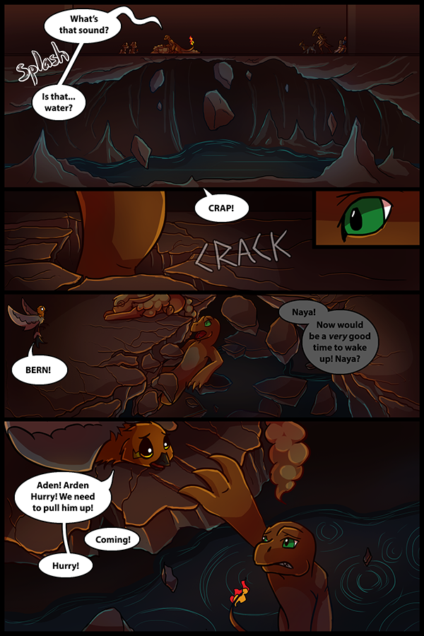
Also, as promised- progress of a PRS page. If there's ever a page of PRS people want to see the progress/process of, just ask! The only pages I can't do this for right now are the prologue pages since I don't have the PSDs of those on this computer. I should have access to those files next month.
This is the typical process of a PRS page these days. My process has changed a bit over the years, so it's not how older pages were done- but most of the recent pages have been done like this!
Note: The images included are 1/3 of the actual file size I work in. I scale the final page down to 600x900 after it's done. I won't be showing full size images cause... they're big. (Only more recent pages have been done at 1800x2700px)
Step One: Sketch the page. Once I'm done with the sketch, I add in the speech bubbles and ensure nothing important is covered up. I may make adjustments to the sketch to better fit the dialogue as needed.
Spoiler:
Step Two: Lineart! I hate this part so freaking much. Especially on pages like this one with lots of it. I usually split the lines into two or more layers- one for characters, one for backgrounds. It makes it easier to edit one or the other as needed. Things like the highlights on character eyes is also a separate layer so that I can edit the line color later without messing with that.
Spoiler:
Step Three: Flat colors. I do the flat colors in three different main layers since most characters don't have more than three main colors. Separating the colors like this makes it easier to shade certain areas individually layer without overlapping and whatnot. I pick what color goes on what layer based on how I'll shade. For example, Lucy's Head/body colors are the same layer since I shade them together. Naya's mane and base colors are separate since I like to shade those separately.
Background flats are sometimes done after all the character shading is done and are done on however many layers I feel necessary on a page. I did the layering by panel on this page- so each panel had three or four main layers. Sometimes I'll do one color across the page per layer. It varies on how efficiently I'm thinking. I derped on this one.
Spoiler:
Step Four: Shading- Shadows. I put two multiply layer masks on all of the character layers. One to darken them for environment- the other for the actual shading.
Spoiler:
Step Five: Shading- Highlights and Soft Lights! Two more layers- the rim light around the outline of the character on a lighten mask between the two shadow layers and the softer light on a normal layer on top of everything else. I start with the lighten layer and use a single orange color for this- the lighten layer style does the rest of the work for me. The soft light I add after that is with a big soft/round brush where I use orange and a dark-ish red around the highlights/shadows of the image. This helps with the warm lighting effect of the setting.
Spoiler:
Step Six: Background Shadows. With the backgrounds I just filled the entire mask layer with the shadow and erased in highlights for most of the layers. I use a mix of hard and soft edges for the shading- hard shadows help define the shape while the soft ones help make it look more natural.
Spoiler:
Step Seven: Background Soft Lights. I do this much like I do the characters except I start with the softer lights first- especially since this is a detail-heavy background.
Spoiler:
Step Eight: Background highlights. I had fun with these- helps accentuate the cracks in the stone and give some color to the background. Helps make things pop too! But mostly for color. xD
Spoiler:
Step Nine: Water! I tend to do different textures/surfaces separately, so I saved the water for last since it would interrupt my process for the rocks. With water I typically start with the streaky texture, but I didn't use that on this since it's so far in the background. I do the highlights on the water around where it meets surfaces and some streaks. Ripples too since a bunch of rocks just fell in.
Spoiler:
Step Ten: Simple- add in the lighting to the water. Just some soft lights- the hard shadows where the walls went into the water were added back in Step Six. Nothing fancy here- just the same way I've done the soft lights on characters and the rest of the backgrounds.
Spoiler:
Step Eleven: Lighting Touch-ups and Line Colors. I decided the lighting wasn't quite as warm as I'd wanted to, so I adjusted the overall background color to be a bit more red. Then added some more shading to Bern in the last panel. Lastly, I put some masks on the lineart layer/s and colored those in. I haven't been consistent with the line-art colors in recent pages though. Sometimes I just flat out forget.
Spoiler:
Step Twelve: The step I forget most of the time. Sound effects! Nothing fancy. I think I've gotten good at drawing that splash bubble. xD
Spoiler:
Step Thirteen: Put the text back, resize, and upload!
Spoiler:
And finally, here's an animated PNG of the process.

-
This post has been liked by:
-
05-23-2016, 07:44 PM #39Gym Leader
- Join Date
- May 2013
- Posts
- 2,024
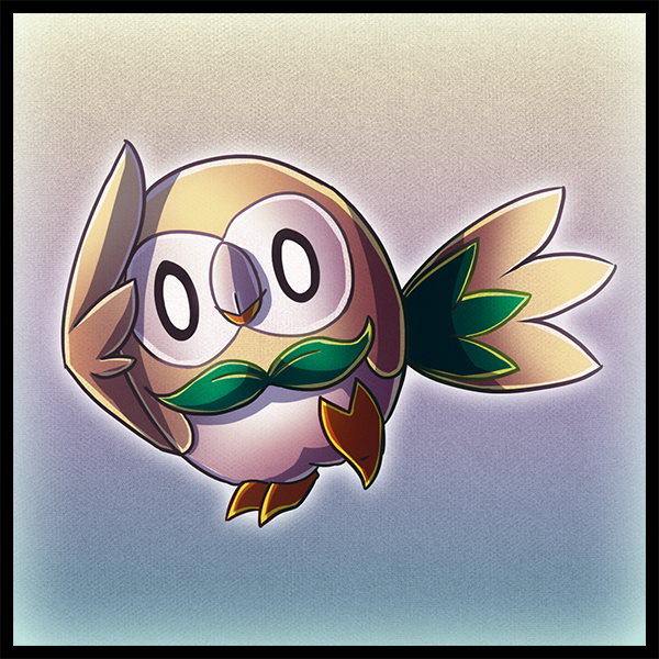
New art.
Also, time lapse video of PRS Page 05-32
Note: The process for Page 05-32 is different than my usual process. I typically do all lineart before moving to flats- all flats before shading, etc.
-
This post has been liked by:
-
05-25-2016, 06:50 AM #40Reach for the Stars ~★
- Join Date
- Feb 2014
- Location
- On a fluffy cloud of cotton-candy.
- Posts
- 4,095
I forgot to comment on the PRS pages (and the process) but really, thanks for doing that, Neko! *u* They're amazing! And it's really good to get an inside look at how you create your pages.
Also EEEEEEYAAAAAAHHHH ROWLET. <3 It's the most adorable starter out of the newbies (imo) and it'll be the first time I'm choosing a grass starter since Hoenn. xD I LOVE IT ALL.

 .
. .
. .
. .
. .
.

 Reply With Quote





Bookmarks