

Ahhh I can't believe I missed Zorua! I love its simple design and rich color scheme, and it looks so cute and fierce, what with the eyebrows and its almost regal mane. The only thing that I dislike about it is the weird thing on its head - it looks like fire or the tip of an ice cream cone, and has nothing really to do with its typing or abilities. Overall, however, it's a very strong design, especially to someone like me who loves cute little canines. 8/10
Aaand now for Serperior. At first, I wasn't much for its design - the entire thing just rubbed me the wrong way, especially the ears. But after using it for a while, I've got to say that I'm seriously fond of the design. I love the dark green and yellow and white that they used, and the way all of its curves add to the flow of the design. The only thing I'd really change is darkening, desaturating, yellow-tinting, or any combination thereof, the light green. Other than that, Serperior is a gorgeous Pokemon with a lovely regal design. It's definitely one of my personal favorites. 9/10
Results 11 to 20 of 21
-
04-10-2014, 11:05 PM #11taking flight!
 URPG Staff
- Join Date
- May 2013
- Location
- My heart is in several places and all of them are fictional. u^u
- Posts
- 2,647
-
04-12-2014, 12:31 AM #12The Fire Fox Gijinka
- Join Date
- Jan 2014
- Location
- Canada
- Posts
- 812
Starmie!
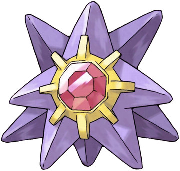
What can I say about Starmie? Well, the design makes sense of course as it is a seastar! I can't say I adore it, but I cannot say I dislike it either. It has the simplicity people always speak about of the Gen 1 Pokemon, and to be honest I think the gem in the middle was a good idea. It never appeared out of place for me, and I also though the colours wee flattering. Starmie may not be turning a lot of heads but it's definitely a design that didn't make me cringe. The colour scheme might be the best part of it, but I fear I am a bit biased against this type of predator! Starmie loses a bit of its points from me because I think a few small touches could have been added to it and it still could have kept its simplicity, such as golden tips on the arms that match the colour of the area surrounding the gem. Just my opinion though!
8.5/10
What do you think of Starmie? Gen 1 perfection, or Gen 1 unimaginative?
-
04-12-2014, 12:36 AM #13taking flight!
URPG Staff
- Join Date
- May 2013
- Location
- My heart is in several places and all of them are fictional. u^u
- Posts
- 2,647
I've never really been much of a Starmie fan - not because I dislike its design, but because it just doesn't strike me as all that great. That said, it's a solid design - good color harmony, not too complicated, and a neat gemstone. That said, it looks a bit busy simply because it's got so many lines, and it certainly doesn't stand out much, but overall it's not bad. 7/10
-
04-13-2014, 12:21 AM #14The Fire Fox Gijinka
- Join Date
- Jan 2014
- Location
- Canada
- Posts
- 812
Drifloon!

My thoughts: I think this Pokemon is near perfect. I may just be slightly biased but I think it represents its intentions extremely well. It's a good combination of adorable and unique and I rarely think non quadruped Pokemon are adorable. Beyond my person thoughts on this Pokemon I think the concept is fantastic, they took a balloon and gave it life with "arms" and "hair" in the form of string and clouds respectively. Although the colour choices appear slightly random I don't think it's a flaw that they stayed clear of the obvious colours (such as a blue palette).
9.5/10
What are your thoughts? Do you think this design is as fantastic as I said? Why or why not? :)
-
04-13-2014, 08:44 AM #15your turn to roll
- Join Date
- Feb 2013
- Posts
- 13,469
I think drifloon are pretty cute. xD No complaints. 8/10.
~SF.
-
04-13-2014, 10:55 PM #16The Fire Fox Gijinka
- Join Date
- Jan 2014
- Location
- Canada
- Posts
- 812
Last one until I make a choice on whether or not to continue with these (will decide after my exams are over on the 18th).
Emboar

Where to start. I'm not fond of this design at all. I think the colours are well chosen, and I do like the swirls on the middle of it but I dislike almost everything else. I don't like the shape, the fire placement, the tail, the eyebrows, etc. I would have made him a bit less "round", and have his body be defined more. The eyebrows aren't needed and the fire should have been more cape like or a bit more subtle. I don't mind his arms but I find them extremely "unpiglike" (new word!). I'd definitely scrap the entire design and start from scratch if I had the power to make that sort of choice before it was released, keeping only a few details.
1.5/10
Was I too harsh? Are there things you like about Emboar? Share your thoughts! Also if you'd like to comment on this thread and give input on it continuing let me know, I'd love to hear it either here, via VMs, or PMs. :)
-
04-14-2014, 01:28 AM #17taking flight!
URPG Staff
- Join Date
- May 2013
- Location
- My heart is in several places and all of them are fictional. u^u
- Posts
- 2,647
Echhh, Emboar has always irritated me. It's not that it's super-ugly, it's just... mediocre. Part of my issue with it is that it's busy, and its many designs don't really work together well. On top, it's got flowy bits; around the middle, it's got spikes, heavy bits, and swirls; on the bottom, the foot designs just don't belong. The swirls conflict with the spikes, and the spikes conflict with the flow. Contrast is good, when used properly, but on Emboar it's just very distracting. That said, I do like the colors chosen for it, and it's a strong design from a silhouette standpoint. However, it's still got many flaws, leaving it with 4/10 from me.
-
04-14-2014, 05:12 AM #18growing strong
Site EditorSenior Administrator
- Join Date
- Feb 2013
- Location
- Route 1
- Posts
- 10,711
I think this thread is a cool idea. I hope you continue it and that it gets more popular!
I don't like Emboar's design. I agree with you guys that there's just too much going on. It looks extremely top heavy as well. I think the fire collar thing is alright. The swirls are unnecessary and a bit too girly, for lack of a better word. They don't go with the rest of the design. The colour choices are rather bland for a fire type, always reds and blacks and oranges... but I guess that was expected. The tail is unexciting too, would have made more sense if it was curled like a pig. I give Emboar a 2/10. Never been a fan.
-
04-14-2014, 05:39 AM #19your turn to roll
- Join Date
- Feb 2013
- Posts
- 13,469
Yeah, I agree with you guys--not about the complexity, but about the general not-impressed attitude I have towards it. I love tepig but not its evolutions, sadly. =/ I think they should have stuck to quadruped designs instead. =/ Like the fennekin line. xD 4/10 from me.
~SF.
-
04-14-2014, 06:38 PM #20A fairy a day keeps the Hydra away
- Join Date
- Nov 2013
- Location
- Teh interwebz, Connecticut
- Posts
- 3,678
Not surprised with the ratings, Emboar isn't one of the most popular starters. Especially because it continued the chain of Fire/Fightings. But, that has nothing to do with design.
I personally like Emboar's design, although I don't think he looks like a fighting type, more like a Dark type to me. Maybe it's just because he reminds me of Ganon. Colors are some of my favorite, looks pretty epic, and he's a pig, one of my favorite animals. I think his face looks just fine, as it looks pretty intimidating. Overall, a pretty boss design. I give it a 8/10. Spoiler:


 Reply With Quote


Bookmarks