

Comic Tips, Tricks, Guides, and Resources
Hey, everyone! Since we're going to be starting our community comic in the foreseeable future, I decided it's time to create a thread containing useful tips and tricks for making comics! I'll be updating this guide with new content whenever I have the chance. If there's any tips/advice you want to see, feel free to request!
Do note that a lot of my guides will be from actual comic rules and trends. While I'll be going based on what is considered to be 'rule' for some, remember that like all types of art, there are situations where rules can and should be broken!
While I'm at it, I'll include some useful photoshop tips if I see good times to drop them in.
Warning: I'm going to use a lot of examples of what to do from MTMTE and lots of examples of what NOT to do from PRS. You have been warned.
Table of Contents
Crossed out items are guides that are not up but are in the works.
- Helpful Resources
- Outlining, Scripting, and Writing
- Paneling and Layout
Types of ShotsLettering
Q&A and Help Requests
Feel free to post in this thread for help or advice on anything comic-related. I am more than happy to answer questions or make guides on more specific aspects of the comic pipeline! Just be sure to check through existing guides and Q&A posts to ensure your question has not already been answered.
Results 1 to 10 of 18
-
01-19-2017, 06:20 PM #1Gym Leader

- Join Date
- May 2013
- Posts
- 2,024
Comic Tips, Tricks, and Guidelines
Last edited by Nekomata; 02-10-2017 at 03:46 AM.
-
This post has been liked by:
-
01-19-2017, 06:20 PM #2Gym Leader
- Join Date
- May 2013
- Posts
- 2,024
Helpful Resources
Here's some resources that may prove useful for comic making! These will include brush packs, guides, videos, etc. that may aid you in your comic making attempts! Some of the links to guides that I'll post in this thread are guides that I have personally followed for my work and have influenced the guides I've since written for everyone here. Be sure to check them out!
Brushes and Tools
- Mar-ka's Brush Set: This is the set I use for most of my painting- it's free and offers a good variety of brushes!
- AlectorFencer's Texture Brushes: I don't use these often, but they're really nice and FREE texture brushes!
- Tamberella's Fur Brushes: Some really gorgeous fur-texture brushes. Not free, but well worth the cost!
- Kyle's Brush Packs: The holy grail of brush packs. Heck, ANY brushes this guy makes is likely to be worth every penny. I personally use the Mega-pack for a lot of things- most importantly: The ink brushes. No one- I repeat- no one has made inking brushes as wonderfully as this guy. Most of the brushes I use for lineart are from this guy's mega-pack. Also included are some handy action line brushes, texture brushes, and my favorite pencil brush on the face of the internet. The best part? If you buy the mega-pack- you will get free updates for it from time to time!
Guides
- WIP
Videos
- WIP
Last edited by Nekomata; 02-10-2017 at 03:46 AM.
-
This post has been liked by:
-
01-19-2017, 06:20 PM #3Gym Leader
- Join Date
- May 2013
- Posts
- 2,024
Outlining, Writing, and Scripting!
So. You want to make a comic. Great! There's a lot of work that goes into every page of a comic- but the most important part is the story. Everything else around the comic will revolve around the story you make. So you need to stop and carefully plan your story.
Now, I'm not going into a whole spiel on what makes a good story- go to the wrtier's desk for that. What I AM going to talk about is writing for comics and how to sell that story in this specific medium. A lot of people think writing is writing, no matter the form, but that couldn't be further from the truth!
When you write a novel, you have nothing but words alone to tell the story. So you write with that in mind. If you don't put it on the page, then it never gets into the story. When you write for other mediums, however- you must consider HOW the story is going to be told. You don't have the luxury of writing out every little detail. As a visual medium, you have to show the story.
Writing for comics is a lot more like writing for a movie or a TV show than it is to a novel. This is because you're writing a script, not a story. A script, like for a play, is essentially a set of instructions for the artist. You're telling the artist what the scene is like, what the characters are doing, what their feelings are, etc. For a comic writer, being able to clearly express all of these things to the artist is vital.
That said, the writing process for comics starts similarly to that of novels. You need an outline. This will be the basis of the story. Plan, plan, and then plan some more. This outline will help with your scripting. Think about how you're telling your story. Is it in episode-like chapters or more a movie-like story? This is important because you need to plan the length of your comic.
I warned that I'd use MTMTE as an example, so here we go. MTMTE is a comic I love dearly cause it does so many things right. One of these things is that, while it's got a huge over-arching plot, but the way the story is told in a very episodic format. Each issue can be read as an individual episode and are about the same lenghth page-wise.
So look at your outline. Can you break down your story into chapters/episodes/issues? Do it- try it. Once you do that, look at all of the scenes you've got planned for that chapter. How important are they? How many pages do you think they will take? Plan this out.
Using PRS as an example (Chapter Six, since that's where I've gotten a bit more serious) I decided that all future chapters will be 20 pages. I looked at my outline and decided how many pages each scene should get.
So how do you decide this? First, look at the scenes. And consider the following:
- Is it an action scene, or a dialogue scene? I find that action scenes take up more page space. Dialogue is best condensed into fewer pages so you don't spend 5 pages on one conversation when you can easily do it in one or two.
- How important is the scene? If it's something important, consider giving it more page space. If it's something that needs to be emphasized, you don't give it a single panel.
- Over how much time does the scene take place? You can create the illusion of time through paneling (I'll cover that later) and extending the length of the scene. If you dedicate an entire 2 pages to an explosion vs half a page, it'll certainly feel longer. I COULD have condensed the last two pages of PRS Chapter 6 into one, but that would have made the scene feel rushed.
- How long is the scene? This one is obvious- a longer scene will probably require more page space. You don't want to try to squeeze a long scene into too few pages since it'll make the page messy and mess with the pacing of the story.
Of course, different artists/writers have different styles. If you look at manga, you'll notice they've got a more expanded format of story-telling. That said, they release chapters on a more frequent basis. Western comics (like MTMTE) often have more condensed story telling. Find what works for you.
Once you've decided what scenes will go into what pages of the chapter, you get to script each page!
When you're scripting pages for comics, you want to first picture how the page will look like in your head. How many panels do you need to express the story? While I'll get more into paneling in a different tutorial- consider the impact of the paneling. Try to imagine the scene like a video in your head- what's important, what's not?
In dialogue scenes, you may need fewer panels to express what you need. Maybe a panel to set the scene- a panel with thhe two characters talking, maybe a facial reaction to some shocking news in a different panel. This kind of things. You want to express your story as effeciently as possible. If having something in it's own panel that doesn't add to the story to any effect, then you probably should cut it.
With this in mind, get scripting. It's common for comic scripts to include page number, the panel number, a brief description of what's going on in the panel, then dialogue for the panel. Here's an example using part of the PRS script. Itallics are not part of the script but my notes on the importance of various parts.
Note: I'm terrible at scripting and don't always script before I work on PRS pages. Don't be like me. SCRIPT!
Chapter Six, Page 16
In the previous page we saw Zila enter the door to Bern's house. She's now in the house and looking around. There's no light on inside the house, but there should be enough moonlight coming in through the window to offer some visibility.
This sets the scene and gives the artist an idea of what to do with the setting. It also clarifies this as a continuation of the previous page.
Panel One
Establishing shot. Zila has just entered a medium-sized room. It's what would be the equivalent of a dining room mixed with a living room. A table can be seen on one side of the room. On top of it sits a pair of letters with the [Redacted] symbol. Next to that is a bowl of fresh berries that are grown in the house- one of the berry trees should be visible as a potted plant. An orange glow can be seen behind the pot as that is where Bern is hiding. On the other side of the room is a bookshelf with books, a locked box, and a box of random things. A painting/photo of [Redacted] can be seen on one wall.
This paragraph describes what is seen in the panel. Since this is a new location, I had it work a bit like an establishing shot with a description of the room. It's important to set the scene when in a new location (more on establishing shots later)! Specific details are included for important objects- like the letters, the berries, or the painting. Being a visual medium, you need to communicate to the artist what objects in the setting are important and need to be included.
ZILA: Okay. Hard part done. Now to find the-
Panel Two
Zila trails off as she notices the glow from Bern's tail behind the potted berry tree. Close up shot of the pot/plant.
Having a close up shot of the pot/plant emphasizes the fact that Zila has noticed the glow from Bern's tail.
ZILA: Looks like I'm not alone.
Panel Three
Switch to Bern's perspective. We see Bern hiding behind the pot with Zila approaching in the background. Bern is terrified, and curled up trying to not be seen.
ZILA: Come out, come out, little lizard!
Panel Four
Should be a larger panel of Zila grabbing Bern from his hiding spot.
It's okay to specify the size of a panel to the artist- it helps emphasize 'This is important!' - you would not want important actions to be overlooked. The larger the panel, the longer the viewer's eye will linger on it- and the better they're remember. (More on this in the paneling guide.
ZILA: Got ya!
Panel Five
Bern is thrown against the corner of the table! Evidence of the bite should seen.
See why I mentioned the table earlier in the script? You don't want objects coming out of nowhere- it's best to establish these things earlier if you plan on using them as part of the scene later. Remember, you won't be able to tell the audience 'There's a table' - you have to SHOW them.
FX: Smack!
Panel Six
We see Bern laying on the ground, terrified. Zila's shadow looms over him.
ZILA: Now maybe you can help me find the-
Panel Seven
Big panel. Zila is interrupted when Pyrra crashes through the wall to confront Zila. She's angry like any protective mother would be. Zila looks grustrated and maybe a little surprised.
FX: Crash
PYRRA: Get away from my son!
ZILA: Dammit!
------
Here's the page mentioned!
Spoiler:
------
Remember that the script is a guide for the artist to work from. If you don't also happen to the artist, you need to be extra specific with details that you consider important to the narrative. Some things like emotion, mood, etc. can be picked up from the dialogue alone, but other things like the inclusion of certain objects in the background that are being used as foreshadowing are things that the artist may not know about.
Of course, there's no issue at all leaving the artist to his or her own instincts on things. When it comes to creating visuals, sometimes the artist knows best. Comic making is very much a cooperation between the writer and artist/s. (Unless you happen to double as both!)
Most importantly- be flexible. As you script, you will get better ideas for your story. You will change details and find opportunities to drop foreshadowing all over the place. Dialogue can and will change, plot elements will evolve, and sometimes you'll end up realizing some things that you wrote can be expressed more effectively in a different way via the art alone. With comics 'Show, don't tell' is VERY much an important factor. If you can express an idea without dialogue. For example, in panel six of the above script, Bern is scared. He doesn't SAY he's scared- but you can SEE it through the art.
Here's some links to excerpts from the ORIGINAL script from MTMTE #1 (The writer posted them a while back). A lot of these scenes were completely changed by the final. Good example of being flexible considering some of these changes had major impacts on the story. I'll describe best I can! It's also a good way to see how people in the industry write scripts.
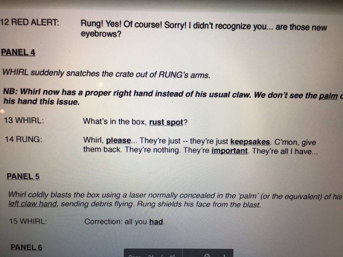
Original Script Excerpt #1:
Spoiler:
Changes Made: Whirl does not have any conversation with Rung prior to the launch. In the final script, he's actually fighting with another character at this time. Their fight ends up at this spot and Rung loses an arm (and his keepsakes go flying). So Whirl did not intentionally destroy stuff in the final (in this scene, anyway)
Also Whirl still has claws- this is significant later because his lack of hands is both a physical impediment and a constant reminder of his past- it's what fuels his anger.
In the final version of the scene, Rung is talking to someone else instead- this helps lay down the relationship between these two characters (Which will later be important of course). Below is how the final scene turned out.
Spoiler:
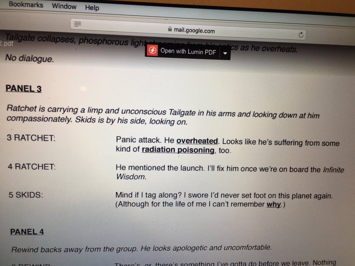
Original Script Excerpt #2:
Spoiler:
Changes Made: After changing the first part of the script to a fight instead of Whirl just being a butt, Tailgate explodes something and KOs Whirl on accident. He freaks and panics. That leads to this scene- which seems to have been cut entirely!
The most notable difference this makes is that Skids is present. In the final version of the script, Skids isn't even on the same planet! This leaves a HUGE difference in plot since his arrival on the other planet is a major mystery and plot point later on.
Lastly, the Infinite Wisdom had a name change to The Lost Light - which will later go to be the new name of the series later on!
Spoiler:
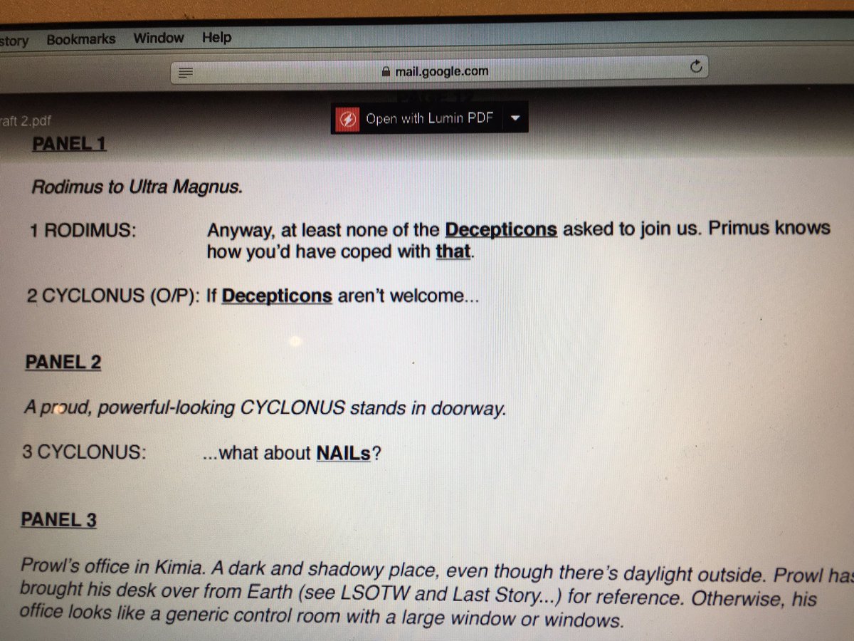
Original Script Excerpt #3
Spoiler:
Changes Made: This is another scene that was cut. Cyclonus instead is fighting with Whirl! After the fight he simply latches onto the hull of the ship and hopes for the best- that's how he joins the cast... not by asking.
The conversation about joining the crew comes AFTER he's caught as a sorta-stowaway. I'll post that page from the next issue since this page doesn't really exist anymore.
Spoiler:
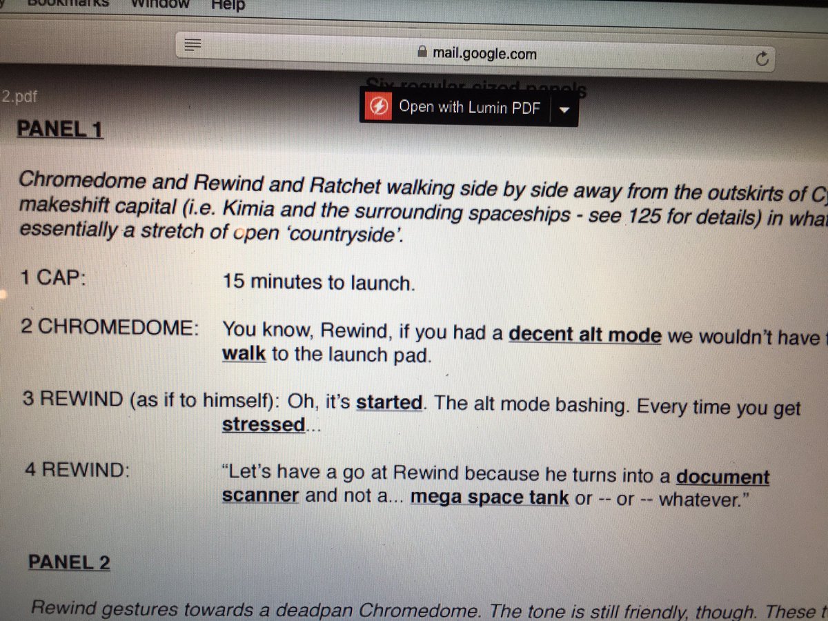
Original Script Excerpt #4:
Spoiler:
Happens before Excerpt #1/2 - and is actually mostly unchanged! Just some slight dialogue changes, I think. Including this to show you the final panel for an idea on how this went from writing to art!
Spoiler:
So yeah, the point of the above is not to be afraid to change your story in drastic ways. Also just to see how some professional scripts look like and how they translated to the page.
I think that's it for my script rambles. Enjoy!Last edited by Nekomata; 02-10-2017 at 03:31 AM.
-
01-19-2017, 06:20 PM #4Gym Leader
- Join Date
- May 2013
- Posts
- 2,024
Layout and Paneling
Panel Size and the Illusion of Time.
Okay, now that we've gotten some of the basics on how to approach writing for comics, it's time to move into more in-depth areas of focus. To be more specific- Layout, Paneling, and how they effect pacing.
One thing you'll probably ask yourself when scripting a scene/page is 'How many panels should be on the page?' If you haven't asked yourself this, stop and do it right now. This is important, because the number of panels and how they're presented on a page is crucial the pacing of a comic.
Think of a comic page in terms of time. The page represents a total of x minutes. When the reader's eye goes across the page, you're looking at part of that time. If a panel takes up half a page, the reader is looking at 1/2x minutes. If there's many small panels across the page, the viewer will read through them at a faster pace instead of lingering on a larger panel.
See what I'm getting at here? By manipulating the amount of space of a panel, you're creating an illusion of time in the story. You can use paneling and lout to create a sense of urgency or to focus on a moment of time in the story.
For example, if you've got a fact-paced action sequence or chase, you want a lot of smaller panels in a single page. Imagine seeing a fight scene using single panel pages? Wouldn't that feel longer? Fight scenes are chaotic and require a lot of quick thinking, action, etc.
Going back to the area of a page representing 'x' time. Due to the fast-paced nature of action-y things, it makes sense for a lot to happen in a short period of time- and this should translate into the page. On the other end, if you want to give an illusion of extended time or 'slow motion'- give more of the page's time to a panel.
I mentioned in the previous guide that larger panels should be used for important things. So what if that important thing happens to take place in a relatively small amount of time? This is where writer/artist's choice takes over. Will giving the panel more space interrupt the pacing of the story? Will it diminish the importance of the panel if it's too small? Balance can be hard to find. In the end, what matters most is how much time you want the reader's eyes to linger on a scene.
A quick rundown on when to use large vs small size panels
- Quick-paced sequences should typically have smaller panels to emphasize the speed of time.
- A panel with a single character talking probably should be smaller. There's no point in taking half a page with a headshot and dialogue (unless it's a LOT of dialogue, then you might have a problem with the 'show, don't tell' rule.)
- Dialogue heavy scenes are tpyically in smaller panels. Think about it, you don't want to waste 4 pages with dialogue that could easily be done in 1 or 2 pages.
- Establishing shots are typically medium to large panels.
- Important panels containing things like big plot twists, reveals, etc. should be in medium to larger panels.
- Using med/large panels should also be used to slow time down for more dramatic sequences.
- Larger panels are also good for introducing new characters.
- Use larger panels for anything you want the reader to spend more time looking at.
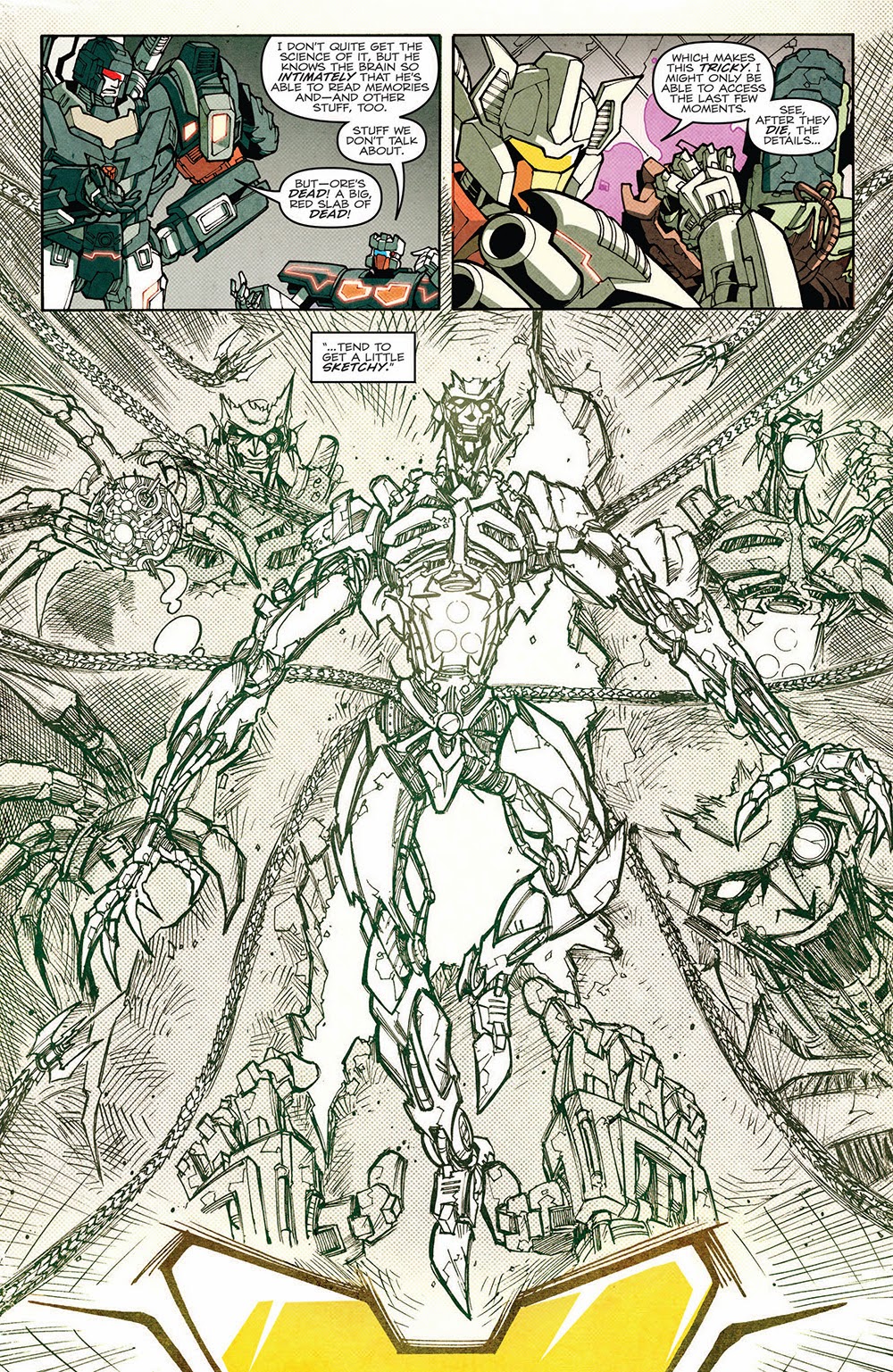
Here's some pages I'm pulling from- to no one's surprise- MTMTE to talk about the paneling. I'll keep them relatively spoiler-free (even if there's a PERFECT example of using an entire page to emphasize emotion and the extension of time that'd I'd love to use...)
Example Page #1
Spoiler:
Three panels. The first two aren't particularly big, so your eye goes across them rather quickly- the last one however, is a reveal panel. It's large for dramatic effect as well as an introduction to unknown enemies.
Example Page #2
Spoiler:
A lot happens on this page. It's not a full-blown action scene, but there is definitely plenty going on. It all happens rather quickly. Try imagining if this scene took two or three pages? Poor Rung there would be dangling for quite a bit longer- or it would feel like it!
Example Page #3
Spoiler:
Here's an example of using panels to express a sense of time. The bottom row of panels are very similar- it's focusing on the face of a character as he's processing some information he just received. The way it's layed out in the bottom there suggests that he waited a good few seconds before coming to the conclusion "Cool."
Example Page #4
Spoiler:
Look- a dialogue heavy page. The first panel is larger because it happens to be an establishing shot showing the change of setting from the previous page. Dialogue heavy panels don't need much space- just enough for the speech bubbles and to express any important reactions or facial expressions from the characters.
Example Page #5
Spoiler:
Another action-y scene. Note that the panels with the security system coming out are quite small- they're big enough to show what's going on, but don't eat up much space that could be used for more important things! If you can express an action in a smaller panel without losing effect of timing/importance, then you should!
Panel Layout and Rhythm
Nearly done, guys! Okay, so after you decide how to use panel sizes and whatnot to give the illusion of time, you have to determine how you'll be presenting the panels. This seems like a silly thing to consider- why not just slap them on the page? If only it were that simple...
Page layout is important. It determines the path in which the audience's eyes go through the page. Think of layout like a rhythm. Any rhythm that repeats long enough gets a bit boring, right? So be concious on how you arrange your panels. Repetition can be good when used in moderation though.
Look at the script and what you've written. Consider the time in which each panel takes place. Do you have a bunch of smaller panels close to each other? Larger panel in the middle? Maybe a few medium panels? How can you best tell the story while making it easy for the reader to know what panel comes next?
Look at the above examples. You'll notice that the panels vary in sizes- even on the same page. You may have two identically sized panel followed by one slightly larger. Some panels don't take the width of the page, leaving white space on either side. Some panels take the entire width and lack borders. This is all to help give some variety to the paneling.
Just be sure to make it clear what the panel order is. Bad paneling can make a reader view the panels in the incorrect order. Typically, we read top to bottom then left to right, yes? You start at the top row, go right, then proceed to the next row. Keep this in mind when picking your panel flow. Do your eyes travel the page naturally in the right order? Or do you need little arrows to point to the next panel to clarify the panel order to the readers? If it's the latter, then that's a big no-no!
Here's a good image I found on the internet that expresses the issue of panel flow. See how the intended panel order of this artist's page worked? It didn't feel natural reading in that order- so he changed it!
Spoiler:
Speaking of that image, those are thumbnail images! What better time to talk about those than now, yes? Thumbnail pages are basically the very rough outline of a comic page. They're typically used to experiment with layout and paneling before doing any serious sketching or drawing for the page. As a result, they're very rough and undetailed- why should they? They don't need to be! It is highly recommended to thumbnail your pages ahead of time to see how they flow both in terms of layout and pacing of the story!
Planning ahead like this will give you the opportunity to edit things before they go through timely sketches- or even worse, final colors! See a scene that you think might work better with an extra panel or two? Edit it in and redo the thumbnails! Best to catch the layout/pacing issues in thumbnails than final sketches.
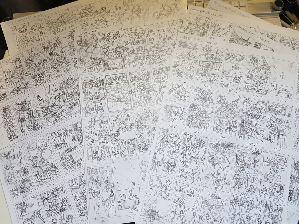
Here's an example of MTMTE (Hahaha!) Thumbnails from a more recent story arc. Note they aren't particularly detailed but contain enough information for the paneling and layout.
Spoiler:
Last thing I want to discuss in this guide is panel spacing. It goes along with the layout. Typically, it is best to have space between panels to make a clear distinction where one panel begins and another ends. A lot of times, you'll see webcomics use nothing but a line to break apart panels. This makes for very cluttered looking pages and is a big no-no. It can make it difficult to differentiate between panels.
Of course, it's not bad to have panels overlapping from time to time- especially in more fast-paced scenes. You'll notice at least one of the MTMTE examples I used has some overlapping panels. Another type of panel would be the borderless ones- panels without borders are typically reserved for larger more important panels. It's not uncommon to see smaller panels on top of the borderless ones!
So, some things to remember/consider:
- Regularly use space between panels! Borderless panels and overlapping panels can be used to good effect, but shouldn't be used too frequently in a page to avoid looking cluttered.
- Thumbnails are essentially the outline for comic artists. Outlines change, so do thumbnails- use them to plan ahead!
- Panel flow is key! Bad panel flow can lead to confusion for the reader.
- Variety in panel size and placement can be a good thing- as can be repetition. Remember to think of it like a rhythm- consistency with a little variation is what makes it interesting. Too much variation makes it feel random.
Last edited by Nekomata; 07-02-2018 at 07:45 PM.
-
01-19-2017, 06:20 PM #5Gym Leader
- Join Date
- May 2013
- Posts
- 2,024
And this one. I like this one.
-
01-19-2017, 06:21 PM #6Gym Leader
- Join Date
- May 2013
- Posts
- 2,024
But this post is my favorite.
-
01-19-2017, 06:21 PM #7Gym Leader
- Join Date
- May 2013
- Posts
- 2,024
This reserved post is jealous of the one above. I don't love it as much.
(You may now post questions/requests for guides below)
-
01-19-2017, 10:56 PM #8Gym Leader
- Join Date
- May 2013
- Posts
- 2,024
First Guide is up. Please feel free to leave any questions/comments/thoughts/etc.
I TRIED.
-
01-24-2017, 06:09 AM #9growing strong
Site EditorSenior Administrator
- Join Date
- Feb 2013
- Location
- Route 1
- Posts
- 10,750
I liked this guide! I've never done a comic before or thought of doing one really, but it was interesting to think how it would need to differ from writing a story, and is probably a good idea for people doing the Community Comic to read!
I found the examples really helpful in understanding how a script should be written, as well. Nice one, Neko! You're really good at writing tutorials! :) I hope you do more!
-
01-24-2017, 02:23 PM #10P i k a c h u
Administrator
- Join Date
- Jun 2014
- Location
- Clinging onto Hope
- Posts
- 10,853

This really will help later when it comes to trying to make the comic! Any bit of help through a tutorial I'm glad to see. Trust me, I'm THAT BAD at making anything art related xD. So this guide makes it a little easier to understand. No garuntee it will help in the long run for me, but it's something really useful to go by later.
Really enjoyed it, Neko! Looking forward to more later on!
The time is upon us...

 . Pika Pair with the yellow bundle of fluff Chibi Altaria..

 Reply With Quote


Bookmarks