


I HAVE RETURNED FOR MORE SPRITES.

Those big guys are both ELDINPYRE, a Mythical pokémon I made up. The left is his normal palette, and the right is his shiny palette.
Results 121 to 130 of 211
Thread: General Spriter's Showcase!
Hybrid View
-
05-01-2014, 08:11 PM #1>tfw somebody insults your hair

- Join Date
- Dec 2013
- Location
- Protected by『BITES THE DUST』
- Posts
- 8,285

-
05-02-2014, 02:04 AM #2growing strong
Site EditorSenior Administrator
- Join Date
- Feb 2013
- Location
- Route 1
- Posts
- 10,750
That's really cool! I like the colours of the shiny a lot. The eye makes it look pretty scary though. xD Nice idea! What type is it? Originally Posted by Sir Sivelos

-
05-04-2014, 03:39 AM #3your turn to roll
- Join Date
- Feb 2013
- Posts
- 13,468
It's cool, but I have something against using a fused sprite to make a fakemon. I think the second one's colours work a little oddly together, namely that red colour with the...greeny bluey body. The design is cool though. The outlines on the right front paw has outlines that are too light for the shade of grey you have there and it blends in the way you don't want it to. Darken some of those outlines, and also on some other feet. x) Originally Posted by Sir Sivelos
~SF.
-
05-02-2014, 02:46 AM #4>tfw somebody insults your hair
- Join Date
- Dec 2013
- Location
- Protected by『BITES THE DUST』
- Posts
- 8,285
Eldinpyre is Electric / Water. He's meant to be like a typhoon, and he brings about horrible storms wherever he goes. His normal ability is Drizzle, and his hidden ability is Electron Coat, which is basically an OP version of Static.
-
05-08-2014, 11:22 PM #5formerly Speed-X
- Join Date
- Apr 2013
- Location
- USA
- Posts
- 4,686

I finally am giving myself time to actually post here and critique things. Maybe this will help get my mind off of the myriads of crap occurring that is my life.
Those are interesting concepts, but like with Suicune's Fire / Xanthe, I've never really been a fan of using various pieces of other Pokemon sprites to create an amalgamation, of sorts--a combination of many small and insignificant, already-existing elements to make up one original image. At least, not as a final "draft," per se. I think this is one of those things that you should now try to draw out after having created it and then potentially making a sprite out of it, using nothing but...well, you. It's cool as like a concept art of sorts, but it would be even cooler if made totally custom. 
The typing of the Pokemon is a little offsetting. The Electric typing visually makes sense, but there doesn't appear to be a single remnant of it being a Water-type. Dark-type, maybe, but not water. You could fix this possibly by reconcepting this Pokemon slightly to exhibit more features of a Water-type Pokemon. I think that even the slightest notion would do.
You also have two black colors, and a couple of redundant colors here and there. I would stick to one black, but I have a feeling this was caused mostly by splicing. The black on its nose is redundant, also.
You may want to fix the readability if you decide to either edit or entirely remake this sprite. Here and there--mainly on the back legs--it is very difficult to tell what's going on. Are those clumps of fur? Is the thing sticking off out of its back right (our right) foot the heel? Again, it's possible that the splicing is a main factor to this.
I'm not sure if you did, as I can't really tell, but I think you would greatly benefit from adding your own shading next time. Try this: if you still like splicing parts from other Pokemon, just reduce it all to a blank outline and put those together. Add the shading yourself, because doing that overall makes the whole process much easier and less confusing. :>
I like the color scheme, and I think this design is very intriguing. Just maybe if you're wanting to stick to it being a Water-type, try slightly redesigning it. Maybe add some more water-like attributes? I think the main reason as to why it looks more like a secondary-Dark-type than a secondary-Water-type is mainly because of the coloration. I think the colors are cool, though--makes me think of a thunder cloud--so I think the design would benefit the most from adding attributes instead of changing its color scheme.
If you decide to remake or edit it is up to you, these are just pointers and suggestions for if you do decide to. :>
@Sir Sivelos


Greninja: Axibians | Gengar: Speed's ORAS Emporium! | Malamar: Picarto | Roserade: Speed's Pixel Cluster | Gliscor: ASB Stats | Tentacruel: Pokemon Prism Stats | Drapion: VPP Stats | Mega Sableye: Recolored Shiny XYORAS Icon Sprites | Flygon: URPG Stats | Snivy: Viridian Reference | Treecko: Link Vault | Shiny Whismur: All shiny Pokemon
Pfp by my friend Muerte Verde
------------
-
This post has been liked by:
-
05-14-2014, 03:56 AM #6person. most of the time.
- Join Date
- Jun 2013
- Location
- Colorado
- Posts
- 26
So, with my return to the forums, I also took another swing at spriting. Small steps. These first things are just simple palette swaps of the starters. Eh. They're alright.
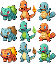
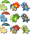
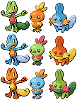
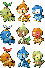
Also, it's finals week at university, and I decided a good distraction from the stress would be to attempt a pixel over. I've never successfully completed one, and I think that this is a pretty honest attempt at one. The shading is sort of iffy, but at least you can tell what it is. Personally, I like its expression. It's the FRLG Bulbasaur art by Sugimori. I think it turned out okay.

-
This post has been liked by:
-
05-14-2014, 11:45 PM #7Certified Eeveelution Enthusiast
- Join Date
- Aug 2013
- Location
- New Jersey
- Posts
- 3,258
OH MY GOD ITS AMAZING Originally Posted by Cheerful Cherubi
-
This post has been liked by:
-
05-15-2014, 12:18 AM #8person. most of the time.
- Join Date
- Jun 2013
- Location
- Colorado
- Posts
- 26
Thanks, Sarah! Yeah, the revamps aren't so bad, it's just about doing something over and over again. I made a Bulbasaur one a long time ago. Originally Posted by Pokemon Trainer Sarah

I just looked over the Crystal animation, and mine is wrong, but it looks alright.
THANK YOU! :D Originally Posted by Dragon Master
-
05-15-2014, 04:39 AM #9growing strong
Site EditorSenior Administrator
- Join Date
- Feb 2013
- Location
- Route 1
- Posts
- 10,750
Those wings look pretty interesting! I like the headpiece too. It kinda looks futuristic! I think there are a couple of odd pixels on the bit to our right though, just before where it joins the head. Originally Posted by The Frost Dragon
Aww so cute! It looks pretty right to me. :D Originally Posted by Cheerful Cherubi
-
05-15-2014, 09:08 AM #10your turn to roll
- Join Date
- Feb 2013
- Posts
- 13,468
With palette swaps, you should edit them a little. Even if it's not much. Because when you don't have enough colours, or when things don't match up, it just looks a little sloppy. Not only that, but make sure you always match up lights and darks, or you'll have to edit the sprite. Good examples of this include: Originally Posted by Cheerful Cherubi
Orange squirtle - this isn't too bad, but the shell...that's not good. xD You can't even see the white part that borders the shell, and what's confused me is that you've made that part darker than the shell.
Lime green cyndaquil - Ooh, now this is a prime example of a need for editing. The colours of a cyndaquil are normally dark, so making the dark parts into a light colour ruins the composure of the lineart. You can see it's very broken around the head, right? This ONLY works for dark colours, do you'd need to edit that or make the green darker. The back also looks quite...not good. xD Like what I said before, you HAVE to match up the light tones with the dark tones of the palettes otherwise it looks backwards.
Totodile-coloured cyndaquil - the colours just do not work at all on this one. The yellow is too dark and the linart is way too light. You can barely see it.
Orange turtwig - This is mainly for the shell. You used the fire colours to shade the shell, which is not at all a good idea considering that's not supposed to be shades. It's different colours. Sort of like colouring with pink and then shading with orange. Just won't work. xD Considering the shell is the same colour as the patch on its head, you should have made the shell yellow.
Green/brown chimchar - The palette does not work at all on this sprite. Again, you didn't match up the darks with the lights. Chimchar have light bellies and faces, and darker orange fur. So the brown should have been used where the orange was, and the green where the lighter yellow was.
Blue chimchar - This sprite has a severed ear. O_o
Both piplup - Once more, this sprite's colours doesn't work because you didn't adhere to the dark/light matchup. That red face looks totally odd. xD
That being said, some of them turned out well. Just remember, palette swap does not mean you're confined to the EXACT shades that are given to you. They're sprite specific, so you HAVE to make edits if you're gonna slap those colours on other pokemon. x)
As for the bulbasaur, it's pretty good, but it needs a lot softer transitions between shades. The hard green under its chin looks much too dark. My main critique is the way you didn't blend the spots/shapes with the body. They are not protrusions, and yet you've shaded them separately, like they're little pebbles attached to the sprite. Do you see how, on the official bulbasaur sprite, there is no outline for the spots? Don't outline yours either. It looks unnatural and gives the wrong impression of the dimensions. The outlines around the eyes aren't as smooth as they could be; they're rather jagged, especially around the red part of the larger eye. Parts of the outlines are also jaggedy, like the front right leg, and your outlines are also too bright in a number of places (mainly where dark shading is). Nice start though. :] Hope this helped.
My advice to you about this would be to treat the head as a circular object. You need to shade it accordingly, as opposed to shading different sections separately. Try to use darker shades as well. The beak seems a little big as well, but it's a pretty good start. :] Originally Posted by Shiny Totodile
I quite like those omanyte revamps! You've shaded the lineart oddly on the front in parts (random patches of darker shading at times) and I think more of the lighter shade could be used on the front moustache tentacles, but other than that, well done. ^^ Originally Posted by Cheerful Cherubi
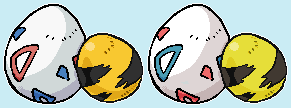
As for the eggs, pixel overs generally have single-pixel width lines. What you've done isn't sprite art, although it is pixel art, I believe... I think there needs to be more detail in the shades, especially around some of those triangular shapes on the togepi. On the elekid egg, it looks like you've shaded the lines, which make it look blurred and odd, considering the lines are marks, and not to be shaded. xD Anyway, nicely done.
Haha, I like it. The yellow colour means that you have to update the state of the wings' outlines though, since they have black in dots, which should be lighter considering the lightness of the yellow. The blackness of the white part of the wings looks a little odd against the whiteness, and also considering it has a tail that isn't comprised of black outlines, but is also white. Originally Posted by The Frost Dragon
I like this. ^^ The only thing I have to complain about is that I think the right eye should have more of a border, as it seems like it finishes too high up on the right side, whereas the Crystal one has outlines that go further down. If that makes sense. xD Originally Posted by Cheerful Cherubi
~SF.


 Reply With Quote


 It's not very good, but it's a start.

Bookmarks