

Head decorations are fun! Anyway, the concept was... An otter? A cool otter, who is possibly having a chill day? Man, I'm not good with explaining things, I never was. It's the second sprite I've made in a while, I'll add the first sometime later. It was just really fun to make for some reason.
Results 131 to 140 of 211
Thread: General Spriter's Showcase!
-
05-14-2014, 11:49 PM #131"I don't want to fight."

- Join Date
- Jul 2013
- Location
- A Spaceship
- Posts
- 283
 "You kids have a nice day."
-
05-15-2014, 12:18 AM #132person. most of the time.
- Join Date
- Jun 2013
- Location
- Colorado
- Posts
- 26
Thanks, Sarah! Yeah, the revamps aren't so bad, it's just about doing something over and over again. I made a Bulbasaur one a long time ago. Originally Posted by Pokemon Trainer Sarah


I just looked over the Crystal animation, and mine is wrong, but it looks alright.
THANK YOU! :D Originally Posted by Dragon Master
-
05-15-2014, 04:39 AM #133growing strong
Site EditorSenior Administrator
- Join Date
- Feb 2013
- Location
- Route 1
- Posts
- 10,750
Those wings look pretty interesting! I like the headpiece too. It kinda looks futuristic! I think there are a couple of odd pixels on the bit to our right though, just before where it joins the head. Originally Posted by The Frost Dragon
Aww so cute! It looks pretty right to me. :D Originally Posted by Cheerful Cherubi
-
05-15-2014, 09:08 AM #134your turn to roll
- Join Date
- Feb 2013
- Posts
- 13,468
With palette swaps, you should edit them a little. Even if it's not much. Because when you don't have enough colours, or when things don't match up, it just looks a little sloppy. Not only that, but make sure you always match up lights and darks, or you'll have to edit the sprite. Good examples of this include: Originally Posted by Cheerful Cherubi
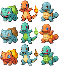
Orange squirtle - this isn't too bad, but the shell...that's not good. xD You can't even see the white part that borders the shell, and what's confused me is that you've made that part darker than the shell.
Lime green cyndaquil - Ooh, now this is a prime example of a need for editing. The colours of a cyndaquil are normally dark, so making the dark parts into a light colour ruins the composure of the lineart. You can see it's very broken around the head, right? This ONLY works for dark colours, do you'd need to edit that or make the green darker. The back also looks quite...not good. xD Like what I said before, you HAVE to match up the light tones with the dark tones of the palettes otherwise it looks backwards.
Totodile-coloured cyndaquil - the colours just do not work at all on this one. The yellow is too dark and the linart is way too light. You can barely see it.
Orange turtwig - This is mainly for the shell. You used the fire colours to shade the shell, which is not at all a good idea considering that's not supposed to be shades. It's different colours. Sort of like colouring with pink and then shading with orange. Just won't work. xD Considering the shell is the same colour as the patch on its head, you should have made the shell yellow.
Green/brown chimchar - The palette does not work at all on this sprite. Again, you didn't match up the darks with the lights. Chimchar have light bellies and faces, and darker orange fur. So the brown should have been used where the orange was, and the green where the lighter yellow was.
Blue chimchar - This sprite has a severed ear. O_o
Both piplup - Once more, this sprite's colours doesn't work because you didn't adhere to the dark/light matchup. That red face looks totally odd. xD
That being said, some of them turned out well. Just remember, palette swap does not mean you're confined to the EXACT shades that are given to you. They're sprite specific, so you HAVE to make edits if you're gonna slap those colours on other pokemon. x)
As for the bulbasaur, it's pretty good, but it needs a lot softer transitions between shades. The hard green under its chin looks much too dark. My main critique is the way you didn't blend the spots/shapes with the body. They are not protrusions, and yet you've shaded them separately, like they're little pebbles attached to the sprite. Do you see how, on the official bulbasaur sprite, there is no outline for the spots? Don't outline yours either. It looks unnatural and gives the wrong impression of the dimensions. The outlines around the eyes aren't as smooth as they could be; they're rather jagged, especially around the red part of the larger eye. Parts of the outlines are also jaggedy, like the front right leg, and your outlines are also too bright in a number of places (mainly where dark shading is). Nice start though. :] Hope this helped.
My advice to you about this would be to treat the head as a circular object. You need to shade it accordingly, as opposed to shading different sections separately. Try to use darker shades as well. The beak seems a little big as well, but it's a pretty good start. :] Originally Posted by Shiny Totodile
I quite like those omanyte revamps! You've shaded the lineart oddly on the front in parts (random patches of darker shading at times) and I think more of the lighter shade could be used on the front moustache tentacles, but other than that, well done. ^^ Originally Posted by Cheerful Cherubi
As for the eggs, pixel overs generally have single-pixel width lines. What you've done isn't sprite art, although it is pixel art, I believe... I think there needs to be more detail in the shades, especially around some of those triangular shapes on the togepi. On the elekid egg, it looks like you've shaded the lines, which make it look blurred and odd, considering the lines are marks, and not to be shaded. xD Anyway, nicely done.
Haha, I like it. The yellow colour means that you have to update the state of the wings' outlines though, since they have black in dots, which should be lighter considering the lightness of the yellow. The blackness of the white part of the wings looks a little odd against the whiteness, and also considering it has a tail that isn't comprised of black outlines, but is also white. Originally Posted by The Frost Dragon
I like this. ^^ The only thing I have to complain about is that I think the right eye should have more of a border, as it seems like it finishes too high up on the right side, whereas the Crystal one has outlines that go further down. If that makes sense. xD Originally Posted by Cheerful Cherubi
~SF.
-
05-15-2014, 09:33 AM #135person. most of the time.
- Join Date
- Jun 2013
- Location
- Colorado
- Posts
- 26
I totally agree with all of this. I was just kind of experimenting with some new styles, and I agree that the starter thing is pretty terrible. It's interesting, because it started with the Hoenn starters (HOENN CONFIRMED), and went on from there, and you didn't say anything about those, so I guess they just got progressively more rushed and worse as time went on? Maybe? Originally Posted by Suicune's Fire
I agree with the shading. I'll take a look at it.
Yeah, agreed about the Omanyte. I noticed a flash of dark when it was finished, but didn't want to put in the effort to fix it right away.
Yeah, eggs are weird. I did those at like four in the morning. I was in a weird place.
No real comment on this one, it's an earlier work. Eh. I might take a look at what you mentioned.
Thanks for the feedback!
-
05-15-2014, 12:24 PM #136your turn to roll
- Join Date
- Feb 2013
- Posts
- 13,468
Okay, cool. ^^ Wasn't sure if I was coming across narky or anything. xD (LOL YES.) Haha maybe. xD Those were the better ones, but the palette swapping may have just worked out better.
Kewlies. x)
Haha I understand.
xD It's fine, you don't have to defend yourself. I'm offering advice and critique for the taking.
No worries! ^v^
~SF.
-
05-15-2014, 04:09 PM #137>tfw somebody insults your hair
- Join Date
- Dec 2013
- Location
- Protected by『BITES THE DUST』
- Posts
- 8,285
Okay. So I made a sprite recently, named Teraconda. It's a desert dwelling snake that's Ground type. But the thing is, I feel like the sprite isn't good enough. So I tinkered around with the palette and came up with another one I like. Here they are:


The thing is, I feel like the second one looks too much like Sandile. .3.
And if you were wondering, I used Arbok's body as a base and then scratched the Head and the little blade on its tail. I just want some criticism on this, so please, tell me what you think.
-
05-15-2014, 10:39 PM #138growing strong
Site EditorSenior Administrator
- Join Date
- Feb 2013
- Location
- Route 1
- Posts
- 10,750
I like the second one too! The brown in the first one doesn't go as nicely with the tan colour. But now that you mention it, the colours do look like the Sandile line. It's probably a different enough design that you can get away with it though.
The blade on the tail looks good! There is a spot on the back of the head where you have a little right-angle and it makes the outline look a bit disjointed at that point. The shading looks pretty good. I probably prefer more (like I would add an extra dark shade to the curled body part that is behind the neck), but if you're going for BW style, then it looks about right. The bottom jaw looks a little bulky for a snake, but that could just be part of your design, so disregard if so. Teraconda is a really cool name!
I hope something in there was somehow helpful. xD
-
This post has been liked by:
-
05-16-2014, 04:28 AM #139your turn to roll
- Join Date
- Feb 2013
- Posts
- 13,468
In my opinion, it doesn't look like a sandile at all. xD The colours are similar, sure, but its shape is in no way reminiscent of a sandile's. I wouldn't have even related the two had you not brought it up, and even still I can't really see much of a connection. Contrary to Sarah's opinion, I like the first one's colours a lot, and think the brown complements the tan colour. The black belly is good, but there isn't much of a difference between it and the darker brown parts, making it a little hard to discern further down. Originally Posted by Sir Sivelos
The way you've shaded the body along where the "torso" would be, mostly behind the head/neck part (where it curls around) makes it look flat. I see you've shaded a little bit of tan before the brown (or in the second sprite, before the black) that disappears behind the neck. Don't shade that unless those sprites are meant to be protrusions. I'm tipping it's just stripes, so shade them all with the same intent. Don't treat the stripes differently to the tan parts of the skin. x) The head is good, but it seems a little weirdly shapes in places. Mainly where there seems to be some odd bump where the eye line meets the top of the muzzle...instead of being smooth, there's a lump. It might be something that's meant to be there but it just looks like a fault in the lineart. If you meant for the lines down the front of the body/neck to be separate scales, you could go ahead and shade them with that in mind, and sort of bring some of the lighter shading onto the scales individually, if that makes sense.
Overall, nice start, but room for improvement. x)
~SF.
-
This post has been liked by:
-
05-19-2014, 02:36 AM #140Pokemon Trainer
- Join Date
- Dec 2013
- Location
- Canadaustralia
- Posts
- 230
I just made these little guys-


Any tips? I'm really happy with WhiteHand the Ghost. Meh with Robert the Sheep. Not so happy with Mayor Wayne.
The Icons could also use work, but I just left them like that for time's sake. Also, yes that's a PXR Icon I thought up quickly.~~~Deviant Art ~~~
~~~ Pokemon Crossroads~~~
 Facebook~~~

 Reply With Quote


 It's not very good, but it's a start.


Bookmarks