


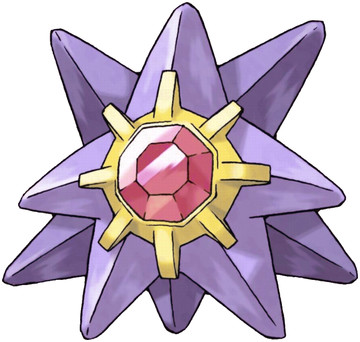
Starmie!
What can I say about Starmie? Well, the design makes sense of course as it is a seastar! I can't say I adore it, but I cannot say I dislike it either. It has the simplicity people always speak about of the Gen 1 Pokemon, and to be honest I think the gem in the middle was a good idea. It never appeared out of place for me, and I also though the colours wee flattering. Starmie may not be turning a lot of heads but it's definitely a design that didn't make me cringe. The colour scheme might be the best part of it, but I fear I am a bit biased against this type of predator! Starmie loses a bit of its points from me because I think a few small touches could have been added to it and it still could have kept its simplicity, such as golden tips on the arms that match the colour of the area surrounding the gem. Just my opinion though!
8.5/10
What do you think of Starmie? Gen 1 perfection, or Gen 1 unimaginative?
Results 1 to 10 of 21
Threaded View
-
04-12-2014, 12:31 AM #12The Fire Fox Gijinka

- Join Date
- Jan 2014
- Location
- Canada
- Posts
- 812

 Reply With Quote
Bookmarks