@
Brettles
Team Dirty Rotten Scoundrels
 Neatness:
 6/10
Creativity: 2/10
Overall Look and Effort: 3/10
Relevance: 5/5
Total: 16/35
Comments:
This fusion is very basic and it looks like you spent a minimal amount of time on it. The way you shaped the part of the mane fur which was clearly the edge of your copy/paste is quite lazy and doesn’t look good, and as for the concept, well it’s pretty basic and it’s not at all a new idea. If you can fused in other places and done more of a crossover than just a head placed on a body, then you would have gotten more points.
@
Tenacity
Team Trainer
 Neatness:
 6/10
Creativity: 9/10
Overall Look and Effort: 7/10
Relevance: 5/5
Total: 27/35
Comments:
I like the concept, and the way you created the fusion is done really well! The face is a little awkward however, mostly just in the placement of the coral “arms” and the line that’s separating the red with the yellow. I’m not sure if it was meant to be curved or straight, as it’s straight toward the back of the head but then gets lumpy, and then right at the front there’s a stray pixel that makes the line dip, which didn’t really make sense. The white ring on the back of the head is also poking out a little too far when, at that angle, I think it would be mostly or nearly completely masked by the head, and therefore you could have just had some of that yellow coral poking out. Overall a good effort and great combination of pokemon. :]
@
Pokeman
Team Trainer
 Neatness:
 5/10
Creativity: 7/10
Overall Look and Effort: 6/10
Relevance: 5/5
Total: 23/35
Comments:
Your idea is good, but the execution could have been better. At first I thought you’d simply replaced the head, but upon closer inspection, I discovered that you actually used the krokorok as a base and added sceptile parts. The arms should have been higher up, like where the krokorok’s were, and the way you’ve tried to use the red for where the stripes used to be doesn’t work out so well. It’s quite awkwardly shaped. I think the sceptile legs look slightly out of place on the body as well, because they’re slim and they don’t look like they can support a heavy body like that. xD Good concept though.
@
Velocity
Team Awesome
 Neatness:
 7/10
Creativity: 9/10
Overall Look and Effort: 7/10
Relevance: 5/5
Total: 28/35
Comments:
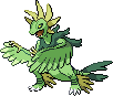
Heh, this made me smile when I saw it. However, I have a few things to point out and the first one is the wing coming across the body. As a first critique, it covers a lot of the body which is disappointing because I would have liked to see what more you did to it. Mainly though, it seems that you’ve inverted a wing that normally faced upwards and was the inside of the wing, yes? The main thing that gives it away (despite the fact that there are no sprites that are in that pose) is the bone along the outside, which you can only normally see on the inside of the wing. On a fearow, anyway. So it makes it seem like something weird has happened and the wing was turned inside out or something. The outlines of the yellow crest on the head are too light in some places and although I realise this is the original shading/placement of pixels, the difference between the red and the yellow makes it not look right when replaced with yellow. Overall, I really do like it though. x)
@
Pokemon Trainer Sarah
Team Trainer
 Neatness:
 8/10
Creativity: 9/10
Overall Look and Effort: 8/10
Relevance: 5/5
Total: 30/35
Comments:
I really like what you’ve done with this. It’s creative and it looks great. 8D I think the servine collar is a little too straight and sort of stretches away without much curvature. The yellow band on the leg isn’t really outlined properly so it blends a little with the other colour, and I reckon the claw outlines are a little too light, but apart from that it’s quite good. C: There’s something about the shading but I can’t put my finger on what it is. I think the dark parts stand out quite well but I’m not sure if that’s a good thing or a bad thing so I won’t mention any more about it. xD Well done.
@
Minunrocks
Team Aqua
 Neatness:
 8/10
Creativity: 8/10
Overall Look and Effort: 7/10
Relevance: 5/5
Total: 28/35
Comments:
This is a very cool idea, and I think you’ve tried it out quite well. I’m confused about the shading though, since it seems to be coming from behind and from in front based on the outlines, so you lot a mark for look & effort for that, but otherwise it’s quite cool. I wasn’t sure whether or not to accept the horns, considering it is technically not part of any of those pokémon. Anyhow, it was nicely done but the shading confused me a little, and I think you could have done a bit more with it. x)
@
Corrupt_Voidlich
Team Trainer
 Neatness:
 8/10
Creativity: 9/10
Overall Look and Effort: 7/10
Relevance: 5/5
Total: 29/35
Comments:
Very cool concept. O: The sawdust idea is a pretty cool one, especially since it is normally, obviously, sand. Your shading is a little confusing in places, such as on the face rock. At first I couldn’t quite understand what was going on with your chest shading, only to realise that it was a rock on the snout. xD They look more like spikes; I think if you wanted them to be more rock-like, you could have gone for a more grey look rather than making them white. The way you reshaded the nose is a little off considering the light source is to the left, and I think in generally it might be a little over-shaded. I also would have liked to see some more hippowdon. However, I still like it, so nice job. B)
@
The Frost Dragon
Team Trainer
 Neatness:
 4/10
Creativity: 6/10
Overall Look and Effort: 4/10
Relevance: 5/5
Total: 19/35
Comments:
I think this sprite is very lacking. From the flower and up, the whole thing is unchanged and entirely meganium. Generally with a fusion you wanna go with a mix basically everywhere, or nearly everywhere. I would have liked to have seen a lot more tropius and armaldo used in places other than just below the flower. The tail is also strangely placed; I think moving it a little upwards and to the left would have helped. Also lol at you not knowing what a meganium was. XD
@
Speed-X
Team Dirty Rotten Scoundrels
 Neatness:
 9/10
Creativity: 10/10
Overall Look and Effort: 9/10
Relevance: 5/5
Total: 33/35
Comments:
...This thing is feckin’ adorable. I love the way you’ve done the stripes on its back. They’re very smooth and it works really well! The way the wings bend around does look weird, and that diagonal line is bothering me a little, but that’s pretty much my only critique. Everything else is pretty much seamless, including the way you shade and the way you outline. Very well done!


 Reply With Quote
Bookmarks