

Yeah, I just finished the article for this, and the article for MotY. Expect this one's to be up in about an hour, that's when I have it scheduled to post. xDOriginally Posted by Braixen

Results 11 to 20 of 127
-
11-14-2014, 09:09 PM #11The Lord of Awesome

- Join Date
- May 2013
- Location
- In a Van down by the River
- Posts
- 909
-
This post has been liked by:
-
11-15-2014, 12:41 AM #12growing strong
Site EditorSenior Administrator
- Join Date
- Feb 2013
- Location
- Route 1
- Posts
- 10,750
This looks fun! Since Bulbasaur is gone, can I reserve Ivysaur, Wartortle and NidoranM?
Also questions... Do banners need to be made with official art only or is fanart okay? If so, do we need permission from the artist?
Can we submit banners we've made previously as long as they fit the rules or do you want new banners only?
And a comment... Maybe if this is an official art only thing we can put all the banners on the website when they're done, as a resource for people everywhere to use?
-
11-15-2014, 05:59 AM #13The Lord of Awesome
- Join Date
- May 2013
- Location
- In a Van down by the River
- Posts
- 909
Okay... This is actually a good point. It needs to be official art. Being Pokémon cards, sprites, or renders. Because it'll be a good thing to post them up on the main site. I'm totally behind this idea. Also, I feel like they should be newly made. I mean, how do you hope to test your skills if you used some old banner you did? Originally Posted by Pokemon Trainer Sarah
And, like.. Once a week on my free time, I'll post an article update. Just to appease the powers that be.
Speaking of which.. Ray asked me to see this through until the end. I will see it through until people stop posting here all together. Even if one or two people still post, I won't abandon ship, but if it's just Braixen and myself.. I can't say it'll be worth keeping around. It was spur of the moment and a total shot in the dark. With little to no preparation. But I've always been that sink-or-swim kind of guy.
Also, Sarah.. if you wanna reserve, you should probably sign up, first. <3
-
11-15-2014, 07:03 AM #14growing strong
Site EditorSenior Administrator
- Join Date
- Feb 2013
- Location
- Route 1
- Posts
- 10,750
Thanks for answering this questions! And sorry, I missed the sign up thing. Oops! I was just way too excited haha.
Username: Pokemon Trainer Sarah
Gender: Female
Favourite Colour: Blue
Banner Example: See signature
How Active Are You?: Very!
-
This post has been liked by:
-
11-16-2014, 12:32 AM #15your turn to roll
- Join Date
- Feb 2013
- Posts
- 13,468
I'd love to try my hand at this and help out (and I totally support the idea of everyone being able to use these) and Sarah's question about the official art thing was also on my mind since you said in the rules that it had to be your work and nobody else's. xD
I've never really done banners before so I dunno how good I'll be. xD If I manage to whip anything up that looks half decent then I might sign up. :]
-
11-16-2014, 03:54 AM #16The Lord of Awesome
- Join Date
- May 2013
- Location
- In a Van down by the River
- Posts
- 909
Originally Posted by Pokemon Trainer Sarah
Accepted and reserved.
Originally Posted by Suicune's Fire
Very well, but you don't need to sign up as I was going to sign you on as more of the enforcer and acceptor of things. I feel that this project will start getting very popular very soon. So I'm going to need all the help I can get. Of course, you're welcome to reserve and create banners as well. <3
On that note, I will now submit the first banner!
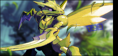
Behold #123 Scyther!
I will also reserve Zapdos.
-
11-16-2014, 04:00 AM #17your turn to roll
- Join Date
- Feb 2013
- Posts
- 13,468
Okay, well can do that then! ^^ Sounds fun. x) I suppose there's a certain standard we're looking for, but I'm also assuming that most will be accepted anyway (unless it's somehow horrific and indiscernible. xD)
Nice scyther banner! O: I haven't seen that image before. I don't know about the random black stripe on the edge though, and it looks a little tall. More effects would be cool too, as it seems more like a cropped image than anything. But yeah. xD
-
11-16-2014, 04:04 AM #18The Lord of Awesome
- Join Date
- May 2013
- Location
- In a Van down by the River
- Posts
- 909
-
11-16-2014, 04:08 AM #19your turn to roll
- Join Date
- Feb 2013
- Posts
- 13,468
Ooh, okay. xD I'm not sure how edited these are meant to be. But if it's not much, then I'm sure I could whip a few out! Originally Posted by XaiakuX
-
11-16-2014, 04:18 AM #20The Lord of Awesome
- Join Date
- May 2013
- Location
- In a Van down by the River
- Posts
- 909
Originally Posted by Suicune's Fire

This is a relatively smaller version of the card that I used. Here's to hoping you'll notice the differences. xD
Also, these are examples of what not to accept:

This is, for one, way too big. 2, there was little to no effort, I spent, at best, 30 seconds making this. I want to see real effort. C'mon.

While this has a little more effort, I mean.. I just hope to whatever God you believe in that you never EVER consider something like this acceptable.... EVER.
In closing, taking a gander at my actual Scyther submission, it is very basic, yet clean and neat. a few gradient maps and some blur/sharpen action goes a long way. As Xanthe stated, It looks like I just cropped it out, and made it look pretty. Because that's what I did. Borders are also essential. It really helps to have them when making tags, and submitting them to this particular project..

 Reply With Quote


Bookmarks