

I would buy the heck out of a Rayne sticker if I had the money.
Results 171 to 180 of 288
Thread: Neko's Failtastic Art Thread
-
08-22-2017, 02:23 PM #171
 The Queen of Shaymin
 Site EditorAdministrator
- Join Date
- Dec 2014
- Location
- US
- Posts
- 17,593
-
08-22-2017, 08:03 PM #172Gym Leader
- Join Date
- May 2013
- Posts
- 2,024
-one day- Originally Posted by Noblejanobii

I've been thinking of maybe ordering a few extra for the monthly PRS raffles. Gonna wait til I settle down for the semester before I go through with that though. Budget has been a bit tight lately. xD
-
08-22-2017, 09:13 PM #173
The Queen of ShayminSite EditorAdministrator
- Join Date
- Dec 2014
- Location
- US
- Posts
- 17,593
ohh yeah that could be cool. Totally understand about the budget thing though. Originally Posted by Nekomata
-
08-22-2017, 09:51 PM #174Gym Leader
- Join Date
- May 2013
- Posts
- 2,024
Ye! It'd be fun to give them out as prizes. So I'm hoping in the near future I'll stabilize my budget enough to get a few extras here and there. ^_^ Originally Posted by Noblejanobii
--
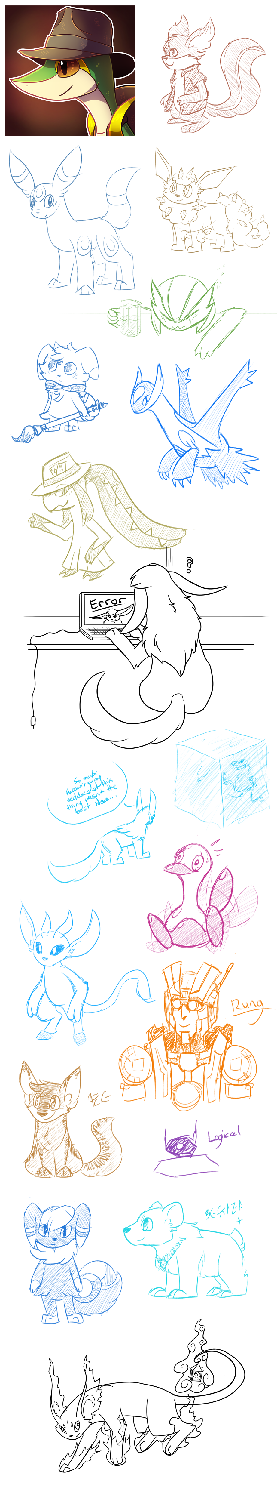
Going off the PRS Discord's Pokemon-of-the-week Art theme:

I'll be putting together a process thing of that commission later.
-
08-23-2017, 01:36 AM #175Lover of Centipedes
- Join Date
- Nov 2014
- Location
- Ant Island
- Posts
- 1,796
That wigglytuff is adorable! And I love that commission you finished.


-
08-23-2017, 02:51 AM #176Gym Leader
- Join Date
- May 2013
- Posts
- 2,024
Yeee! Thanks! Was going for a Hybrid- not sure if the other Pokemon in there is too subtle or not. Azumarill- they're very similar in shape/structure, so wasn't sure how to add some of Azumarill's traits in without being too overpowering. Originally Posted by Scytherwolf
---
And I'm really proud of that commission. Spent so much time on it and it came out so nicely!
Put together a quick breakdown of how I work on digital paintings. This obviously isn't the exact process, but gives an idea of thought process and all.

1) Sketch for composition and general placement of things.
2) Since this was going to be a piece heavily reliant on value and lgihting, I did a quick value/tonal study to see how it would look.
3) Color blocking. Just establish all the shapes in the image.
4) Character flats. The character clearly isn't just a single color flat color, so added gradients, markings, etc.
5) Character shading. General shadows and some lighting on the character.
6) Character details. Add in the rim lights and some smaller details to help pop the character from the background more
7) Background roughs. Use shadows to show the 'form' of the background objects. Sky is colored to add contrast to the character and other important focal points.
8) Background textures. Painted in the textures of various background materials.
9) Lighting. Added in the lighting to the background objects and adjusted the shadows as necessary- especially near the character.
10) Details! Detail out the texture/light interaction some and help pop the main tree branch with a strong rim light.
11) Pushing back the background. The two background branches and the stones from them are too far in focus. They are pushed 'back' in distance so their presence in the image isn't quite as strong as that of the main branch and the character.
12) Tonal test. Take away all color to see if it still looks good as pure greyscale. A good lighting composition should read well without color!
-
This post has been liked by:
-
08-31-2017, 03:19 AM #177Gym Leader
- Join Date
- May 2013
- Posts
- 2,024
I held the sketch request stream this past week! Had a good turnout and got quite a bit done!
-
09-22-2017, 04:45 AM #178Gym Leader
- Join Date
- May 2013
- Posts
- 2,024
Commission for @Chakramaster !
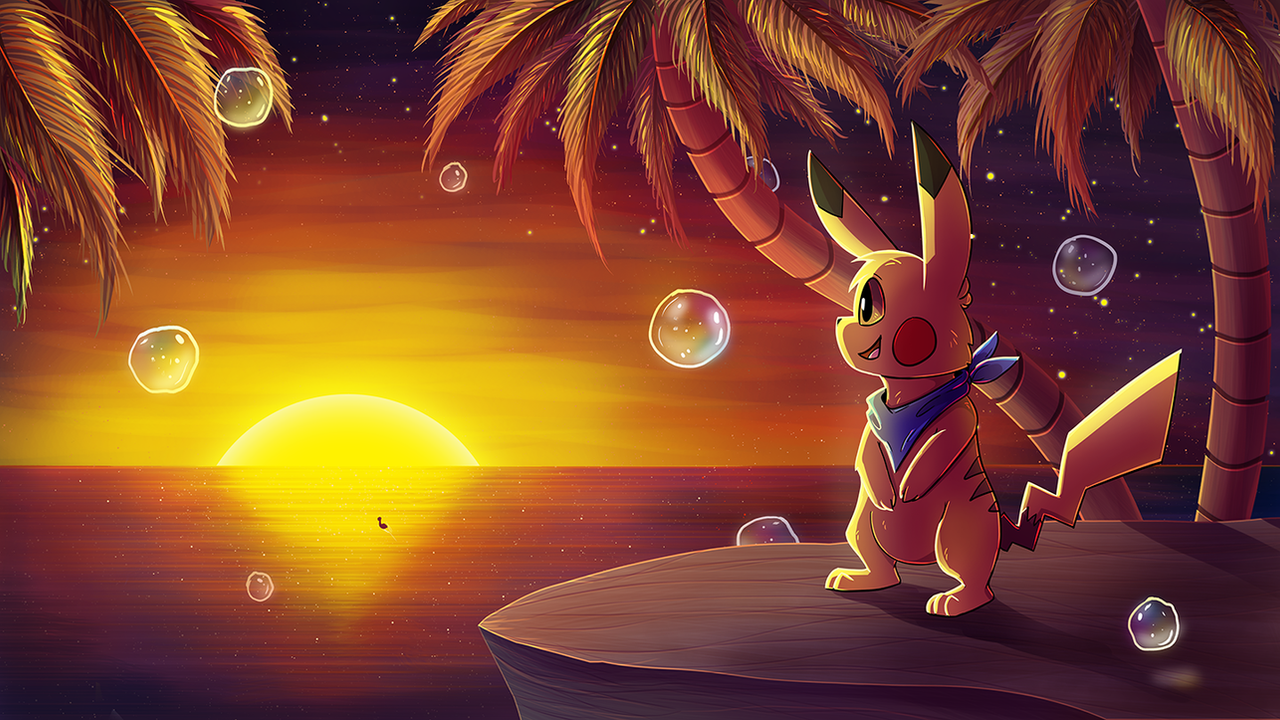
Had a blast working on this. Final file is a massive 5.7k px wide- but the palm trees don't look all that good at the higher res... but that's why we scale down. =D
-
This post has been liked by:
-
09-22-2017, 04:51 AM #179growing strong
Site EditorSenior Administrator
- Join Date
- Feb 2013
- Location
- Route 1
- Posts
- 10,711
Wow Neko! Chakra's commission is GORGEOUS! Look at those colours! The bubbles are perfect too :O Can't wait to see Chakra's reaction. xD You're amazing at sunsets!
Also it's really cool to see your process in the commission above that! I love how your "quick value/tonal study" is already amazing on its own! xD Really cool to see how you art :3
-
This post has been liked by:
-
09-22-2017, 08:28 AM #180Cheers and good times!
Senior Administrator
- Join Date
- Mar 2013
- Location
- New Jersey
- Posts
- 17,439
Oh snap, Chakra is going to THRILLED when he sees that! XD
That's amazing and what an awesome job you did with the colors, shading, and especially those palm trees! I always get lazy with those. XD
-
This post has been liked by:


 Reply With Quote


Bookmarks