

Look, if I post a banner will you guys post one? xD You're killin' me.
Results 91 to 100 of 127
-
12-09-2014, 12:57 AM #91The Lord of Awesome

- Join Date
- May 2013
- Location
- In a Van down by the River
- Posts
- 909
-
12-10-2014, 06:09 AM #92I'm Gigi
- Join Date
- Sep 2014
- Location
- Somewhere
- Posts
- 2,473
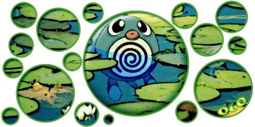
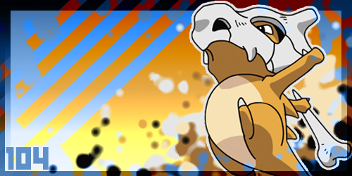
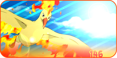
Got some time to do Poliwag c:
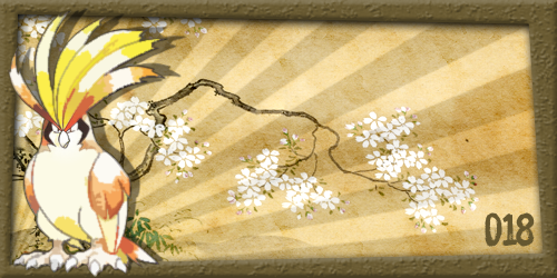
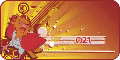
EDIT: Also got Cubone and Moltres done!
Last edited by PTGigi; 12-10-2014 at 07:22 AM.
Mewtwo banner and avatar by Pokemon Trainer Sarah!

'I see now that the circumstances of one's birth are irrelevant; it is what you do with the gift of life that determines who you are.' -Mewtwo

My Art! | ASB Stats | My Nuzlocke
-
12-10-2014, 09:58 PM #93growing strong
Site EditorSenior Administrator
- Join Date
- Feb 2013
- Location
- Route 1
- Posts
- 10,750
Ooh nice banners. I really like the colours in the Moltres one!
Here is Aerodactyl!
And a tutorial with links to my fave brushes for anyone who is interested: http://www.pokemoncrossroads.com/for...rs-Sarah-style
-
This post has been liked by:
-
12-10-2014, 11:02 PM #94I'm Gigi
- Join Date
- Sep 2014
- Location
- Somewhere
- Posts
- 2,473
Great job with Aerodactyl @Pokemon Trainer Sarah, and thank you! Nice tutorial too!
Also for Butterfree's banner it links to Jigglypuff's, not Butterfree D: (to save you hunting back through the pages, here's a link to Butterfree's)
New day, new banner c: Goldeen!

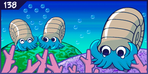
And because this is my favorite Pokemon card, Omanyte!
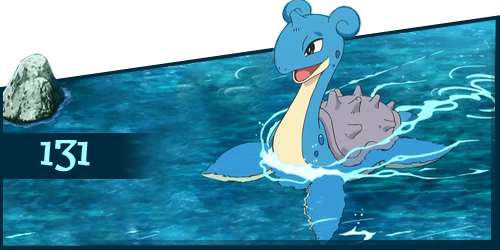
And the last one for today, Lapras!
New day but no new banners. Little weird to be editing the same post for 3 days in a row so I'll wait until other people post.
But I did notice I accidentally wrote down the wrong number for Gengar, here's that fixed:
Last edited by PTGigi; 12-12-2014 at 08:20 PM.
Mewtwo banner and avatar by Pokemon Trainer Sarah!
'I see now that the circumstances of one's birth are irrelevant; it is what you do with the gift of life that determines who you are.' -Mewtwo
My Art! | ASB Stats | My Nuzlocke
-
12-13-2014, 03:09 PM #95The Lord of Awesome
- Join Date
- May 2013
- Location
- In a Van down by the River
- Posts
- 909
-
12-13-2014, 09:05 PM #96formerly Speed-X
- Join Date
- Apr 2013
- Location
- USA
- Posts
- 4,686


Just wanted to say that these are all coming together really nicely! Love the effect on Squirtle, and how it looks like a CRT monitor. The unconventional ones are really cool, too (by that, I mean the ones like Bulbasaur that aren't just your typical rectangle and are really unique and stuff)
And with Gigi, it's like you never know what kinda style she's going to do next because almost every one of the ones she makes it different from the others.


Greninja: Axibians | Gengar: Speed's ORAS Emporium! | Malamar: Picarto | Roserade: Speed's Pixel Cluster | Gliscor: ASB Stats | Tentacruel: Pokemon Prism Stats | Drapion: VPP Stats | Mega Sableye: Recolored Shiny XYORAS Icon Sprites | Flygon: URPG Stats | Snivy: Viridian Reference | Treecko: Link Vault | Shiny Whismur: All shiny Pokemon
Pfp by my friend Muerte Verde
------------
-
12-14-2014, 02:11 AM #97Just smile!
URPG Staff
- Join Date
- Nov 2013
- Location
- Here, there, everywhere.
- Posts
- 1,429
-
12-14-2014, 06:01 AM #98I'm Gigi
- Join Date
- Sep 2014
- Location
- Somewhere
- Posts
- 2,473
I'll take that as a compliment =P Originally Posted by Speed-X

Speaking of which more banners before I go to sleep c: Pidgeot and Spearow!
 Mewtwo banner and avatar by Pokemon Trainer Sarah!
'I see now that the circumstances of one's birth are irrelevant; it is what you do with the gift of life that determines who you are.' -Mewtwo
My Art! | ASB Stats | My Nuzlocke
-
12-14-2014, 06:10 AM #99your turn to roll
- Join Date
- Feb 2013
- Posts
- 13,468
Sweet, guys. :] I love that there are all different types of styles! 8D It's so cool!

-
12-14-2014, 03:05 PM #100The Lord of Awesome
- Join Date
- May 2013
- Location
- In a Van down by the River
- Posts
- 909
I'll say a few things. First off, it's not bad, and I'll accept it. Unless you want to work on it, again. I feel like the lettering stands out more than the Pokémon. This was my same beef with Xanthe's Flareon. On top of that, if I remember reading the tutorial correctly, you're supposed to center the brushes around the image you were working with to make the Pokémon stand out more. It's easy to get confused, though. especially when you're relatively new at making banners. I know I was terrible when I first started. But I was so full of myself that I called myself the "Hidden Talent." But that was more or less because I was a champion of the sprite art boards on pe2k. If I were to recommend anything else give the Persian render its own window/tab, size it down a bit, and rotate it a little. Make the arrows point away from Persian, then make the text smaller and less prominent. Then show me what you come up with and we'll go from there. Originally Posted by Lightning Dash
Also, yes, PTGigi does make some impressive banners. I'll be stoked to see what she does for the Mega Evolutions that she chooses when she reaches 25 banners. xD
@Speed-X The Bulbasaur one was a complete accident. But I'm glad you approve. <3
-
This post has been liked by:

 Reply With Quote


Bookmarks