

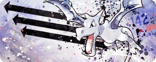
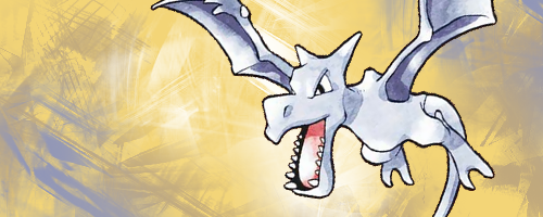
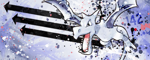
Hi guys! Here is a tutorial showing how I make banners. It is designed for beginners and anyone who wants to give it a go! I use Photoshop here, but you can probably apply the same ideas in other programs. Today we're going to be making the Aerodactyl banner above!
Step One - Finding an ImageFirst thing to do is find a picture that you would like to use in your banner. The easiest images to use are those which have a transparent background. These are usually called "renders". You can also use images with a single colour/white background, but these might not come out as nicely. Alternatively you can cut out an image from a background yourself on Photoshop, but I'm not going to cover that here.
[Tip! Put the word "render" after your search in Google Images to find renders more easily.]
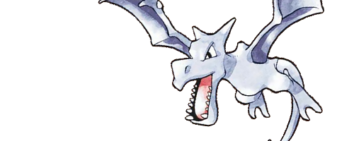
I selected this image. It is not a great render because the outline is a bit pixelly, but it will do.
The first thing to decide is a size for your banner. The default size I tend to use is 500 pixels wide by 200 pixels tall, but you can make this any size you want. Open your image with a transparent background in Photoshop.
Step Two - Setting out the banner
[Tip! Most browsers will make transparent backgrounds black if you try and copy them straight from the internet, so you will need to save the image to your computer and then open it in Photoshop. Alternatively, in Photoshop, go to File > Open and paste in the image's URL. It will then open correctly in Photoshop. (Thanks for the tip, PTGigi!)]
Now create a new Photoshop document the size of your banner, in this case 500 x 200 px.
Copy and paste your image into the banner and resize it to fit nicely. You can also rotate it or flip it around if you want!
[Tip! Press CTRL+T to resize your image. Hold down the SHIFT button when resizing to prevent stretching of the image. Never resize images to be bigger, only smaller, otherwise they will turn out blurry.]
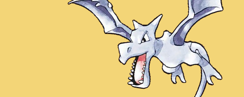
Now you need to pick a background colour. I usually pick a colour which is found somewhere in the image, but you can pick whatever colour you like. Try to make sure it looks nice with the image you chose. Now make a new layer under your image and fill it with your background colour. This way you can edit it later! I picked a sandy colour since Aerodactyl is a fossil. [I also moved Aerodactyl down a few pixels from the previous image as I didn't like the bit of tail showing at the bottom.]
[Tip! Use layers as much as possible! Every time I add a different effect or brush, I use a new layer. That way if something doesn't look nice later on, you can easily change it or delete that part. If you do everything on the same layer, you'll be stuck!]
Step Three - Filling in the backgroundEverything looks pretty plain so far, so we're going to fill in the background a bit by using brushes. You can use any brushes you like! For this tutorial I will be using these Abstract Grunge brushes. Try to use colours that go with the background or that are found in the image. Feel free to use different shades of these colours for a nice effect! Black and white are always good too. Make sure you do this on a new layer, not the background layer! And make new layers often! Don't forget to mess around with the blending options for the layer. Sometimes you can get a very nice effect! You can mess with the opacity and fill as well. Just see what you come up with.
Here I have brushed using different colours with different blending options: dark purple on Hard Light, white on Hard Light and then dark purple on Normal.
To tie it all together we're going to use a pattern. Patterns are great!
This is a pattern I made myself and use on almost all of my banners. It will be very hard to see here as it is merely 5 white pixels on a transparent background. I suggest you right-click the link and Save it to your computer. Now open it in Photoshop. You should be able to see it if you zoom in. Now go to Edit > Define Pattern and press OK. Let's see what we can do with it!
To use a pattern, select the Paint Bucket tool on the left toolbar. At the top of the page where it says Foreground with a little downwards arrow, click it and select Pattern. Now click the down arrow on the little box next to that, and choose the pattern we just saved. I made a new layer under my image and then clicked the layer. This fills it with the pattern! I then adjusted the opacity of the layer to 20%. Mess with these settings as much as you like!
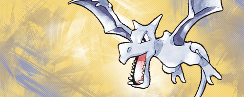
I decided that the edges needed to be darker to sort of frame the banner. So I put some black around the edges with some random brushes (same set as before). I did this in black and then changed the blending style to Overlay.
[Tip! Save often! ]
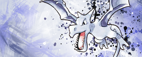
At this point I decided the sandy background wasn't working for me. So I picked a colour from Aerodactyl itself, in this case, a light grey, and changed the colour of the background layer using the Paint Bucket tool. Feel free to experiment with different colours at this stage!
Step Four - Special Effects
Aerodactyl is blending in with the background a little too well, so it's time to bring it out a bit! I used my favourite brushes for this part: Spatter Brushes. Make a new layer behind your image and get spattering! I usually pick 3-4 colours: black, white and then a couple of colours from the image itself. Remember to do each colour on a new layer so you can mess around with it separately.
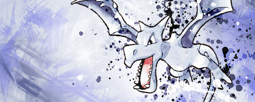
Here I did a white layer, a light purple layer, a dark purple layer, a black layer set to Overlay and then another small black spatter on another layer.
You can also do some of your spattering on top of your image if you like. Just be sure to erase any parts that cover important bits of the image (like the face etc.). This goes for any brush that you're using. Here I moved the black overlay and white spatter layers on top of Aerodactyl and then erased any bits covering the face. I think it helps Aerodactyl become more a part of the banner, rather than something pasted on top.
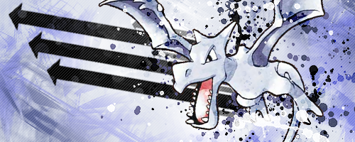
It's still looking a bit plain though and there's a lot of blank space. Let's fill it up! Something solid would fit nicely in there. I am a fan of arrows, so I added some arrows. I can't find the brush set they were from, sorry. :( Any vector brush will do though!
Still a bit plain. Decided to add spatter some pink from Aerodactyl's mouth and some more white and purple on the left side. Brought the layer with the arrows above the one with the pattern so they stand out more.
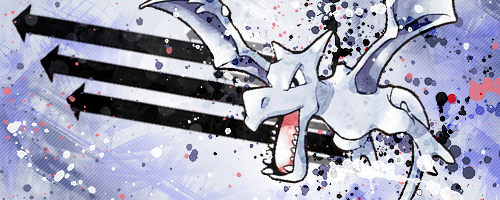
Hmm, getting there now. Text time! Since this is a banner for .:The 721:., I am just going to be adding the number "142". I chose the font Blue Highway D Type. I did it in black, rotated it a bit and set the blending mode to Overlay. Then I found a nice spot where it was visible but didn't stand out too much.
Now the bottom left could use something else. I made a new layer and then selected a part of it using the Elliptical Marquee tool (found by holding down your mouse button on the Rectangular Marquee tool). Then I used the Paint Bucket tool to fill it with my white diagonal line pattern. I then moved the layer under the arrow layer.
[Tip! Hold down SHIFT while using the Elliptical Marquee tool to make more than one circle at a time!]
Added a few more circles and...
Looking better! Now the fun part!
Step Five - Selecting Colours
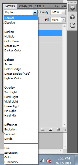
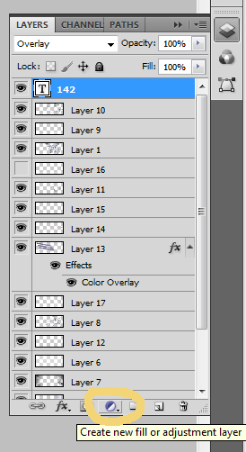
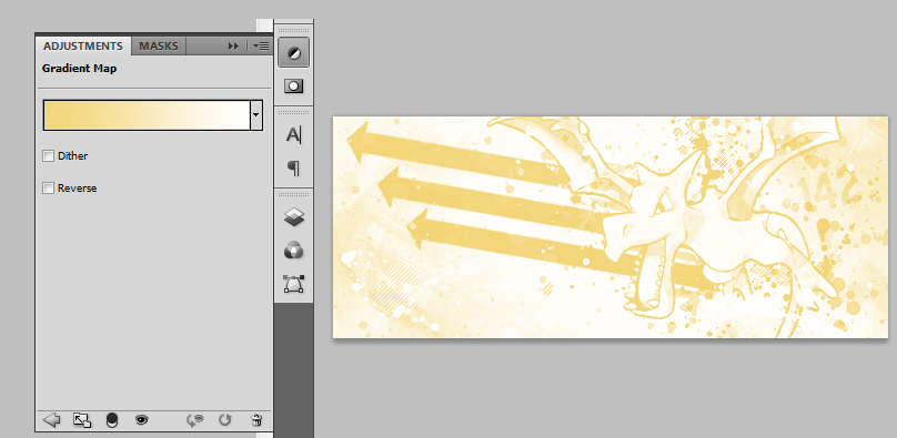
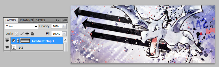
Now we're going to mess with the colours until we find an overall colourscheme that we really like. Go to the bottom of your layers panel and click the little half shaded circle, as shown below. These are all different things you can mess with! But today we're going to select Gradient Map from the menu that pops up.
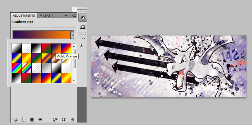
Now you will get a new layer which has a gradient in it, and the gradient tab should pop up, allowing you to pick whatever colour/style gradient you want to use. This will change the colour of your banner!
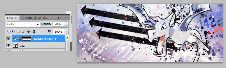
Set the layer with your Gradient Map on it to 20% Opacity and then set the blending options to Color. Now go back to the gradient and choose one. My personal favourite is the violet/orange one.
You can mess with different gradients, different opacities and different blending options to make all kinds of colourschemes, not to mention all the other options in the pop up menu, such as Colourfill and Curves. Have fun playing around!
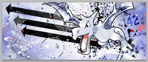
While I was making a picture to show you the difference before and after the Gradient Map... I figured out a new thing, so I will show you that instead!
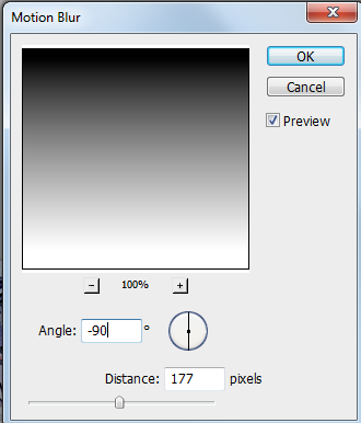
Go to your Gradient Map layer and select half of it using the Rectangular Marquee tool. Press delete. Now the gradient is only covering half the banner (the bottom half).
Now to go Filter > Blur > Motion Blur. We're going to blur the remaining bit of Gradient Map so it transitions nicely from the gradient through to being transparent. Here are the settings I used:
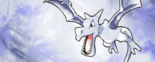
And voila! The original colour shows through at the top, and then it transitions down into the Gradient Map colour.
This won't always look good. It depends on your original colours and how well they fit with your new colourscheme. You can leave the Gradient Map intact if you like (I usually do).
Looks like we're pretty much done!
Step Six - Borders
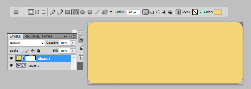
My favourite way to do the border right now is to have rounded edges, which you probably know if you have seen any of my banners haha. This is the easiest way I have found to do it...
Make a new layer above all your other layers and then go to Image > Apply Image, and press OK. This merges all your layers onto one new layer, while still keeping the original layers underneath. We do this because now we can copy and paste the whole banner at once. Copy your banner and paste it into a new document. Now choose the Rounded Rectangle tool on the left toolbar (found by holding down your mouse button on the Rectangle tool). Make a rectangle on top of your banner, with the settings shown below. The colour of the rectangle doesn't matter, as long as it is filled with some colour.
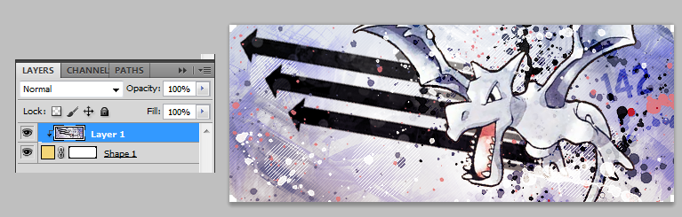
Move this shape layer underneath your banner layer. Now on your Layers panel, hold down the ALT key and then click right inbetween the shape layer and the banner layer. You should get this:
Note the rounded edges! This process creates a clipping mask, so only the parts of the banner that are on top of the shape will appear. Now we can save it! I always save as PNG-24. Make sure you tick the Transparency box so that we keep those rounded edges!
And here's our banner! Don't forget to save your original work with all the separate layers in case you need to edit something later!
Resource List
Here are some of my favourite brushes and things to use!
Vector brushes by Revelatus
Midnight City Vector Brushes by ShiftyJ
RisingSun Brushes by JaviarZHX
Vector arrows by deviantales
Spatter Brushes by IceChicken
Abstract Grunge Brushes by xALIASx
Cloud Brushes by JavierZHX
[Tip! You can find a lot of good brushes by browsing the Photoshop brushes section on deviantart.]
If you have a go at this tutorial, please post your results! I'd love to see them. :) Also if there are any questions, ask away!
Results 1 to 5 of 5
Thread: [Tutorial] Banners, Sarah style
-
12-10-2014, 04:08 AM #1growing strong
 Site EditorSenior Administrator
- Join Date
- Feb 2013
- Location
- Route 1
- Posts
- 10,750
[Tutorial] Banners, Sarah style
-
This post has been liked by:
-
12-12-2014, 10:44 PM #2I'm Gigi
- Join Date
- Sep 2014
- Location
- Somewhere
- Posts
- 2,473
*evil laughter* More Photoshop brushes for my
armycollection! >:D
Really great tutorial! One thing I might add that is you can cut a step for getting renders. If you copy the image location of the render you want to open, then go File>Open or CTRL+O in Photoshop and paste the image's url 95% of the time Photoshop can open it right there without you having to save the image C:Mewtwo banner and avatar by Pokemon Trainer Sarah!

'I see now that the circumstances of one's birth are irrelevant; it is what you do with the gift of life that determines who you are.' -Mewtwo

My Art! | ASB Stats | My Nuzlocke
-
12-13-2014, 09:10 PM #3Doom Bringer
- Join Date
- Dec 2014
- Location
- Canada!
- Posts
- 230
Wow, great tutorial! Kinda makes me feel like trying to do something pretty, but I can't do anything pretty owo
-
12-13-2014, 09:22 PM #4I'm Gigi
- Join Date
- Sep 2014
- Location
- Somewhere
- Posts
- 2,473
But that's what this tutorial is for! You should try and see what happens! C: Originally Posted by wilpin7

 Mewtwo banner and avatar by Pokemon Trainer Sarah!
'I see now that the circumstances of one's birth are irrelevant; it is what you do with the gift of life that determines who you are.' -Mewtwo
My Art! | ASB Stats | My Nuzlocke
-
12-14-2014, 10:28 PM #5growing strong
Site EditorSenior Administrator
- Join Date
- Feb 2013
- Location
- Route 1
- Posts
- 10,750
I'm glad it was useful :D Thanks for the tip, I didn't know about that! That's so awesome. I will add it in! :D Originally Posted by PTGigi
You should definitely give it a go! ^^ It just takes practice. My first banners were pretty terrible! Originally Posted by wilpin7


 Reply With Quote


Bookmarks