


With palette swaps, you should edit them a little. Even if it's not much. Because when you don't have enough colours, or when things don't match up, it just looks a little sloppy. Not only that, but make sure you always match up lights and darks, or you'll have to edit the sprite. Good examples of this include:Originally Posted by Cheerful Cherubi

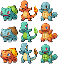
Orange squirtle - this isn't too bad, but the shell...that's not good. xD You can't even see the white part that borders the shell, and what's confused me is that you've made that part darker than the shell.
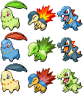
Lime green cyndaquil - Ooh, now this is a prime example of a need for editing. The colours of a cyndaquil are normally dark, so making the dark parts into a light colour ruins the composure of the lineart. You can see it's very broken around the head, right? This ONLY works for dark colours, do you'd need to edit that or make the green darker. The back also looks quite...not good. xD Like what I said before, you HAVE to match up the light tones with the dark tones of the palettes otherwise it looks backwards.
Totodile-coloured cyndaquil - the colours just do not work at all on this one. The yellow is too dark and the linart is way too light. You can barely see it.
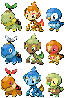
Orange turtwig - This is mainly for the shell. You used the fire colours to shade the shell, which is not at all a good idea considering that's not supposed to be shades. It's different colours. Sort of like colouring with pink and then shading with orange. Just won't work. xD Considering the shell is the same colour as the patch on its head, you should have made the shell yellow.
Green/brown chimchar - The palette does not work at all on this sprite. Again, you didn't match up the darks with the lights. Chimchar have light bellies and faces, and darker orange fur. So the brown should have been used where the orange was, and the green where the lighter yellow was.
Blue chimchar - This sprite has a severed ear. O_o
Both piplup - Once more, this sprite's colours doesn't work because you didn't adhere to the dark/light matchup. That red face looks totally odd. xD
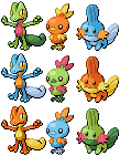
That being said, some of them turned out well. Just remember, palette swap does not mean you're confined to the EXACT shades that are given to you. They're sprite specific, so you HAVE to make edits if you're gonna slap those colours on other pokemon. x)
As for the bulbasaur, it's pretty good, but it needs a lot softer transitions between shades. The hard green under its chin looks much too dark. My main critique is the way you didn't blend the spots/shapes with the body. They are not protrusions, and yet you've shaded them separately, like they're little pebbles attached to the sprite. Do you see how, on the official bulbasaur sprite, there is no outline for the spots? Don't outline yours either. It looks unnatural and gives the wrong impression of the dimensions. The outlines around the eyes aren't as smooth as they could be; they're rather jagged, especially around the red part of the larger eye. Parts of the outlines are also jaggedy, like the front right leg, and your outlines are also too bright in a number of places (mainly where dark shading is). Nice start though. :] Hope this helped.
My advice to you about this would be to treat the head as a circular object. You need to shade it accordingly, as opposed to shading different sections separately. Try to use darker shades as well. The beak seems a little big as well, but it's a pretty good start. :]
I quite like those omanyte revamps! You've shaded the lineart oddly on the front in parts (random patches of darker shading at times) and I think more of the lighter shade could be used on the front moustache tentacles, but other than that, well done. ^^
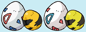
As for the eggs, pixel overs generally have single-pixel width lines. What you've done isn't sprite art, although it is pixel art, I believe... I think there needs to be more detail in the shades, especially around some of those triangular shapes on the togepi. On the elekid egg, it looks like you've shaded the lines, which make it look blurred and odd, considering the lines are marks, and not to be shaded. xD Anyway, nicely done.
Haha, I like it. The yellow colour means that you have to update the state of the wings' outlines though, since they have black in dots, which should be lighter considering the lightness of the yellow. The blackness of the white part of the wings looks a little odd against the whiteness, and also considering it has a tail that isn't comprised of black outlines, but is also white.
I like this. ^^ The only thing I have to complain about is that I think the right eye should have more of a border, as it seems like it finishes too high up on the right side, whereas the Crystal one has outlines that go further down. If that makes sense. xD
~SF.
Results 1 to 10 of 211
Thread: General Spriter's Showcase!
Threaded View
-
05-15-2014, 09:08 AM #11your turn to roll

- Join Date
- Feb 2013
- Posts
- 13,468


 It's not very good, but it's a start.


 Reply With Quote
Bookmarks